Thanks for the comments guys. This is a very helpful forum. I thought I’d react a bit to your critiques….
From John (jmilkins)
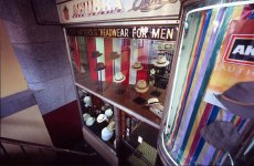
There’s a lot happening in this one Steve. I think the square format is great here – it adds a certain order to the scene, but doesn’t impose a hierarchy of where to look first. So my first impression was “what’s the subject?” but then my eye is drawn to the lighter parts of the scene. The chance arrangement of the figures works well – I go from the pram and couple on the right, to the lookout, the stairs, the other pram , and then to the shadows and the foreground couple. There’s even a view form them to the final figure back through the light on the left. I like the way the eye can wander through the image picking up interest. The lighting is lovely, imparting a delicacy to the stonework pillars. Nicely exposed and seen!
I love square! I need my Iskra back so I can shoot some more.
“What’s the subject.” Why should this be an amazing question? I’ve done a bit of writing and the subject is always in mind. For some reason, I seldom if ever think of the subject of a photograph. Usually, it’s obviously just whatever I’ve pointed the camera at, but I can see how that is not always the case. So, thanks John. I’ll be asking myself that question far more now as I point the camera.
From Nico,
This could be a real mess but your composition puts some order in the photo, I like the different levels, horizontal and vertical, in every one there's something happening. There also are lots of lines (columns windows, railings etc...), people and then a landscape. I don't really have a critique to make here, maybe this one is a sort of "love it or hate it" and i like it as is.
The activity…the Getty as a place of human occupation and interaction…that’s what struck me about the scene and what I wanted to show in this picture. Including people in my landscapes (I think of this shot as a landscape) is new to me. I waited for someone to come out of the elevator and walk in to the frame (upper left) so there would be activity at all visible levels.
From John (emraphoto)
steve i think this image has tonnes of potential. it is an intersting and visually pleasing image. i think with a little more tonal range it would be a winner for me!
The exposure for this shot was a huge compromise. Because the area to the upper right was so much brighter than the rest of the scene, I had to manipulate a bit in post processing. I sacrificed a bit of dynamic range for the sake of keeping it all together.
From Warren
You pulled off this very complex shot very well! Sometimes, an image with a strong central line get split in half and the composition suffers because of it. This one flows well for me, and shapes of the two openings in the building serve to bridge and balance the two scenes. I tend to observe the outside scene, then the strong lines of the railing on the inside scene leads me from the bottom of the inside scene to the couple in the background next to the building...nice!
The exposure here must have been tricky. I wonder if you had to do some postprocessing to even out the exposure a bit... just curious
Again…the activity, the life of the place is what struck me. I’m glad that you’ve seen it in the shot.
Yes, I did some post processing to balance out the light. The area in the upper right was quite a bit brighter than the rest of the shot. I used two layers in photoshop to adjust for the lighter and darker areas and then blended them together.
When doing this sort of thing, I think there’s a fine line between replicating how we perceive light and creating a situation where the light looks unreal. I think I’m on the right side of that line here, but the fact that you noticed means perhaps that I’m playing rather close to it.
Thanks again to all. This was a worthwhile experience that I hope to repeat.