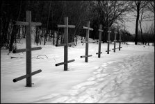
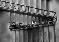
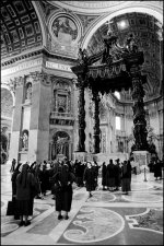
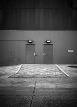
RayPA
Ignore It (It'll go away)
Welcome to this critique thread. Please read the purpose statement and the guidelines/ground rules regarding participation.
Purpose
The primary purpose of this thread is to provide a forum where photographers can give and receive constructive criticism on one another's photographs. By setting up some basic guidelines we hope that this thread will provide a forum where the give and take of honest constructive criticism can help us become better photographers.
Guidelines/Ground Rules
The thread has very specific rules regarding participation. The one basic rule is that you cannot provide criticism on an image or comment in a critique thread unless you also have an image posted. To post an image to this thread you must be a participant. Participation in this thread is limited. Here are the guidelines and ground rules for participation:
• Participation in this thread is limited to 5 photographers
• Participants join the thread by posting their intention. You can simply reply with your intent to join by posting something like: "I'm joining," "I'm in," or just state your name
• Joining is on a "first come, first served" basis. The first 5 to reply become the participants.
• Please, only join this thread if you are able post an image within 24 hours of joining.
• Once the thread has 5 participants, no other photographers can join or participate in the thread
• Once the thread is full of participants all photographers will upload their image(s)
• Please abide by any thematic requirement (e.g., landscape, portrait, etc.)
•The number of photos for each participant is limited to one
• Photographers attach photos as thumbnails (no inline images or links)
• Photos should be standard screen resolution (72~90) and the longest side of the image approximately 10 inches in length. NOTE: New size limitations restrict attachment sizes to 150kb. If you need help sizing your image for the web see THIS pdf.
• Photographers post their images supplying titles (if any) and other pertinent information (the amount of information should be minimal)
• Photographers can only comment on their own images and reply to comments only when everyone else in the thread has posted their comments on the image
• Every participant must comment on every photo (except their own—initially)
• Every participant must make at least two comments, one positive comment, and one constructive criticism (which is actually two positive comments)
• Once every photographer has commented then a free flowing discussion begins. It is at this point that every photographer can comment on their own work and reply to comments, ask questions, etc.
• The participants decide when the thread closes.
What's a Guest?
A guest is a participating member of the thread who does not need to post a picture. The guest is an exception to the guideline that states all participants must post an image. Guests provide criticism just as the other participants do. Guests are also encouraged to act as moderators, to encourage elaboration, to guide discussion and examine latent concepts brought about as a result of the discussion.
Note: Not all threads will have a guest. See the title/subject line for the '+Guest' designation.
If you'd like to participate in a critique thread and need some ideas about how to proceed with viewing images critically, you may find this thread helpful:
How do you look at photos
You can also provide feedback on critique threads here:
Critique Feedback Thread
If you need help sizing your image for the web see:
dcsang's pdf
Remember: Please do not provide criticism on an image or comment in a critique thread unless you also have an image posted.
This thread is now active, please follow the guidelines if you'd like to participate! Have Fun!
.