RayPA
Ignore It (It'll go away)
Welcome to this critique thread. Please read the purpose statement and the guidelines/ground rules regarding participation.
Purpose
The primary purpose of this thread is to provide a forum where photographers can give and receive constructive criticism on one another's photographs. By setting up some basic guidelines we hope that this thread will provide a forum where the give and take of honest constructive criticism can help us become better photographers.
Guidelines/Ground Rules
The thread has very specific rules regarding participation. The one basic rule is that you cannot provide criticism on an image or comment in a critique thread unless you also have an image posted. To post an image to this thread you must be a participant. Participation in this thread is limited. Here are the guidelines and ground rules for participation:
• Participation in this thread is limited to 5 photographers
• Participants join the thread by posting their intention. You can simply reply with your intent to join by posting something like: "I'm joining," "I'm in," or just state your name
• Joining is on a "first come, first served" basis. The first 5 to reply become the participants.
• Please, only join this thread if you are able post an image within 24 hours of joining.
• Once the thread has 5 participants, no other photographers can join or participate in the thread
• Once the thread is full of participants all photographers will upload their image(s)
• Please abide by any thematic requirement (e.g., landscape, portrait, etc.)
•The number of photos for each participant is limited to one
• Photographers attach photos as thumbnails (no inline images or links)
• Photos should be standard screen resolution (72~90) and the longest side of the image approximately 10 inches in length.
NOTE: New size limitations restrict attachment sizes to 300kb for jpegs. If you need help sizing your image for the web see THIS pdf.
• Photographers post their images supplying titles (if any) and other pertinent information (the amount of information should be minimal)
• Photographers can only comment on their own images and reply to comments only when everyone else in the thread has posted their comments on the image
• Every participant must comment on every photo (except their own—initially)
• Every participant must make at least two comments, one positive comment, and one constructive criticism.
• Once every photographer has commented then a free flowing discussion begins. It is at this point that every photographer can comment on their own work and reply to comments, ask questions, etc.
• The participants decide when the thread closes.
What's a Guest?
A guest is a participating member of the thread who does not need to post a picture. The guest is an exception to the guideline that states all participants must post an image. Guests provide criticism just as the other participants do. Guests are also encouraged to act as moderators, to encourage elaboration, to guide discussion and examine latent concepts brought about as a result of the discussion.
Note: Not all threads will have a guest. See the title/subject line for the '+Guest' designation.
Some Resources
If you'd like to participate in a critique thread and need some ideas about how to proceed with viewing images critically, you may find this thread helpful:
How do you look at photos
You can also provide feedback on critique threads here:
Critique Feedback Thread
If you need help sizing your image for the web see:
dcsang's pdf
Remember: Please do not provide criticism on an image or comment in a critique thread unless you also have an image posted.
This thread is now active, please follow the guidelines if you'd like to participate! Have Fun!
.
dazedgonebye
Veteran
I keep signing up for this theme and no one else plays. I think I'll wait and try to be number 5 this time.
iml
Well-known
OK, I'll give it a go.
Ian
Ian
jmilkins
Digited User
Count me in too. RFs area great light weight camera for bushwalking.
dazedgonebye
Veteran
Ok, as long as there are others, I'll play. (Been caught playing by myself in this them too often. Embarrassing!)
Welsh_Italian
Established
Never done this before, but I'm in! (gulp!)
ferider
Veteran
I'll join you guys as #5. Can only post tonight, though.
Roland.
Roland.
Welsh_Italian
Established
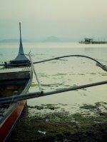
Ok here's mine. I think it qualifies as a landscape - let me know if you think it's not suitable for this critique.
It's a shot across Lake Taal in the Philippines at the end of the day.
Shot with a Fed 4 and Industar-61 lens using fuji superia 200 film. Fairly sure it was f2.8 but not sure about exposure time.
Forgot to mention that it's been cropped a little but everything else is raw.
It's a shot across Lake Taal in the Philippines at the end of the day.
Shot with a Fed 4 and Industar-61 lens using fuji superia 200 film. Fairly sure it was f2.8 but not sure about exposure time.
Forgot to mention that it's been cropped a little but everything else is raw.
Attachments
Last edited:
iml
Well-known
Here's mine. R-D1s w/ CV 21/4.0

Ian
Ian
dazedgonebye
Veteran
Here we go...
Mogollon Rim, Arizona. CZJ WerraMatic with 35mm Flektogon

Mogollon Rim, Arizona. CZJ WerraMatic with 35mm Flektogon
ferider
Veteran
Here is mine:

Yosemite, CV 28/3.5, I believe Superia 400.
Roland.
Yosemite, CV 28/3.5, I believe Superia 400.
Roland.
ferider
Veteran
Post your picture John, please ...
Cheers,
Roland.
Cheers,
Roland.
jmilkins
Digited User
Sorry for the delay folks and thanks Roland will post soon.
jmilkins
Digited User
Welsh_Italian
Established
That's all the pictures! Sorry for the delay in my reply, but I was ill yesterday.
Ian (iml): That looks like quite a bit of vignetting on the picture. I'm not sure if adds anything though. It's a difficult to make an interesting photo out of what you have which I don't think you've done and also difficult to technically compose - the immediate horizon (the grass) is a slope which makes it hard to use rules-of-thumb like the thirds rule. However, I find the tree to be very well contained although because it's so far to the left, I don't know if it's there for framing or as a subject. But despite that there is something very restful about the picture - it's very simple indeed but maybe too much so?
Steve (dazedgoneby): Taken with a werramatic? I must investigate them more closely... Those trees look visually very interesting although they are also chaotic which can make it harder to look at the picture because I don't know where to focus. You can see what I mean by looking at one of Adams' here: http://www.anseladams.com/index.asp?PageAction=VIEWPROD&ProdID=195. It's a picture of a complex object, but done so simply. I think the trees could have been framed better but I suspect it would have been hard to do that without flying or heavy tree moving equipment! Personally, I would like to have seen more of the ground and I think the thirds rule would have done well - but like i said, it looks as though doing that was not practical. It's a nice picture and makes me want to go climbing!
Roland (ferider): what great colours! I don't normally like turquoise, but it looks fantastic here especially when overlaid with the reflections in bright sunlight. The one thing I would suggest is not having the shore in the picture, but then I could be completely wrong about that. I get the sense of something magical happening far away from human eyes which appeals to me. It works wonderfully as an abstract piece though the lack of a specific focus may make reduce is longevity.
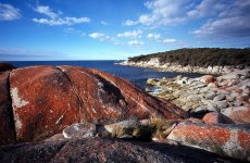
John (jmilkins): Again, wonderful colours with a nice contrast between the red of the rock, the blue sky and sea and the light grey of the other stones. The sky has a really nice perspective effect that always appeals to me but when I look at the picture, I keep on wondering what is behind the red rock? It does dominate the scene and doesn't seem in harmony with the rest as much, but the contrast has its own appeal too.
To all: nice pictures and thanks for submitting them. I hope my comments make sense but remember that I'm not an expert by any means. I think you've all taken pictures that would be better than my efforts for the same subject.
All the best!
Alan
Ian (iml): That looks like quite a bit of vignetting on the picture. I'm not sure if adds anything though. It's a difficult to make an interesting photo out of what you have which I don't think you've done and also difficult to technically compose - the immediate horizon (the grass) is a slope which makes it hard to use rules-of-thumb like the thirds rule. However, I find the tree to be very well contained although because it's so far to the left, I don't know if it's there for framing or as a subject. But despite that there is something very restful about the picture - it's very simple indeed but maybe too much so?
Steve (dazedgoneby): Taken with a werramatic? I must investigate them more closely... Those trees look visually very interesting although they are also chaotic which can make it harder to look at the picture because I don't know where to focus. You can see what I mean by looking at one of Adams' here: http://www.anseladams.com/index.asp?PageAction=VIEWPROD&ProdID=195. It's a picture of a complex object, but done so simply. I think the trees could have been framed better but I suspect it would have been hard to do that without flying or heavy tree moving equipment! Personally, I would like to have seen more of the ground and I think the thirds rule would have done well - but like i said, it looks as though doing that was not practical. It's a nice picture and makes me want to go climbing!
Roland (ferider): what great colours! I don't normally like turquoise, but it looks fantastic here especially when overlaid with the reflections in bright sunlight. The one thing I would suggest is not having the shore in the picture, but then I could be completely wrong about that. I get the sense of something magical happening far away from human eyes which appeals to me. It works wonderfully as an abstract piece though the lack of a specific focus may make reduce is longevity.
John (jmilkins): Again, wonderful colours with a nice contrast between the red of the rock, the blue sky and sea and the light grey of the other stones. The sky has a really nice perspective effect that always appeals to me but when I look at the picture, I keep on wondering what is behind the red rock? It does dominate the scene and doesn't seem in harmony with the rest as much, but the contrast has its own appeal too.
To all: nice pictures and thanks for submitting them. I hope my comments make sense but remember that I'm not an expert by any means. I think you've all taken pictures that would be better than my efforts for the same subject.
All the best!
Alan
dazedgonebye
Veteran
Welsh-Italian
I get a very strong sense of place in this shot. It's a classic view.
Iml
I like the left balanced composition. Everything is leading me to the right...the gentle slope of the hill, the shadow of the tree, and even a bit of lean in the tree itself.
Ferider,
Nice job of color and abstraction here. It's only the the strongly iconic nature of half-dome that clued me in to the location.
John,
Strong composition with an eye catching foreground. Australia is amazing. There always seems to be something just a little different that makes you think "I didn't know there was a place just like that." Good job of showing that off.
jmilkins
Digited User
Welsh Italian: While not a traditional landscape , I still feel it qualifies. You rimage has its own individuality and a pleasant subtleness about it. I like the peacefullness implied by the end of day colours contrasted with the sense of action - the boats prow is ready for the new day. Nicely seen, and good to see what that Industar can do!
jmilkins
Digited User
Ian: Great light is my instant reaction. It looks good in colour, and I bet it's sharp in print! I'd bet it'd look really good in black and white too, perhaps with a slight cyan cast. This would make a starker image though, and might emphasize the vignetting of the lens - for me that's good - it frames the image.I like the traditional rule of thirds placement of the foreground tree, and the hints of green on some of the background trees. The white frame also is a winner I think.
jmilkins
Digited User
Steve. What a stunning view you must have got from this site. This image has a classic look to it that stands out well from the current super- saturated or polarized images one sees so often in landscape shots due to the filmstock or filter (e.g .my submission") ) I like your photo for its honesty. I also think the vertical composition works, though I find the "missing"treetop a little distracting. However a wider angle lens would likely have distorted the image overly, and the background would have been too distant.
) I like your photo for its honesty. I also think the vertical composition works, though I find the "missing"treetop a little distracting. However a wider angle lens would likely have distorted the image overly, and the background would have been too distant.
) I like your photo for its honesty. I also think the vertical composition works, though I find the "missing"treetop a little distracting. However a wider angle lens would likely have distorted the image overly, and the background would have been too distant.
Last edited:
jmilkins
Digited User
Roland. A glorious confusion and a creative, well-crafted view of what must be one of the most frequently photographed part of the world - is that Half Dome? You could so easily have taken a standard snap in this situation looking up, but you've taken the time to think about the image.
The cool colour of the water is great and the ice crystals add to the sense of the chilly outdoors. I really like how you have used elements of the image to frame the face and peak of the mountain. Superb.
The cool colour of the water is great and the ice crystals add to the sense of the chilly outdoors. I really like how you have used elements of the image to frame the face and peak of the mountain. Superb.
Share:
-
This site uses cookies to help personalise content, tailor your experience and to keep you logged in if you register.
By continuing to use this site, you are consenting to our use of cookies.