retinax
Well-known
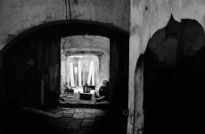
Thank you all for the critique! Nearly all constructive and useful. I'm glad a few more positive comments have come up later on, some understand where I was going with this.
I'll reply to some points that have been brought up all in one post:
I'm a bit baffled by the judgmental wording some employ. You may not want your yard to look like this, but that doesn't make these things "junk". Does your home look like pictures from a furniture catalog by any chance? I expected otherwise from a forum where many enjoy using old cameras that are "junk" to the general public. I believe this place and the things in it are in use.
This was a quick snap, I didn't spend enough time composing it and it shows. I can't go back soon unfortunately, it's on a different continent.
I realized a didn't mention that I very much like to see this and most of my pictures as an abstract picture even though it's representational as well. Or think of it as an architectural - still life hybrid. So the lack of a central object of interest or a person doesn't bother me per se, but I understand where these comments come from.
Some have suggested removing the wooden door thing on the right, I've tried and it doesn't work for me. That adds a lot of what interests me in this scene.
The exposure is optimal actually, this was digital and it's exposed to the right. The scene just has huge DR and that camera doesn't. Anyway if I bring up the shadows more, there will be even less contrast in important parts. I don't like to use much local contrast enhancement (clarity), it looks very bad to me.
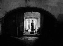
Soooo. To make the best of what I have, I've tried to go a different way and burned quite a bit of the foreground digitally to get a cleaner composition, and cropped a bit differently. I've also tried some tighter crops that also work alright. I think this version is a better image than the first post, and shows more what I like about the scene.
Thank you all for working on that with me. Please continue the critique on this draft version at better post processing:

I'll reply to some points that have been brought up all in one post:
I'm a bit baffled by the judgmental wording some employ. You may not want your yard to look like this, but that doesn't make these things "junk". Does your home look like pictures from a furniture catalog by any chance? I expected otherwise from a forum where many enjoy using old cameras that are "junk" to the general public. I believe this place and the things in it are in use.
This was a quick snap, I didn't spend enough time composing it and it shows. I can't go back soon unfortunately, it's on a different continent.
I realized a didn't mention that I very much like to see this and most of my pictures as an abstract picture even though it's representational as well. Or think of it as an architectural - still life hybrid. So the lack of a central object of interest or a person doesn't bother me per se, but I understand where these comments come from.
Some have suggested removing the wooden door thing on the right, I've tried and it doesn't work for me. That adds a lot of what interests me in this scene.
The exposure is optimal actually, this was digital and it's exposed to the right. The scene just has huge DR and that camera doesn't. Anyway if I bring up the shadows more, there will be even less contrast in important parts. I don't like to use much local contrast enhancement (clarity), it looks very bad to me.
Soooo. To make the best of what I have, I've tried to go a different way and burned quite a bit of the foreground digitally to get a cleaner composition, and cropped a bit differently. I've also tried some tighter crops that also work alright. I think this version is a better image than the first post, and shows more what I like about the scene.
Thank you all for working on that with me. Please continue the critique on this draft version at better post processing:
Last edited: