Extreme post processing

@hteasley

yes that's the hard part for me too.
you can play around for hours on an image, and then you look at it and ask . . .
"Does anyone really need to see this picture? Why?"

Lots of times, most times, you should just chalk it up to playtime and torch the image.
My scrap bin is the biggest folder on my computer.

That aside, here is a "monster movie poster" I made up a while back.
Superimposed 3 photographs (one was a lamp from an old movie projector) plus some simulated lens flare.

web215.jpg
 
@hteasley

yes that's the hard part for me too.
you can play around for hours on an image, and then you look at it and ask . . .
"Does anyone really need to see this picture? Why?"

Lots of times, most times, you should just chalk it up to playtime and torch the image.
My scrap bin is the biggest folder on my computer.

I certainly agree that its possible to waste an awful lot of time on post processing that goes nowhere and results in deleted images. As you will see from the steps I describe below.

Incidentally I always save my image with a new name (Usually I just add a letter or a dash and a number suffix to the original number) This way I always have the original in case I want to go back to it and the adjusted image will be sitting right beside it in windows explorer. And of course if shooting RAW its not an issue anyway.

Also usually an image has to have some inherent interest before you start processing it. If you start with a poor image you usually just end up with an equally poor processed image.

I find it best when processing to start by doing the more or less minor but essential processing that every image gets - check and correct the tone, adjust the saturation if needed, denoise the image if needed and sharpen the image. Finally I may straighten the image - I hate inadvertently having verticals or horizontals that are not! This plain looks sloppy and unprofessional unless its clearly intended as part of the composition.The same can be said for the "falling over building syndrome" caused by tilting the camera off the horizontal when shooting things like buildings. My software has a perspective correction tool that allows you to correct some or all of this if you are so inclined - often I will as its hard not to get this when shooting certain types of images. I then save the resulting adjusted image as a high quality jpg or tiff. You can easily see that good image quality is always about taking extreme pains and paying attention to the details.

I can then use that as a basis to start experimentation and more extreme processing. Without going into too much detail that can involve: creating a duplicate layer and then using layer blend modes to create an interesting effect (Read up on layers and blend modes if you don't know about them), dodging and burning to focus attention of the viewer one one part or another of the image, adjust the image's color or color balance more if desired. At this stage too I may fire up Nik Color Efex software plugin and use some of the very powerful effects it has in its kit. Favourite ones include effects that apply a glow or a soft focus effect selectively. but there are many more.

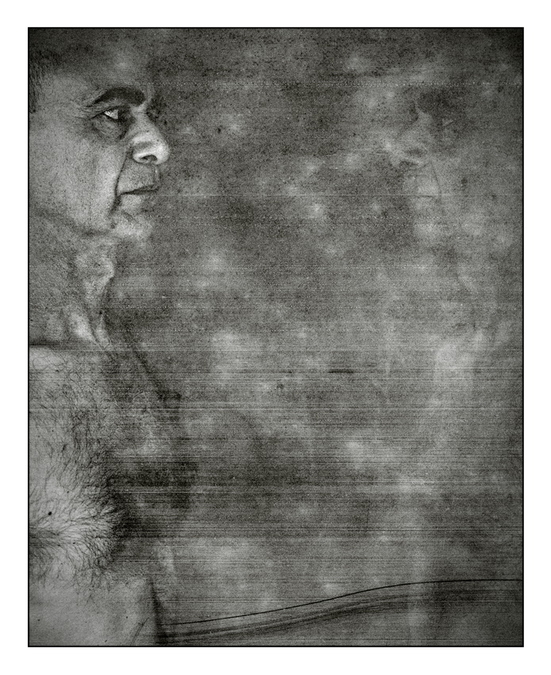
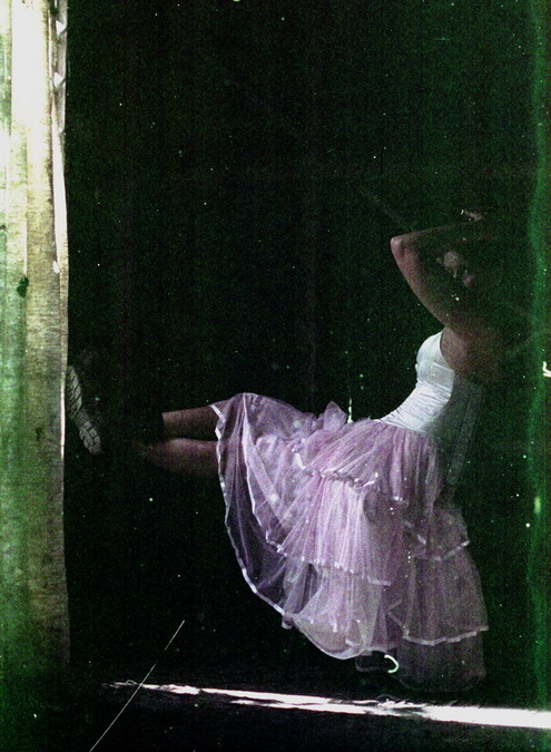
And if I want to be really extreme I may use a texture overlay. A texture is just an image of something like a piece of rusted metal or weathered wood grain or some such that can be imported and applied as a semi transparent layer on the main image. They are widely available for free download on the web courtesy of Mr Google. If you look at some of the images I posted you can see textures I have applied. And even more extreme the textured overlay can be erased partly or completely in some parts of the image so that parts are textured and some are not. (You can of course also repeat this several times with different textures if you wish).

Once you have the basic skills its really much easier to do than it is to explain. And I find it a lot of fun because its creative - it does involve experimentation and that's a bit of a journey itself. All I can say is thank god for the ability of PS (or in my case Corel's equivalent - Paintshop Pro) to save images with layers intact so you can come back to them later.

That's about it really although I have to admit it took me a few months of experimentation, study and research to learn how to use some of the more powerful features of Photoshop and Paint Shop Pro properly.

My final word on this is that even if extreme processing is not your thing all photographers should be prepared to make the basic adjustments that I describe first in this post. If you cant be bothered learning to use PS pr PSP (and it is quite a chore with a steep learning curve) of course Lightroom is the way to go. But the important thing is to make sure your images are the best they can be as they are seldom good enough when they come straight from the camera.
 
Layers

Layers

Most definitely the single biggest step in post-processing for me a few years back was learning to use layers.
These days, I never touch the base layer; do all manipulations on upper layers (some are copies of the base layer).
Recently experimenting / learning the pluses and minuses of layer modes (multiply, burn, etc etc).
That's where it's very easy to go way way overboard with special effects - it's fun and it draws you in,
but that first wild and crazy version of the picture is never the one that looks good the next day.

In the end, it's the image that rules. If the image is happy where it took me, then I'm happy to have gone along with it.
But that doesn't happen very often for me.

Footnote: I never edit the original OOC image. It gets saved off to CD, once the original lot is sorted for trash.
Unfortunately today I work only in 8-bit color space; when the GIMP goes 16-bit stable, I will upgrade my monitor and
computer and enter that brave new world.
I used PaintShop for years, but switched to a Unix system, then to a Linux system, so the GIMP walked into my photo life.
That's another story. I can't blame my computer for what my pictures look like.


Oh . . . let me add that the sub-forum here on Holga / Pinhole / Polaroid is populated by some very bold people
and very cool images. I call that stuff "extreme pre-processing" :D
 
"In the end, it's the image that rules. If the image is happy where it took me, then I'm happy to have gone along with it.
But that doesn't happen very often for me."

Dave you are a man after my own heart................ I agree.

I agree too that layer blending modes have to be used carefully. Almost always the effect is too strong (or inappropriate) and you need to back off on the density slider to bring it under control. And I find that there are only three or four that I use regularly plus one or two more occasionally. Mostly these are blend mode effects like multiply (which darkens an image), screen (which lightens it), hard light, soft light etc. The more oddball ones have specialised uses but are mostly not for photographers. Layers are powerful tools which can save an image that would otherwise be lost. For example if an image is way over exposed a quick and usually very effective way of fixing it is to duplicate the image layer and then change the blend mode to "multiply". The image instantly becomes much darker - it works better than 95% of plugins for darkening without unwanted artifacts. If its too dark just back off on the layer density slider. "Screen" does the opposite - lightens a too dark image. In a couple of seconds a photo is reclaimed that otherwise may have had to be binned.
 
This thread has made me go back and look at some of the images I made with my Bronica RF645 and various other cameras that can be manipulated when shooting. The Bronica in particular can do multiple exposures very simply and I think that this is the way I prefer to create images that that don't follow the normal procedures. Post processing via software is interesting but being able to produce a negative that has been manipulated in the camera is far more satisfying to me. This image has been adjusted for contrast etc digitally after scanning but what you are seeing was created in the camera and during the development process ... very little on the computer!

med_U5265I1363615794.SEQ.0.jpg
 
Another example where very little was done in digital manipulation via photoshop etc.

med_U5265I1241851301.SEQ.0.jpg
 
Thanks Peter and daveleo (and the others) for this thread, which I find one of the most interesting here in RFF. I agree each image (most images?) has to be at least "adjusted" in order to get the maximum visual effect out of it. Than, in some cases you can go to what you call extreme and the pictures posted by peter (not only in this thread) are a good examples of it. Not over processed, not casual and with a good taste for color coordination. I would like to know if there are visual artists (not photographer) who inspire you. Because one thing is to know how to do it, how to use the tools but more important is to decide in which direction to go and when the applied work is ok (or not). Thanks again
robert
 
@ Keith
Coincidentally, I commented on that multiple exposure of yours in the gallery yesterday ! Very nice. Your second one here shows a good example that should be left alone as-is :)

@ robert blu
here are two links about your "inspiration" question . .

http://www.rangefinderforum.com/forums/showthread.php?t=130320

http://www.rangefinderforum.com/forums/forumdisplay.php?f=125

@Peter
I see we are using the same layer modes most frequently.
So why do your pictures look wonderful and mine look like child'splay?
I will have to PM you with a few specific questions when I put the words together.

This should be a sticky thread or maybe even a sub-forum ? ? ?
 
Thanks daveleo for the links, I read the discussions here in the forum which I found interesting. But being english not my native language it is sometimes difficult to find the correct words to take part in it.
robert
 
Peter, thank you for the timely exhortation :)
I'm going there (heavy post processing), but using B&W and darkroom printing.
 
In terms of time spent in post-processing, this is my most heavily processed image.
It's a hiking snapshot (okay, semi-snapshot) from my Panasonic LX3 and I have printed it 12X18
and it is easily my most popular print to date. The print has a very painterly look to it.
The original didn't look like much except for the (I feel) solid composition.

oldbenches007.jpg
 
Wow what a breath of fresh air this thread is. Peter I have always enjoyed your 'Life in Shadows' series. Is a unique look and brave to start this thread because it could have gone the other way as well:) Especially like #1. Exceptional.
Keith I really like those double exposures. Is something I am experimenting with with my Linhof 612.
 
Thank you Hausen and thank you everyone else for their posts and for their thoughts.

My apologies for not paying much attention to the thread over the past few days - I have been off work with the flu for 3 days. Then to make matters worse just as I was getting better I managed to almost sever two fingers while sharpening an already razor sharp chefs knife. Ouch. Fourteen stitches and some nerve damage later all coming good. I think I have learned my lesson - PAY ATTENTION when playing with sharp objects.

I like the images posted here by others and particularly agree that its nice to get images that look post processed - but are not. I will post a couple of such images below that fits this category - thanks mainly to water flowing down a glass wall shot from inside of an art gallery. Hardly any PP at all but very abstract. I suppose it proves the adage that what a photographer needs to develop and learn most of all is a "photographers eye". This is something I work on constantly as its the one thing I think is crucial to producing good images.

I do not really shoot film any more so my hat is off to those who do and who get great images from it. I never managed to get the hang of that - better I stick to digital.


waterwall and abstract by yoyomaoz, on Flickr


Water wall by yoyomaoz, on Flickr

And here is an interesting one that I managed to get - simply because I forgot to focus properly when using a Canon FL mount 58mm f1.2 on my NEX 5. No PP other than to drop the colour out but quite effective never the less.


City impressions by yoyomaoz, on Flickr
 
I like the painterly touch to your photos. I've spent the most post processing time cutting and pasting... I'm almost happy with it.

6901047714_80b0c75bd3_b.jpg
 
I like the painterly touch to your photos. I've spent the most post processing time cutting and pasting... I'm almost happy with it.

That's interesting - you have more patience than me. Making selections is very slow and problematic I have found.
 
Peter, great work. "Texture on a City Skyline" is one of the most powerful graphics-oriented photos I've seen in a long time. Would be the perfect cover for a future-based graphic novel.
 
Boston yesterday

Boston yesterday

maybe not so very "extreme", but close to it I think . . .

bostonsky233.jpg


(or maybe I just wanted to post something here ? :) )
 
Back
Top Bottom