Feedback request: thoughts on contrast in b&w photos

bml

Established
Local time
7:33 PM
Joined
Nov 1, 2006
Messages
55
So I just got back my first set of black and white negatives today. I didn't get prints made up because I planned on simply scanning the negs in at home, which I did.

After looking through all the scans, I feel as though something is off with these photos. I feel like they are perhaps soft and lacking contrast, but I would like a second opinion. For a better idea of the shooting conditions, here's a summary:

All photos were shot on Agfa APX 100, at ISO 100 on a Bessa R3A.

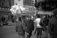
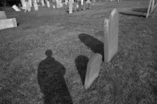
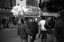
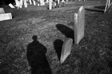
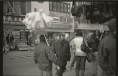
candyman.jpg, shady.jpg: Shot with 40/1.4, in NY with fairly good light conditions. The light was perhaps a little dull, because the sun was starting to make its way down. I think both were shot at decently quicky shutter speeds, definitely above 1/60.


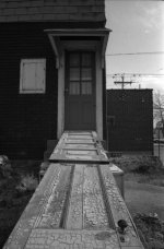
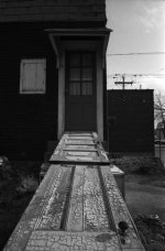
doors.jpg: Shot with 25/4, sunny conditions. f4? I can't remember... again, shutter definitely above 1/60.

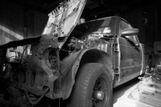
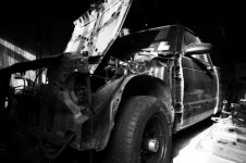
wrecked.jpg: Shot with 25/4, indoors with some light creeping in. f4 at 1/30.

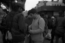
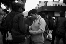
metoo.jpg: Shot with 25/4, sunny conditions. Can't remember shutter speed, but above 1/60. Aperture was smaller than f4, I seem to remember.


I'm not sure if it's my choice of film, my overall rangefinding newbiehood, the scanner, or what, but I do feel like something is off. I scanned using an Epson 4490, at 2400dpi, cropped and levels adjusted in Photoshop. (Adjustments were essentially bringing up the blacks, whitening whites... so that there were no flat spaces on the histogram.)

Any ideas? Thoughts?
 

Attachments

  • candyman.jpg
    candyman.jpg
    362.1 KB · Views: 0
  • shady.jpg
    shady.jpg
    269.1 KB · Views: 0
  • doors.jpg
    doors.jpg
    370.4 KB · Views: 0
  • wrecked.jpg
    wrecked.jpg
    325.2 KB · Views: 0
  • metoo.jpg
    metoo.jpg
    482.5 KB · Views: 0
Overall contrast isn't the issue; the problem is that your midtones aren't separated well enough. They're bunched together toward the dark end of the tonal scale, and that causes your images to look muddy and lifeless (which is a shame, because the subject matter is strong.)

This isn't an uncommon problem when scanning silver-based b&w negatives, and one big reason is that the highlights (which are the darkest parts of the negative, remember) are much denser than those of dye-based films (which are all color films and C41-process b&w films.) By the time you punch enough light through these dense highlights to get detail in them, the rest of the tones tend to be darkened too much.

What to do about it: First, make sure your scans are capturing detail in the shadows as well as the highlights, which it looks as if yours are. Then, start working on the distribution of the middle tones. Sometimes you can do this with Levels (move the center slider to the left until the midtones look well-separated, then move the black level just far enough to the right to restore the blackest blacks.) But you might find you have more control working with the Curves dialog, since it lets you apply different amounts of correction to different parts of the tonal scale.

Don't give up, you're very close to having some really nice images!
 
As jlw said you do have some nice images.

Which version of Photoshop do you have? I messed around with your images with version CS2. I converted them to rgb. Next, I duplicated the main image layer and used the shadow/highlight on the new layer (image>adjustment>shadow/highlight). Next I used a curves adjustment layer to set the black and white points on the new layer. Then I created a second curves adjustment layer, but setting its blend mode to luminosity. In the curve diologe box, create a slight "S" curve. This adds contrast to the image.

I'm sure other folks use different methods, but this tend to work for me.

Take care, Michael
 
jlw: Curves, yes, of course...! It seems like I always have some kind of mental block when it comes to curves, d'oh! I always forget about tweaking them. Thanks for your words.

I did some light curves adjusting and they look much stronger, much more dynamic, I think. I think I am now pretty satisfied where they stand.

Check out the attachments for an update.

Again, thanks!

EDIT: mwooten - I'm using CS2. I typically never deal with anything outside of levels/curves (when I remember)... does using shadow/highlight really make a difference, or is it not essentially the same thing as adjusting the highs and lows elsewhere? Thanks for your feedback.
 

Attachments

  • candyman2.jpg
    candyman2.jpg
    356.4 KB · Views: 0
  • shady2.jpg
    shady2.jpg
    286.3 KB · Views: 0
  • doors2.jpg
    doors2.jpg
    359.3 KB · Views: 0
  • wrecked2.jpg
    wrecked2.jpg
    301.7 KB · Views: 0
  • metoo2.jpg
    metoo2.jpg
    527.4 KB · Views: 0
Last edited:
Excellent, thanks for posting those... it gives me even more to consider. I notice I tend to favor the blacks when I make adjustments, and my final images tend to be a little darker than is ideal, perhaps. Good to see another person's approach and consider that, too.
 
Try Dodge and Burn tools too..

Try Dodge and Burn tools too..

bml said:
Excellent, thanks for posting those... it gives me even more to consider. I notice I tend to favor the blacks when I make adjustments, and my final images tend to be a little darker than is ideal, perhaps. Good to see another person's approach and consider that, too.

In Black & White Darkrooms, thats all you have plus Contrast filters....

I don't use PS, but I use Levels, and Dodge and Burn tools to adjust isolated tones to be more representive to what I saw. I use PSP 10.03. Curves is a less used tool, but I find it useful to set my Black or White points If I can't get it with my Histogram Adjustments

With today's GREAT Software, There are many options and technics to accomplish similar results.
 
Scanning is something of a dark art - but once you get there the results can be very rewarding. I usually scan to get the most info out of the shot but the results are quite 'flat' - similar to your first pass above - until worked on in PS. That's when they come to life and I make decisions about where to lose the blacks or burn out the highlights...etc.

As well as levels and curves, my most used tool is PS is an overlay layer - which allows the equivalent of dodge and burn using a paintbrush - very easy, fast and gives such good, controllable results.

Love the shot of the car by the way...
:)
 
Great thread, I've learned a lot from it! My problem in scanning that that my highlights get blown quite often. I'm going to try playing with some of Michael's techniques. :)
 
I think we're leaving out one of the most important aspect here: who developed the negs, what developer did they use, what temp, what agitation, what development method (dip/dunk, standard reel, jobo-type), etc.? This will all have an affect on the negs. And unless you can find a lab that you feel you can rely on for strict consistency in those aspects time and time again you'll drive yourself nuts with each roll you get back.

The suggestions here are good for trying to salvage the scans but you have to ask yourself why shoot traditional B&W unless you can rely on development consistency to standardize that influence, or do it yourself to vary the results to find what you want. Otherwise shoot color and change to B&W in PS (I use the Russell Preston Brown method myself when I do that) or shoot XP2 and the like.

To develop B&W film yourself is not hard, nor expensive and really adds a needed dimension to using traditional B&W, IMO. Otherwise most of the time you're chasing your tail.
 
I probably shouldn't even enter this thread since I don't own a negative scanner (yet), but it seems I've read something about scanning the negatives as if they were color negs and then converting to gray scale?
 
like2fiddle said:
I probably shouldn't even enter this thread since I don't own a negative scanner (yet), but it seems I've read something about scanning the negatives as if they were color negs and then converting to gray scale?

With loads, and I mean LOADS, of tests, I personally have never been able to find a benefit to doing that. It was covered in a Shutterbug article a few years back, seemed to make sense, and ever since people recommend it. Some use this workflow and say they get better results. Me? Using Epson 1200U, 2450, 4990 and Minolta Scan Dual II and Nikon LS-IV and 4000 and 8000 scanners I've tried both scanning as a neg and a pos and cannot seem to find any benefit or better result.

The key, IMO, is to NOT overdevelop your negs (I generally pull back my development time 10%) as scanners hate contrasty negs and scan not for a good final look right out of the scanner but to get the most info in your scan. This will look relatively flat in your "raw" scan but will preserve the widest range of tones and help you not clip highlights or shadows. Then some quick work in PS (be sure to scan in 16-bit too) you can clean up and add back some contrast and snap.
 
I follow the instructions for the film and developer and usually produce reasonable negatives.

Any problems with the image I would correct with curves and unsharpmask in photoshop.

I suppose I am easy pleased with my images and wouldn't have the patience the more discerning among of us have by spending hours on one print trying to achieve the ultimate print.
 
So here is perhaps a really stupid question, maybe a little off topic, but related: If you intend to use your scanned negatives primarily as a "contact sheet" in order to find those you wish to print the old fashioned way, can one use a regular flat bed scanner and some sort of software to view the negatives?
 
I agree with Rich's comments regarding processing and its consistency. (Personally, I find it frustrating that a "good" negative, i.e. one that would print well in my darkroom, is less than ideal for scanning. But that is tilting at windmills. :rolleyes: ) The other factor, of course, is exposure. If pulling back development by 10% or so is ideal for scanning, then there is little or no room underexposure.
 
There are so many different variables between processing and scanning, it's almost overwhelming...

For this particular roll, I had it processed at a MotoPhoto. There are few labs in my immediate area that develop b&w, and I am not willing to travel very far. (Although I might start using XP2, or mailing stuff out eventually...) I am not willing to start developing at home, for multiple reasons that aren't important right now.

Anyway, it's hard to say whether or not they did a "good developing job", since I'm not really sure how to tell.

I also use an Epson 4490, which is somewhat of a frustrating beast, since the Epson Scan software is somewhat limiting, and any changes in the software's histrogram, etc. do not seem to affect the final scans very much. (In my bit of testing experience, anyway.) Color is much more frustrating that b&w, because the initial scans are never representative of the true color, and the amount of RBG levels adjustment needed in PS is a bit of a pain...

But anyway... yea...
 
bml, if they are a decent lab and consistent you should have no problem. Or alternatively you could consider sending out to a lab that will be consistent and with a good reputation.

As I mentioned, as did you, XP2 is an alternative but is certainly a different look than many traditional B&W films, especially APX100.

And the 4490 flatbed for 35mm is a challenge but for online images should be not bad, though I will say one reason I upgraded from my Minolta Dual Scan II to a Nikon LS-4000 when I did was to get better, more detailed and richer tonal range in my B&W neg scans, which is likely tough with the 4490.

If you want to mail a strip of that film to me I'd be happy to scan it with my 4990 and Nikon LS-4000 so you can get an idea of the potential of those negs and see if they were any limiting factor. I've been scanning for years and using PS since ver. 4 and if I say so myself can scan a pretty mean B&W neg. :D

Let me know...
 
Last edited by a moderator:
rich: Thanks for that offer, I might actually consider that... I will let you know.

Yea, I don't know if I am really willing to 'resort' to XP2, just because I am pretty satisfied with APX 100. Although, I will probably buy at least two rolls for purposes of testing... It can't hurt to try.

The thing is, I am going to London for vacation in two short weeks, so I want to make sure I am equipped with the best possible film options, and don't muck anything up due to experimenting with new stuff. And I want to stick with one film type, so I don't have to waste energy thinking about what to use. (Although, as of right now I am considering using Agfa APX 400 for the extra speed...)

And I meant to include this earlier, but here is a raw scan (resized, of course), so you could see what I was originally working with.
 

Attachments

  • candyman-raw.jpg
    candyman-raw.jpg
    785.9 KB · Views: 0
here's my version modified from the raw:

1.auto levels
2.unsharp mask (amount: 10%, radius: 250, threshold:0)
3.curves
4.some burning around the guy

the photo definitely has great potential...so visit a darkroom near you and start playing ;)
 
Last edited:
As has been said - scanning is something of a mystery, and everyone has their own techniques. Depending on your scanner and software, I usually scan with a fairly flat contrast curve, in order to try and get as much detail in the highlights and shadows as possible - the results look the same as printing with a grade 00 filter (much like yours posted) ... then contrast and sharpness are adjusted digitally in post.

I don't expect my raw scan to be a printing file anymore than I would automatically print everything with grade 0 paper... each has to be treated in the darkroom/editor to it's ideal range. The scan is just making sure you have all the information you need.
 
Back
Top Bottom