sfb_dot_com
Well-known
I think I became lazy...
Let me elaborate. My B&W workflow for film cameras consists of self-developing the film, then scanning via an Epson V750 into Aperture 1.56 I have then generally keyworded and applied basic corrections such as levels and cropping to the image. In my infinite wisdom, that is all I have been doing, and then outputting to an Epson R800, sometimes via the QTR RIP. I've been a bit dissatisfied recently, but hey ho, there are always more images to try. However on this occasion I had made special effort to lug the Mamiya C330 and Berlebach tripod all the way up Helman Tor on the edge of Bodmin Moor. I loaded up with Neopan 400 my favorite film and set to work in gale force winds (beginning to get the picture?) Of course, I'd left my cable release in the car, several hundred feet below, but there were still two ways to release the shutter, and light levels were high giving 1/250th shutter speeds. Getting home, I developed the films, and first results looked promising, so I selected one image (not the best but decent enough) and went for a print on A4 premium semi-gloss.
And, oh dear, oh dear! Muddy, poor definition, soft, heavy magenta colour cast and worst of all, awful posterisation. OK it's Aperture's cr*p printing, so loaded the same picture up in Elements 4.0 and... worse still! an even heavier magenta cast, and darker, slightly less posterisation though. OK I thought, I've got QTR to hand, so I went through the tedious business of connecting the USB cable to the printer (no firewire on QTR) And?? Still dark, but posterisation minimal, colour cast still very strong though, but overall more punch. This however with quite a warm setup. Best yet, but still very far from acceptable. Right, maybe this is my software/hardware combination, so off to ASDA/Walmart for their take. And??? Still poor, but only slight blue colour cast. but still lacking in impact, and overall slightly worse than the QTR version.
Right!! need to do this properly, so I went back to how I used to do this stuff before Aperture arrived. That is, I used selective levels on foreground, middle distance and far distance objects separately, very carefully matching tonal ranges and contrast on the way. A kind of mini and very crude Zone system if you like. OK, so back off to print, again using QTR, this time with a cooler setup, a reasonable amount of USM, and matching all the profiles more carefully. And??? BINGO at last a decent (fairly) neutral print with crisp mid tones no nasty posterisation, and an overall tonal balance pleasing at least to my eye. PHEW!!
So here are my basic mistakes and some suggested solutions:
1) Flare was evident, so use a decent lenshood if possible.
2) The wind was so strong that despite a quality tripod I had camera shake softening the image, and the lack of cable release didn't help either.
3) A few quick fixes in Aperture were not enough to turn this picture into a printable image - there ain't no such thing as a free lunch
4) I just hit the print button without too much thought - checking all my print options first might have saved some wasted paper.
OK, so the lesson here is don't take shortcuts unless you want second rate output.
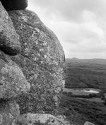
And FYI, here is the final image, still not perfect, but ok.
Regards to all
Andy
Let me elaborate. My B&W workflow for film cameras consists of self-developing the film, then scanning via an Epson V750 into Aperture 1.56 I have then generally keyworded and applied basic corrections such as levels and cropping to the image. In my infinite wisdom, that is all I have been doing, and then outputting to an Epson R800, sometimes via the QTR RIP. I've been a bit dissatisfied recently, but hey ho, there are always more images to try. However on this occasion I had made special effort to lug the Mamiya C330 and Berlebach tripod all the way up Helman Tor on the edge of Bodmin Moor. I loaded up with Neopan 400 my favorite film and set to work in gale force winds (beginning to get the picture?) Of course, I'd left my cable release in the car, several hundred feet below, but there were still two ways to release the shutter, and light levels were high giving 1/250th shutter speeds. Getting home, I developed the films, and first results looked promising, so I selected one image (not the best but decent enough) and went for a print on A4 premium semi-gloss.
And, oh dear, oh dear! Muddy, poor definition, soft, heavy magenta colour cast and worst of all, awful posterisation. OK it's Aperture's cr*p printing, so loaded the same picture up in Elements 4.0 and... worse still! an even heavier magenta cast, and darker, slightly less posterisation though. OK I thought, I've got QTR to hand, so I went through the tedious business of connecting the USB cable to the printer (no firewire on QTR) And?? Still dark, but posterisation minimal, colour cast still very strong though, but overall more punch. This however with quite a warm setup. Best yet, but still very far from acceptable. Right, maybe this is my software/hardware combination, so off to ASDA/Walmart for their take. And??? Still poor, but only slight blue colour cast. but still lacking in impact, and overall slightly worse than the QTR version.
Right!! need to do this properly, so I went back to how I used to do this stuff before Aperture arrived. That is, I used selective levels on foreground, middle distance and far distance objects separately, very carefully matching tonal ranges and contrast on the way. A kind of mini and very crude Zone system if you like. OK, so back off to print, again using QTR, this time with a cooler setup, a reasonable amount of USM, and matching all the profiles more carefully. And??? BINGO at last a decent (fairly) neutral print with crisp mid tones no nasty posterisation, and an overall tonal balance pleasing at least to my eye. PHEW!!
So here are my basic mistakes and some suggested solutions:
1) Flare was evident, so use a decent lenshood if possible.
2) The wind was so strong that despite a quality tripod I had camera shake softening the image, and the lack of cable release didn't help either.
3) A few quick fixes in Aperture were not enough to turn this picture into a printable image - there ain't no such thing as a free lunch
4) I just hit the print button without too much thought - checking all my print options first might have saved some wasted paper.
OK, so the lesson here is don't take shortcuts unless you want second rate output.
And FYI, here is the final image, still not perfect, but ok.
Regards to all
Andy