Honest opinions, critiques, etc.

venchka

Veteran
Local time
5:43 AM
Joined
Apr 24, 2006
Messages
6,263
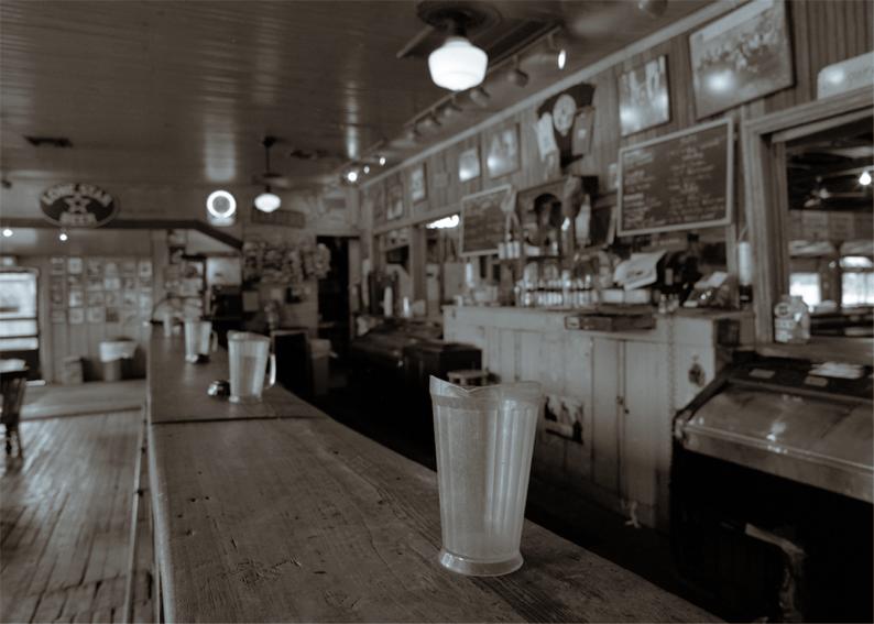
An experiment in Adobe Lightroom toning. Tell me what you think of this photo. First, as a photograph. Second, the toning treatment. Honestly.

Early on a Sunday morning. Right after opening. Bonus points to the first person who correctly identifies the location. No fair cheating.

Gruene+Texas+_1+of+8_.jpg


Ilford HP5+ | Xtol 1:3

Thanks for looking!
 
Hi Wayne,
I like the picture and also the sepia style toning (generally I'm not so fond of it). In this case it helps to emphazise the almost museum like atmosphere in this bar. With some guy at the far blurry end drinking a beer - or coffee at that hour, it would be even more impressive.
 
For me the composition focuses my attention on the pictures over the end of the bar, the receding shapes of the jugs, the bar-top and the photos behind the bar form a big triangle that drags my attention there unfortunately that area is oof and so the viewer is intellectually disappointed by the lack of subject, you did say honest…….sorry 🙂🙂

A duo-tone might help lift the highlights a bit, it could make the first jug more prominent
 
Icebear, I tried to convince the young lady behind the bar to be included. She declined.

Sparrow, Thanks! If I go back I'll try adding some DOF. The toning is what Lightroom calls "Split Toning." I'm stumbling & fumbling my way along. Perhaps I can gain a bit of separation between the nearest pitcher and the cabinet along the wall.
 
Wayne,

I really like the atmosphere of this photograph. And I too think that the toning contributes to the overall impact of the photograph in this regard. But, I have to say that I agree with Stewart's comments on the composition. My focus is drawn straight to the photographs at the end of the bar and I have to consciously pull back to find the point of focus on the jug. I think that the composition would have been stronger if you had shifted the camera slightly down and over to the right (far enough to cut out the bright window at the back which further draws the viewer's eye away from the jug at the front of the bar). The lower camera position would have given you a bit more of the bar in the foreground to lead the viewer's eye to the jug first, and only then back to the photographs at the end of the bar.
 
Hello Wayne, I also like this photo although I'm not sure about the DOF. I think maybe an adjustment of 1 0r 2 stops could have given it a different feel. And I do agree with Icebear about someone at the end of the bar. The toning doesn't seem to have the golden brown that I expect with sepia. It seems to have a pinkish tone to it. But perhaps my monitor is seeing it differently from others.

Mike D.
 
I agree the tone is close but quite what I really want. I keep searching my ancient copy of Photoshop 6 (don't laugh) and Lightroom for the perfect tone: A combination of Belgian dark chocolate, Mounds, Almond Joy, hot cocoa and cafe au lait on a white chocolate base. So far, I haven't found it.
 
I agree the tone is close but quite what I really want. I keep searching my ancient copy of Photoshop 6 (don't laugh) and Lightroom for the perfect tone: A combination of Belgian dark chocolate, Mounds, Almond Joy, hot cocoa and cafe au lait on a white chocolate base. So far, I haven't found it.

One can waste many hours in Photoshop’s “Channel Mixer” but the colour you want will be in there somewhere 😀
 
Grinning. I know it's there. I'm not sure I have enough years left to find it.

Solution: Make silver gelatin prints and apply sepia toner properly.

It's not true. You can't do everything in Photoshop. Or at least I can't.
 
Back
Top Bottom