How about a digital body with minimal menus?

I gave some examples of how menus could be ditched in favor of something nearly everyone agrees is a better way; hundreds of millions of smartphone users. I did not propose that those examples are the only solutions.

Improving an archaic menu-based user interface by simply allowing the user to move items into a custom menu is a step, but it’s hardly innovative or modern, or intuitive.

Every user interface out there is menu based. Smart phones didn't ditch menus. They are absolutely still there. They just also give a shortcut using a search tool. To change my IP address on my phone:

Settings -> Wifi -> Select my network -> Configure Ip -> Manual then entering my settings. That is a menu tree. Just like what is on most cameras.

If anything I'd say Smartphones make the interface more confusing. You go into the camera app for some camera settings but not all of them. If I want to display a grid on my camera app I can't do that in the camera app, I need to go into Settings then scroll down through hundreds of options to find the camera icon and then turn on grid there. If I don't want to GPS tag my photos I can't change that in the app or in the setting -> Camera menu either. I have to go into Settings ->Privacy->Camera and then turn if off there. EDIT: And the camera on my phone isn't even remotely as close to as customizable as my digital cameras.

Those are all menu trees. There no UI out there that doesn't have menus. Because they are an efficient way to display a list of options to a user. They just vary in how well they are organized and arranged.

Shawn
 
I remember all the options I need to remember on several different cameras without any difficulty. I picked up my E-M1 again after not touching it for a couple of years, input all my long-ago defined standard customizations, and remember now exactly how to use it perfectly. It's not really that hard.

Please give an example of something with a modern UI as you imagine it. It's hard to debate between the menu driven UI and a "modern UI" without understanding what you are promoting. Given that I have seven digital cameras all with very different UI systems that are up to seventeen years old, and all are quite usable with the appropriate amount of learning time and practice, it's hard to figure what is classic and what is modern by anything you've said so far.

Knowing your background, you're not an example of a typical user. :D

There are millions of people that don't know but a small percentage of their smartphone's capabilities, even though they use them for hours every day...

There is likely to be an even larger percentage of digital camera users that only know a small bit of the capabilities of their cameras. And they have to relearn what little they do know, every time they pick up the camera. :)

I've provided several examples already, I've not spent more than a minute coming up with them, they are not particularly ground-breaking.

I just find it rather amazing after being in the computer industry as long as I have, watching innovation after innovation get quickly embraced to become the new standard, that the status quo has lasted so long in the digital camera industry (which, after all, are nothing but computers with lenses.)

Which cannot find what you're looking for, it can only find specific strings and keywords. Menu conceptual organization is still pretty important.

Which is why any camera manufacturer that attempts this task should hire a qualified UI team, preferably those with experience in photography, so they can anticipate what keywords people might use for their searches.

In other words, don't do apps half-ass, like Sony did...
 
Every user interface out there is menu based. Smart phones didn't ditch menus. They are absolutely still there. They just also give a shortcut using a search tool. To change my IP address on my phone:

Settings -> Wifi -> Select my network -> Configure Ip -> Manual then entering my settings. That is a menu tree. Just like what is on most cameras.

If anything I'd say Smartphones make the interface more confusing. You go into the camera app for some camera settings but not all of them. If I want to display a grid on my camera app I can't do that in the camera app, I need to go into Settings then scroll down through hundreds of options to find the camera icon and then turn on grid there. If I don't want to GPS tag my photos I can't change that in the app or in the setting -> Camera menu either. I have to go into Settings ->Privacy->Camera and then turn if off there.

Those are all menu trees. There no UI out there that doesn't have menus. Because they are an efficient way to display a list of options to a user. They just vary in how well they are organized and arranged.

In one case there is a text-based menu system that requires multiple left/right/up/down menu presses.

Or, there are alternatives that are faster and more intuitive.

Just suggesting a few ideas for alternatives.

Maybe I'm the only one in the world that prefers to not play Microsoft Decathlon with arrow keys on my keyboard anymore, but for those who want to continue, they are free to do so! :D
 
Knowing your background, you're not an example of a typical user. :D

Never said I was, but thank you anyway. ;)

...
I've provided several examples already, I've not spent more than a minute coming up with them, they are not particularly ground-breaking.
...

I guess I cannot divine from what you've written thus far (and I've read every post in the thread) what defines the 'modern UI' that you are promoting vs just a conceptually clean, logically laid out menu system that interacts with ergonomically 'correct' controls. A summary of your concepts for the modern UI and a single concrete example pointing in that direction would be useful to add to the discussion.

I think there may be some opacity to your vision if you think of digital cameras as being nothing more than "computers with lenses". A similar metaphor applied to film cameras might be that they are nothing more than "a light-proof box with a clockwork-operated door and a lens" from a design standpoint.

G
 
In one case there is a text-based menu system that requires multiple left/right/up/down menu presses.

Or, there are alternatives that are faster and more intuitive.

Just suggesting a few ideas for alternatives.

Maybe I'm the only one in the world that prefers to not play Microsoft Decathlon with arrow keys on my keyboard anymore, but for those who want to continue, they are free to do so! :D

Please articulate some of them.
I don't play any computer games. Never have. They're too boring.

G
 
If you haven't been able to discern my rather simple examples, I have failed, so I'll decline attempting to do so again.

Digital cameras are, indeed, simply computers...I stated that simply to point out that there has been very little effort in improving upon the original menu-based UIs from the very first DSLR, the Nikon D1, back in late 1999.

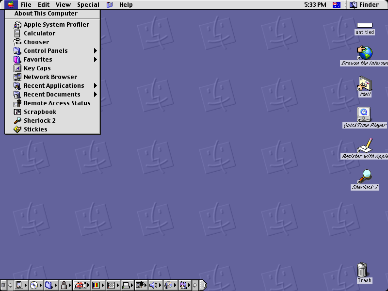
As opposed to the personal computer industry; is there anyone still using Mac System 9 from the same era? :D

Mac_OS_9.0.4_emulated_inside_of_the_SheepShaver_emulator.png


I don't play any computer games. Never have. They're too boring.

That reference will fall flat, then. :)
 
Almost every semi-serious digital camera has exposure compensation. And for many it is a dedicated dial on them. In this group it is the Leica's that is the hardest to use as you have to press and hold a button and spin a command dial.

Shawn


Yes I know but we are talking about simplicity and although my digital cameras have this option they are all over the place. I could list all the ways I get to them but there isn't space for it.


Regards, David
 
Originally Posted by Out to Lunch
The problem is that many 'film shooters' believe that a camera is a camera and never bother to read the manual of their brand new digital camera. Learn and adapt. As we speak, Leica and Fuji offer the best 'classic' camera design and feel. Cheers, OtL

Look at ebay or any other auction site and you'll soon realise that they bin the instruction books; it's rare to see a camera with a manual. (Sometimes I wonder if they bin the lens caps too... )

Old school thinking. All manuals can be found online. Cheers, OtL

Yes, but I prefer the smaller ones with film cameras (simplicity again) to one online because I don't always have access to a computer and the internet.

I read books and they are easy when travelling etc; online ones are great if you want to print out (say) the battery charger instructions for ready reference but cumbersome when you get a weird icon on screen and wonder what it means and how to get rid of it.

It's a question of the right tool for the job not new school thinking...


Regards, David
 
Which cannot find what you're looking for, it can only find specific strings and keywords. Menu conceptual organization is still pretty important. :D

G


I had a vision of the traditional search spiel meaning 125,000 found in 0.86 seconds; I hope they are not like that...


Regards, David
 
In one case there is a text-based menu system that requires multiple left/right/up/down menu presses.

Or, there are alternatives that are faster and more intuitive.

Just suggesting a few ideas for alternatives.

Maybe I'm the only one in the world that prefers to not play Microsoft Decathlon with arrow keys on my keyboard anymore, but for those who want to continue, they are free to do so! :D

Not all cameras have touch screens, I tend to prefer not to have them. So no matter what there are going to be button presses to move though menus. Whether it is text based or graphics based will not change that. A touch screen would allow one to move through a text based menu too.

Text is efficient and much easier to understand for many options than an icon would be. Esp. since graphics would vary between manufacturers. Is it this circle that means center weighted metering or is that for a central AF point???

And again, once you setup things like My Menu, Quick Menu, C1/C2/C3 and map buttons the need to even go menu diving is pretty much gone.

Shawn
 
Re-reading the thread I'm beginning to think I should be ashamed of my old M4...
Regards, David


Never, best Leica ever -:)


Switching between a Nikon and a Fuji camera is like switching from an Android phone to an Iphone. Here's another example. My Leica M4 manual (like most film cameras) is very thin and mostly contains information that every camera user that ever used a camera already knows. My Leica M9 manual is 99 pages long but, again, most users can figure it out without opening the manual. The XPro-2 manual is 177 pages, contains the most basic information, and requires the user to buy a book to figure out what some of the options do. One issue is menu names have changed from previous models (not uncommon). Many menu names aren't even intuitively obvious as to what they do.
 
Obviously as a camera gains more abilities the instruction manual is going to grow too.

M4 is very basic. Not much needed. M9 can do more. It has a larger manual. The XP2 can do *far* more than the M9, of course its manual will be larger too.

What do you want to do with the camera? Ask, plenty of people understand it and can help you set it up the way you want.

Shawn
 
The Epson RD1 was always great for the ability to set the menu then forget about it. Use the meter as a regular camera and shoot away.

Phil Forrest
 
If you haven't been able to discern my rather simple examples, I have failed, so I'll decline attempting to do so again.

Digital cameras are, indeed, simply computers...I stated that simply to point out that there has been very little effort in improving upon the original menu-based UIs from the very first DSLR, the Nikon D1, back in late 1999.

As opposed to the personal computer industry; is there anyone still using Mac System 9 from the same era? :D

Mac_OS_9.0.4_emulated_inside_of_the_SheepShaver_emulator.png

There's much more the same than different with the latest Windows, macOS, and Linux UI compared with that Mac OS 9 UI. The OS functionality underneath the UI is vastly different, but the UI hasn't changed by more than a couple of degrees of freedom.

They're all menu based command structures too. :D

G
 
The reason I give Fuji credit is because the most commonly adjusted settings are placed on dedicated dials, rings, or levers. All you have to do is look and not only can you see your settings at a glance, you also can change them easily. Only the less frequently used items are in menus.

With a Fuji XT there are dedicated knobs, dials, and levers to control shutter speed, aperture, ISO, exposure compensation, metering pattern, drive mode, and focus mode.

Consider shutter speed and aperture - a dedicated dial and a ring. When I use digital cameras where shutter speed and aperture is displayed on an LCD and use wheels to adjust those values, which dial changes which setting? Which way do I turn the wheel? It's not obvious and not consistent from one camera to the next. Same thing for ISO and shooting modes (PASM, etc).

I've had a Nikon D700 for a while and got a Pentax K10D just this year. Both cameras are from the same era, but the K10D is far more enjoyable to use because it is more intuitive - even clever - in its use of controls. I sense they had a good team that studied usability.

If you use just one camera, or family of cameras, then eventually you'll get used to whatever scheme that camera brand uses. But I prefer to start out with something that seems intuitive immediately.
 
What about screen folders that you click on, name and populate from a list. Examples; landscapes, astronomy, portraits, flowers etc. Click the folder to shoot that specific subject matter and use dials etc to make adjustments as needed. You could add hi key and low key folder versions.
 
What about screen folders that you click on, name and populate from a list. Examples; landscapes, astronomy, portraits, flowers etc. Click the folder to shoot that specific subject matter and use dials etc to make adjustments as needed. You could add hi key and low key folder versions.
That's a great idea. MY D750 allows you to populate memory settings to 2 user modes on the P/A/etc,etc dial. Great idea but I can never remember if I want U1 or U2 -:).


The D750 menu system is a great improvement over the D700.
 
I agree with splitimageview. The nested menus with down and across arrow navigation is slow and deadly. Sometimes like with my Fuji X100 there are two main alternative menu lists to hunt trough. The shot is gone. And then the wonderful display on LCD or electronic viewfinder suddenly comes up all busy and distracting and you can't remember how to get back or why it went that way etc etc. Leica is pretty tame in this regard.
 
I agree with splitimageview. The nested menus with down and across arrow navigation is slow and deadly. Sometimes like with my Fuji X100 there are two main alternative menu lists to hunt trough. The shot is gone.

But did you really need to be going through the menus when there was a shot to be had?
 
Back
Top Bottom