Carriage
Established
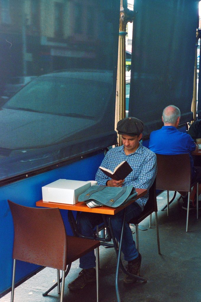
So I had a roll scanned at a lab a while ago and one of the frames looked noisy so I thought I'd give digitising it a go with my dslr. It may have been grain but that's not important for this discussion. To fix the colours of the negative I inverted and then used the curves tool to fix the box so it looked white and an average value of a chrome chair leg so it was grey. I then used the levels tool to change the white and black points to near the edge of the histograms. What surprised me was that the results were quite different. The images below are downsized from ~20MP to about 2MP. The film is Portra 800 (35mm).
My Scan
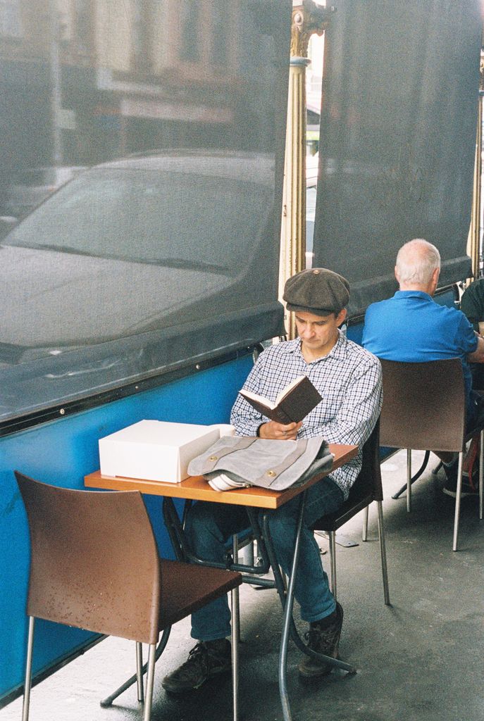
Lab Scan
So my question is, which one's correct? Are neither/both correct because it's just preference? It's been too long for me to recall what the scene looked like exactly. I usually shoot black and white film and print optically so this is a bit new to me.
My Scan

Lab Scan

So my question is, which one's correct? Are neither/both correct because it's just preference? It's been too long for me to recall what the scene looked like exactly. I usually shoot black and white film and print optically so this is a bit new to me.
Ronald M
Veteran
First is correct. Second is washed out. But it really depends on on the camera exposure. If you exposed for inside, #2 is more correct.
I see little point in reversing image. Tell the scanner it is a color neg and it removes the mask.
If you were to measure the white box, it would be over the 245 limit for a good print.
When everything is totally unknown, the way to get perfect color balance and exposure is to use curves . Use RGB separately and use the dropper and thresholds for darkest area and lightest area. This is a pain to do, but it does work. Takes 6 tests.
Carriage
Established
I can't recall the shirt. I suppose I should have used something more recent, but good point about the hair.The first photo looks totally over-saturated and blue, surely that shirt is not blue?? The man's hair full of blue dye?
You were there, was the shirt white or blue?
In terms of saturation, how do I know if that's not just how the film is?
Carriage
Established
Also, how does the shirt change so much when it doesn't seem to me like the white box does?
Swift1
Veteran
One of the tricky parts about scanning color negative film is that you can never really know exactly what the positive image should look like. The film itself looks like a transparent orange negative. Any positive image made from it is essentially a translation of the negative. In the same way that there isn't a perfect translation from English to Japanese, there isn't a perfect translation from color negative film to a positive print or scan.
This is also what makes color negative film so versatile.
Looking at the histogram of the first image tells me a few things,
1- All three channels are clipped a bit on the right side. The blue channel is clipped a bit more than the red or green channels, which is probably why the blues look over saturated.
2- The red and green channels are tight on the left side, but the blue channel has space. This gives the shadows a blue cast.
3- If you look at the main hill of the histogram for all three channels, the blue channel is more to the right than the red and green channels. This makes some sense because there are large patches of blue in the image, but it also can mean there is a blue cast to the image.
To answer your question regarding the shirt and the box...
The box is made up of primarily highlights, but the shirt is more midtones. The highlights are basically the same in both images, but the midtones are very different in the two photos.
If you open a photo in Photoshop and run the Levels tool, and then start moving the triangles in each separate channel, you'll notice that that each triangle in each channel will primarily affect those tones in that channel. For example if you go to the red channel and move the right side triangle a few points to the left, it will give a red cast primarily to highlights. If you move it 20 points to the left, it will give the entire image a red cast, but that partly because when you move the right triangle, the middle one moves with it.
If you go to the blue channel and move the left side triangle to the right a few points, you should see that the darker shadows take on yellow cast, since yellow is the opposite of blue.
I hope some of that makes sense...")
This is also what makes color negative film so versatile.
Looking at the histogram of the first image tells me a few things,
1- All three channels are clipped a bit on the right side. The blue channel is clipped a bit more than the red or green channels, which is probably why the blues look over saturated.
2- The red and green channels are tight on the left side, but the blue channel has space. This gives the shadows a blue cast.
3- If you look at the main hill of the histogram for all three channels, the blue channel is more to the right than the red and green channels. This makes some sense because there are large patches of blue in the image, but it also can mean there is a blue cast to the image.
To answer your question regarding the shirt and the box...
The box is made up of primarily highlights, but the shirt is more midtones. The highlights are basically the same in both images, but the midtones are very different in the two photos.
If you open a photo in Photoshop and run the Levels tool, and then start moving the triangles in each separate channel, you'll notice that that each triangle in each channel will primarily affect those tones in that channel. For example if you go to the red channel and move the right side triangle a few points to the left, it will give a red cast primarily to highlights. If you move it 20 points to the left, it will give the entire image a red cast, but that partly because when you move the right triangle, the middle one moves with it.
If you go to the blue channel and move the left side triangle to the right a few points, you should see that the darker shadows take on yellow cast, since yellow is the opposite of blue.
I hope some of that makes sense...
Stuart John
Well-known
Lab scan could be a touch darker, your scan is too dark and saturated. Adjust the scans to get the result that you want, your pictures are what you make them.
Spanik
Well-known
@Swift, thanks, cleared a few things up for me. I often have the same problem as TS.
charjohncarter
Veteran
Spanik, you should read Swift1's tutorial on color negatives (if you are really serious about color correction). It is excellent and gives some sense to moving the levels arrows. It is on his website.
bmattock
Veteran
This is why I typically don't scan color film, only b&w. I'm colorblind. Just can't do color on a monitor, so I rely on digital cameras for color work, mostly.
Bill Clark
Veteran
It depends.
Who is or will be looking at the photographs? Prints, what size and lighting used for viewng them?
How do they look to you?
I see many photographs that I wouldn't process the way they look.
When I had my people photography business, certain folks wanted to look more tan than they actually were so I gave them a tan with Photoshop. Some wanted to look younger so I made them look younger. Thinner, I made them thinner. Tatoo removed, no problem. And a bunch of other requests!
Beauty is in the eye of the checkbook holder.
waileong
Well-known
Correct color is easy to if you have a white portion in your image. Use that to get the right white balance in your scanner software.
Carriage
Established
To help my understanding rather than because I necessarily disagree, how do you know (in general) if the colour isn't there because of colour reflection from something else? Could the box arguably be slightly blue? The side of the box near the bag looks reasonably like it could be reflecting the bags colour to me.On my monitor the top of the box has a blue tint.
kiemchacsu
Well-known
reviving this thread;
I've always asked myself the reason to shoot different type of color films while the output can be manipulated in the way we want.
For instance; what is the real difference between shooting with expensive Kodak Portra versus cheapy Kodak Gold?
Some local labs here scans and processes in a way that almost every film looks the same.
Someone please enlighten me in this matter.
BernardL
Well-known
You don't, unless you have absolute color memory from the original scene and can do matrix algebra in your head. The previous comments more or less boil down to using a known white (cloud?) patch and setting it to white in the output file. Yes, that is better than nothing, and that's what I do when I have no other choice.How do you know the correct colour
BUT... what if that cloud is bright enough to be on the shoulder of the RGB layers; what if the gammas of the three color layers are different? And is that cloud really white anyway? How do you convert an RGB triplet for the negative into an RGB triplet for the putative scene colors: the difficulty and ambiguity involved is very well illustrated by the two versions of the image in the OP.
Minimal solution. Devote one frame of each film to shooting a neutral gray card (more if light conditions change and you want to cancel the visual impact of these changes). Vuescan, so-called advanced workflow (read) lock film base color (takes care of orange mask). Generic negative film (provided profiles are useless). Right-click on neutral gray patch: takes care of color balance.
Better solution. Devote one frame of each film to shooting a Wolf Faust target. Vuescan. Scan target as RAW. Use Argyll to derive a CM profile. Scan rest of film as RAW. Assign profile to all frames. No guesswork. This is just a short summary.
Dralowid
Michael
You don't, unless you have absolute color memory from the original scene and can do matrix algebra in your head.
Which is one of the reasons why, in the days before digital, repro houses, press and publishers wanted colour images supplied as transparencies.
Roger Hicks
Veteran
How do you know the correct colour for a scanned colour negative?
You can't, because there isn't one. The colours in a photograph are not the original colours. They are a reconstruction using dyes and (if you are viewing the picture on a monitor) phosphors. All you can go for is pleasing colour.
Cheers,
R.
You can't, because there isn't one. The colours in a photograph are not the original colours. They are a reconstruction using dyes and (if you are viewing the picture on a monitor) phosphors. All you can go for is pleasing colour.
Cheers,
R.
Carriage
Established
So what are people really noticing when they talk about the look of a particular colour negative film? It appears that the scanning/inverting process has a potentially greater effect
Pherdinand
the snow must go on
How do you know the correct colour for a scanned colour negative?
You can't, because there isn't one. The colours in a photograph are not the original colours. They are a reconstruction using dyes and (if you are viewing the picture on a monitor) phosphors. All you can go for is pleasing colour.
Cheers,
R.
"Phosphors"?? Ah the good old days
nukecoke
⚛Yashica
reviving this thread;
I've always asked myself the reason to shoot different type of color films while the output can be manipulated in the way we want.
For instance; what is the real difference between shooting with expensive Kodak Portra versus cheapy Kodak Gold?
Some local labs here scans and processes in a way that almost every film looks the same.
Someone please enlighten me in this matter.
That is a phenomenon I noticed too.
Fuji SP2000/3000 is the dominating scanner for most labs in both countries I live in. When scanning, most of the time the lab people apply one colour scheme for all films no matter if it's Gold or Superia or other, and in the end you always get pictures with enhanced contrast/blown highlight, strange green and unnatural red colour. It's a signature easily recognized and make you react: scanned by Fuji SP2000/3000, dead giveaway.
I do have seen individuals using sp2000/3000 output more natural/pleasant looking results. It's less common, but I guess the photo owners are much happier with the output.
Avoid the irresponsible labs. I scan my 135 negs with VueScan and a PlusTek 7200 and I'm happy with the results. And different films do have different colour scheme (that's why I shoot different films), it's not as simple as "Kodak is redder and Fuji is greener" though.
Prest_400
Multiformat
So what are people really noticing when they talk about the look of a particular colour negative film? It appears that the scanning/inverting process has a potentially greater effect
Well, there is grain, contrast and saturation. Though it is easy to vary them in some way. I would say that the essence of a film always gets through in a greater or lesser way.
It is particularly interesting how a same frame could look light and ethereal or dark and moody. Kodak's Portra 400 page had two different stark examples, a motorist in a quite contrasty and colorful scene and the usual portrait which was much softer.
I've found that many Japanese film photographers (on Instagram BTW) tend to process with a very light, greener biased, pastel look; quite noticeable.
I don't shoot that much... but wow, it can be quite entertaining to balance a negative scan. Sometimes I've had straight scans that needed little correction, but get through the film characteristics.
Things may be more complicated with pushed film, which some labs do treat nicely but I've seen individuals not liking their results.
Share:
-
This site uses cookies to help personalise content, tailor your experience and to keep you logged in if you register.
By continuing to use this site, you are consenting to our use of cookies.