How do you know the correct colour for a scanned colour negative?

In his site, under "Articles". I suppose he'll be fine to have it linked here:
http://www.coltonallen.com/scanning-color-film/

It helped me learn quite a bit the process, though I do not adjust the individual color channel levels... Then I end up messing up color and well :bang:
I discovered through a video tutorial that the "Show output" button in the preview actually did that, as it just fuctions when it is pressed. Now at least I get the histogram right. Before, I used to just put the white and black points. But I obviated that this let me finely adjust the values of these!

Because oftentimes the white point when put to the edge of the input histogram does not put the output histogram to the proper place and in negative the highlights go yellow-brown. Colton's tutorial does not mention it, perhaps it is down to some software-hardware combination. Instead, I have to keep using the "show output" and have the input whitepoint slightly inside the histogram end.

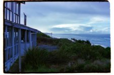
I scan with a V550. Portra often scans nicely and when properly exposed does not require corrections. My scanner does have a color cast in deep shadows (blue in negative, red in positive) that I remove afterwards using RawTherapee. The latter I use to add sharpening and adjust some color to taste.
PS: Thanks Colton a lot for the tutorial! I just read through again and I obviated that the settings can be saved. After a few frames, it is tiring to adjust output 10,240 to 0,255 and the histogram itself.

If you move only the RGB white triangle, you are still moving the individual color channel bright points, but you are moving them all together. If you move the white triangle to the histogram edge, and then look through each channel, the bright point triangle will probably be clipping or to far away.
 
I usually just mess with the settings until it looks good to me.

For example, I've always scanned my own Portra 400, and I have no idea what it's "supposed" to look like (according to Kodak, or labs and whatnot), just what my scans look like, but they're ok with me.
 
So what are people really noticing when they talk about the look of a particular colour negative film? It appears that the scanning/inverting process has a potentially greater effect

in addition to what others have said, each film responds to colors differently. photograph a colorchecker with two films, and even if they have the same contrast curves and saturation, the squares may not be the same hue. they shift colors from the real world in different ways. you can adjust how the hues are mapped in photoshop, but it's not as common as other adjustments. and you can't change them when doing wet prints, unless it's dye transfer.
 
I've been giving this another go with a different roll (agfaphoto vista 400) and was again seeing large differences between mine and the lab. Could the differences be in how I'm digitising the negative? I've put the negative below if someone was willing to colour correct so I can compare again. Thanks for all the help.

 
After invert the colour, I clicked a point on the lighted cloud and set it as true white, and a point some where inside the cabin which looks like true black and set it as true black. I'm sure the points I clicked are not true white nor true black.

It will be better if you can give a scan with the coding bars on the edge of the film shown.
 

Attachments

  • DSC_0226s_zpsuqpiwbne-1.jpg
    DSC_0226s_zpsuqpiwbne-1.jpg
    26 KB · Views: 0
black, gray, and white points...the gray takes a bit of work, will outline later. This needs a small tweak - less blue.

DSC_0226s_zpsuqpiwbne.png
 
This was my go (brightened it up a little too):

and this was the lab's:


Mine looks comparatively very blue but I don't know how I would get what the lab got. I'm not sure which one is more representative of what it should be. I think the lab's is more like real life but I think my one is perhaps more pleasing.

I'll see what I can do about getting a photo with the rebates tonight. I'm not using a scanner if this matters. Using my tablet as a light source and taking the image with a dslr.

I don't like the lab one and it looks so overkilling with contrast...which is how many labs do it. The details in both dark and light areas are lost due to the contrast enhance, what a pity. Is it Fuji sp2000/3000? ( judging from the familiar "green" scheme)
 
White point clouds (manually set, not eyedropper), black point just off negative frame. I used the gutter under the eaves as a grey point to adjust the color a bit warmer. I did pull it back a bit to something I thought more natural.

Some contrast tweaks to overall curves, and a separate adjustment to just the green curve.

E2uTvW9h.jpg
 
Not sure if people are still interested but I've been playing with all this and I believe I've determined why there was so much blue. I was using the histogram to push the exposure all the way to the right when taking the photos of the negatives but when I had a look at the separate channels it seemed that the red was being clipped. I've redone it with reviewing all three channels to see that none are clipped and got the below which looks more natural and I'm relatively happy with. Thanks for all the help everyone.

 
Back
Top Bottom