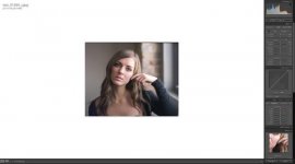
How do you scan color?

I use a Coolscan 9000, Vuescan and CP and find that CP's list of colour negative films totally destroy the colour on the scanned image. So I don't use this function at all.

But a question to PatrickT -- I don't know how the V500 works but why set Input Mode to transparency in Vuescan?

When doing a RAW scan in Vuescan, I don't believe it matters what you have that set to. Someone, please correct me if I'm wrong!
 
brbo...did you do the conversion in CP?

PhotoSmith...your version looks quite good. Like I said above, I know that if I spent a couple minutes in Lightroom, I could make my Epson version look better, more like yours.

Yes, inversion with ColorPerfect. Finished in Lightroom.

When doing a RAW scan in Vuescan, I don't believe it matters what you have that set to. Someone, please correct me if I'm wrong!

When you scan to RAW, color tab has no effect. Input media type (Color Negative, Slide, Image) DOES have an effect on RAW file.
 
Here is the secret:) Just get a close enough flat scan..Drop it into Lightroom use the white balance tool select a neutral area and go from there.. Here is what I did to your image.. pretty simple..
 

Attachments

  • Screen Shot 2014-02-12 at 1.40.17 PM.jpg
    Screen Shot 2014-02-12 at 1.40.17 PM.jpg
    23 KB · Views: 0
Here is the secret:) Just get a close enough flat scan..Drop it into Lightroom use the white balance tool select a neutral area and go from there.. Here is what I did to your image.. pretty simple..

That looks pretty good! So my question to you is...what do you mean by a "flat" scan and how do you accomplish that?

EDIT: Thinking about this, you must have just taken my JPEG and tweaked it in Lightroom? Or did you start with my RAW scan?
 
Here is the secret:) Just get a close enough flat scan..Drop it into Lightroom use the white balance tool select a neutral area and go from there.. Here is what I did to your image.. pretty simple..

Small image but looks good from what I can see. I agree, would you mind sharing a bit more about your workflow? I would greatly appreciate it as I have a lot of colour neg sitting around that I want to scan to share with family.
 
Basically just modified in ColourPerfect:

400H_test2.jpg

I'm not sure what her make-up was like? It sounds terrible to ask, but was the make-up that kind of thick orange-brown stuff, or should the file be processed for natural skin tones?
Pete
 
That looks pretty good! So my question to you is...what do you mean by a "flat" scan and how do you accomplish that?

"Flat" only means that you don't clip your scan. Scanner by itself will only clip the scan if it's exposure is set to high by operator or if it's dynamic range is too low (not a problem with negative film).

Now, scanner in "auto pilot" will not over expose the negative (and therefore produce noise in blacks), but "auto pilot" will try to make a dull scan somewhat more "attractive" and crank up contrast, saturation, clip blacks etc. A file like that will be much harder to correct/work with later when you process it to your taste.

So, you should set the scanning software in manual mode and not let it do any correction to the info that it gets from the scanner (RAW/linear file) or at least only let it do inversion if you don't want to invert it yourself or a tool that does that for you.

I invert in ColorPerfect and I still want inverted file to be as "neutral" or flat as possible.

6Ad4eCuPLPULI3yYJ446MY


After that, it's really up to you to interpret the file.

Another (more conservative) take from the same ColorPerfect inverted file...

26RRqemuNZw59pumr2Z8Ez
 
That looks pretty good! So my question to you is...what do you mean by a "flat" scan and how do you accomplish that?

EDIT: Thinking about this, you must have just taken my JPEG and tweaked it in Lightroom? Or did you start with my RAW scan?

When I say flat scan, I mean don't try to get it to look right in the scanning software just get everything in the ballpark..don't do any contrast adjustment..etc in the scanning program whether its Epson Scan or VueScan just make sure the exposure is in the ballpark. In Vuescan there are neg profiles just find one that gets you in the ballpark Then import the image into Lightroom if you don't have lightroom you can use camera raw..Once your in either program use that white balance eye dropper tool click on a neutral area, that will give you a good starting point. In this case I made it slightly warmer and added a bit more magenta..added some contrast and saturation really lightly, use the blacks slider to get some density pulled the orange saturation down a bit and you can sharpen if you like a little bit too..

If you want to give me a full res scan via dropbox or something I would be happy to work on it and could walk you though it more.. Its hard working with that small little image.

Marko
 
Okay,

I played with it a little more. I had forgotten about the Film Type slider, which is a good tool when you have odd color casts. Sometimes certain films developed certain ways can had different colors. Using this is best explained here: http://www.colorneg.com/color_casts.html?lang=en. One good tip he gives is to increase saturation to 150 and decrease White to -0.05 to make it easier to eyeball color casts. After some fiddling with Film Type and Sub Type, sampling a point on the windowsill for neutral grey, and a small amount of White removal, I reached this point:

Screenshot%202014-02-12%2017.01.57.png


I think this looks pretty good, but you can find one that works for you. After some curves/levels in PS I get this:

400H_test.jpg


Not too far from what others are posting here, but it has the added benefit of reproducibility. In ColorPerfect you can save your best Film/Sub Type and try it on subsequent scans. This avoids the trouble you were having with Epson Scan of having it look great sometimes, and terrible other times.

-Greg
 
20 seconds in CP (+ one 'C' curve and using the whites of her eyes to colour balance).

First is purely balanced to the eye, with a very mild (12%) magenta filter. I could do much better with a few more minutes.
 

Attachments

  • 400H_test_EDIT.jpg
    400H_test_EDIT.jpg
    31.5 KB · Views: 0
20 seconds in CP (+ one 'C' curve and using the whites of her eyes to colour balance).

First is purely balanced to the eye, second is with a very mild (12%) magenta filter. I could do much better with a few more minutes.

Looks greenish/yelowish..Certainly would not use the whites of her eyes to get the color balance..Something more neutral like the wall or even better the gray window..
 
Looks greenish/yelowish..Certainly would not use the whites of her eyes to get the color balance..Something more neutral like the wall or even better the gray window..

Like I said, this is just a start.

The point here is not what this specific image looks like (in fact, I personally wouldn't want much more magenta than this), but that it's REALLY easy to dial in the colour balance that YOU want in your images.

Remember that colour negs don't actually have a particular 'look', per se; these are not slides we're talking about. It's up to us to balance to taste.

Oh, and I find the whites of the eyes to be excellent for white balancing...insofar as they ARE white.

EDIT: Another version. Color Balance layer with magenta and blue in the highlights. I personally find this too cold, but it's closer to the original Epson Scan version.
 

Attachments

  • 400H_test_EDIT_2.jpg
    400H_test_EDIT_2.jpg
    34 KB · Views: 0
When you hit those restore color and backlight correction buttons you can look and see what it's changing in the other controls (the buttons) after you hit it. I got similar results as yours with colorperfect, it looked non survivable, I don't think the process is as sound as the one in epsonscan. Epson knows their color handling. However in configuration, the "auto exposure" slider just adds a curve (in the curves dialog) of varying severity. All the way left is no curve.
 
Remember that colour negs don't actually have a particular 'look', per se; these are not slides we're talking about. It's up to us to balance to taste.

Oh, and I find the whites of the eyes to be excellent for white balancing...insofar as they ARE white.

I tested films for Fuji in the late 1980's and I can tell you colour neg does have a 'look' its not up to you to define the colours.
Each record is set to a value with respect to the other two, those are set each one having a neutral Munsell value at three given points on the curve, the LAD aim being Munsell N 4.5 (reflectance 16%) Red 0.80 Green 1.20 and blue 1.60.

You plot the resultant curve against the paper curve with a quadrant diagram with conventional paper, with scans its slightly different but you still have a neutral aim.

And the whites of the eyes aren't white, forcing them to be 255, 255, 255 isn't going to get you neutral results and will clip the whites.
If you put a white aim in your target it should be 90% reflectance neutral Munsell value 9.5, you can take your white from that (the eyes don't have it)!
 
It's not about the whites of the eyes being 255 255 255, but rather the eyes being neutral with respect to RGB values (i.e. R = G = B, or something reasonably close). My point is that the whites of the eyes give you a pretty good jumping off point for balancing.

"It's not up to you to define the colours" seems pretty arbitrary. Why isn't it up to me? Yes, each film has a characteristic set of RGB curves and contrast, but I can print (on paper or to JPEG) as I wish. Even the big pro labs (RPL, for e.g.) offer custom colour balancing to suit the individual photographer. It seems a bit fascist to limit yourself to just what Fuji or Kodak says is the way your film must look.
 
Re: Epson Scan Software
I once made the mistake of downloading the 64bit mac version of vuescan which didn't work with the V500. It took a while to figure out why because the scanner still showed up in the input tap. So I used Epson Scan again for a few scans and found that the results were totally acceptable - I actually used the auto button but then went into the levels setting to widen the distance between black and white point cos otherwise there would be too much clipping - maybe a bit of tempering with the curves too. Other than that the auto setting (little sphere with two triangles) worked well.
 
It's not about the whites of the eyes being 255 255 255, but rather the eyes being neutral with respect to RGB values (i.e. R = G = B, or something reasonably close). My point is that the whites of the eyes give you a pretty good jumping off point for balancing.

"It's not up to you to define the colours" seems pretty arbitrary. Why isn't it up to me? Yes, each film has a characteristic set of RGB curves and contrast, but I can print (on paper or to JPEG) as I wish. Even the big pro labs (RPL, for e.g.) offer custom colour balancing to suit the individual photographer. It seems a bit fascist to limit yourself to just what Fuji or Kodak says is the way your film must look.

The reason you don't get to define a films colour balance is that it is built in at Manufacture, a state you say doesn't exist.
I'm not arguing against individuals liking a hue shift to their personal taste (evaluative colour) just that films are built with a set of values that are defined by objective measurements.

If you use a white colour picker you are defining that point as being white, they are not neutral RGB sometimes far from it. The best way is to put a standard 90% white point in an image as a reference (look at the rear of a Kodak grey card) not always practical but preferable.
But if you say it works for you fine, I can live with that but it doesn't come close for me.

When did I say I was using the white colour picker?

Also, when did I say that films don't have preset RGB values? In fact, I said they DO. That's irrelevant, though. I don't care what the RGB curves are on the negative; I how those are translated to the print, and this has ALWAYS been subjective.

This is in direct contrast to a slide, where you have an actual positive to use as a reference.
 
Back
Top Bottom