Hyper realistic art ... photographs that aren't photographs?

Amazing skill. Quite mundane subjects. Coke cans? I must be missing something...

Ron Mueck is the only one whose work I've seen in person. Definitely interesting.
 
I must be gettin older, I see the link above and thought, "....Chuck Close was doin this stuff back in the '60s....".

close_self_68.jpg


Though lineage asside, some great artists linked OP! Thanks for the share!
 
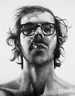
Some of those pencil drawings are razor sharp all the way to the corners - must be using Blackwings. Papermates and Dixons wouldn't keep that level of resolution. Of course, perhaps they're using mechanical pencils, but the signature, how they 'draw', just isn't saying that to me.

... more likely they are working very large, and we are viewing them quite small ... an old commercial artist trick
 
... more likely they are working very large, and we are viewing them quite small ... an old commercial artist trick


Trick? Blow a 35mm negative up to sufficient size and its detail diminishes significantly.

What's your point? 😀
 
Trick? Blow a 35mm negative up to sufficient size and its detail diminishes significantly.

What's your point? 😀

Exactly, except here it is like viewing a large format photo at 35mm size. Not much apparent grain in the photo nor many visible pencil strokes in the art!

When I worked in illustrated factual books (bird field guides and such like) we would routinely published the artwork at 90%. It made a huge difference to their apparent realism.

It's the same thing that makes downsized images from hi-res sensors such as the D800 look hyper-detailed compared with a lower-res sensor even when both are downsized to make prints at the same size.

Some of my wildlife photos mimic the photo-realistic style (chickens and eggs of course). This, for example, reminds me of an Ian Lewington painting http://www.ian-lewington.co.uk/Birds of the Americas.htm


green violetear in the rain by jj birder, on Flickr
 
. . . . reminds me of an Ian Lewington painting http://www.ian-lewington.co.uk/Birds of the Americas.htm

What strikes me about the Lewington paintings are the out of focus backgrounds
("shallow DOF" in photography portrait talk) . . . painters generally don't use that technique.

(Some landscape painters have used OOF foreground and backgrounds, again sim to photographs).

EDIT: painters also "smear" their leaves on trees simulating wind and also flowing water over rocks -
like using a slow shutter speed for a photograph to capture motion.
So, "photo-realism" starts to take on many dimensions when you think about it.
 
Yes, OOF backgrounds are very much part of Ian's style. Bird artists often use a selective focus style for the same reason as portrait photographers: to isolate the subject. Some also use colour only on the bird or use a pale vignette. I guess some of this is due to the influence of field guide painting (where several birds are on the same page and clarity of view is required).
 
Actually the well known older painters like Ralph Goings (who I first saw at OK Harris in 90) paint very large and highly detailed, which is what makes them appear so odd, as though they are too sharp.

I am surprised that realist painters seem a "surprise" on the RFF, since the work has been shown for so long in the mainstream.
http://ralphlgoings.com/

See also Richard Estes, Don Eddy, Audrey Flack, John Salt, etc.

... when I started in the 70s it was normal to work 5, 10 sometimes 20 times life-size and then photo-reduce to print ... I'm confident it was an old technique even then
 
Well yes, especially for commercial water color magazine covers and the like.

But the realism gallery work is huge, the some like James Rosenquist is billboard sized -- never designed to be reduced.

... yep that's true, well except in books, and prints, and on TV where some people see them ... oh, and the interweb where everyone sees the stuff we're taking about here eh?
 
Back
Top Bottom