
You are using an out of date browser. It may not display this or other websites correctly.
You should upgrade or use an alternative browser.
You should upgrade or use an alternative browser.
I need some abuse!!!
- Thread starter Dfndr90
- Start date
- Latest activity Latest activity:
- Replies 17
- Views 1K
trittium
Well-known
Praise: Great Composition, and interesting material
Abuse: I think your images are either too contrasty or not contrasty enough. In other words, you need a wider range of tones.
Abuse: I think your images are either too contrasty or not contrasty enough. In other words, you need a wider range of tones.
Dfndr90
Member
Trittium,
Thanks for the comments. I think the contrast part is my lack of photoshop ability.
I have been having the negs developed and scanned then trying to work in photoshop. I also have been jumping around the film spectrum from Tmax 400 to 3200 to Fuji 1600 to Kodak BW400CN trying to find the "right" film for what I want to capture.
Again, I appreciate the comments.
Matt...
trittium
Well-known
No problem. If you want to adjust the contrast while sill preserving your range of tones, I suggest the curves adjustment. You can probably find a place online to describe how it works. Or just mess with it and see what happens. I find it to be the most usefull adjustment tool for photos.
NIKON KIU
Did you say Nippon Kogaku?
You need some abuse?
lets help him guys!
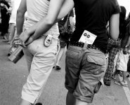
I start...how about your pix??!! Butts and Jeans??!!
Kiu
lets help him guys!
I start...how about your pix??!! Butts and Jeans??!!
Kiu
Last edited:
ywenz
Veteran
abusE: of the few pics that are up, 3 of them are of the same dog. Less pet pics, more other pics.
P
philm
Guest
Why do so many people on the web spell "divine" as "devine"?
Oh, yes, the pics need help too...
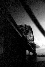
Most need some serious PS work (although the bridge shot probably needs the "round file"). As someone mentioned - use Curves or even Levels after doing a Threshold to determine your B and W points.
Oh, yes, the pics need help too...
Most need some serious PS work (although the bridge shot probably needs the "round file"). As someone mentioned - use Curves or even Levels after doing a Threshold to determine your B and W points.
P
philm
Guest
RJBender
RFF Sponsoring Member
NIKON KIU said:You need some??!!
looke here:
http://www.rangefinderforum.com/forums/showthread.php?t=25369&page=3
I'll give you some!!
Kiu
Yeah... I read your comments, Kiu.

R.J.
P
philm
Guest
RJBender
RFF Sponsoring Member
philm said:BTW: here is one of your images with a "quick and dirty" PS "fix"
Nice contrast adjustment, Phil.
R.J.
P
philm
Guest
RJBender said:Nice contrast adjustment, Phil.
R.J.
Thanks, RJ.
I've been taking a class in PS and have learned a few "basic" tools.
I'm kind of new here - are there any "rules to the road" I should know about?
Regards,
philm
RJBender
RFF Sponsoring Member
philm said:Thanks, RJ.
I've been taking a class in PS and have learned a few "basic" tools.
I'm kind of new here - are there any "rules to the road" I should know about?
Regards,
philm
Phil, I was going to send you the link to Jorge's Golden Rules but the golden rules are GONE.
http://www.rangefinderforum.com/forums/showthread.php?t=24739
R.J.
Creagerj
Incidental Artist
You're night shots need some work, both those and the bridge shot are really grainy. You're portraits of Mel at the bottom of the page are a little contrasty. The last one seems washed out. The portraits of the dog are very good. Some say you posted to many of the same dog, but I say if you like the dog why not, this isn't an art gallery exhibit. The picture from ComFest of the two holding hands isn't contrasty enough. The disco balls picture is also very washed out. Besides some of the technical problems such as exposure, I really like your pictures. I think you're composition is fantastic! It's a good start.
Dfndr90
Member
I would like to thank all for their thoughts and input. As stated, I have no idea what I am doing in photoshop, but I am looking to take some type of class. I think we should all take a "That which does not kill us makes us stroger attitude" when it comes to everything on this board.
Thanks again,
Matt...
Thanks again,
Matt...
micromontenegro
Well-known
If you want some abuse, forget about the defender 90 and get a 1971 Series IIa like I did. On the other hand, you are on the right track with french bulldogs 😀
NIKON KIU
Did you say Nippon Kogaku?
They are not...they are right where they are suppose to be...under FAQbut the golden rules are GONE.
http://www.rangefinderforum.com/forums/faq.php?faq=vb_faq#faq_new_faq_item2
Kiu
RJBender
RFF Sponsoring Member
NIKON KIU said:They are not...they are right where they are suppose to be...under FAQ
http://www.rangefinderforum.com/forums/faq.php?faq=vb_faq#faq_new_faq_item2
Kiu
Hey thanks🙂
I used to get to the rules though the link here
http://www.rangefinderforum.com/forums/showthread.php?t=24739
R.J.
Similar threads
- Replies
- 0
- Views
- 453
- Replies
- 13
- Views
- 1K
- Replies
- 4
- Views
- 327
- Replies
- 3
- Views
- 654