Ilford HP5 in Rodinal 1+50

Chriscrawfordphoto

Real Men Shoot Film.
Local time
12:19 AM
Joined
Apr 1, 2007
Messages
11,807
Location
Fort Wayne, Indiana
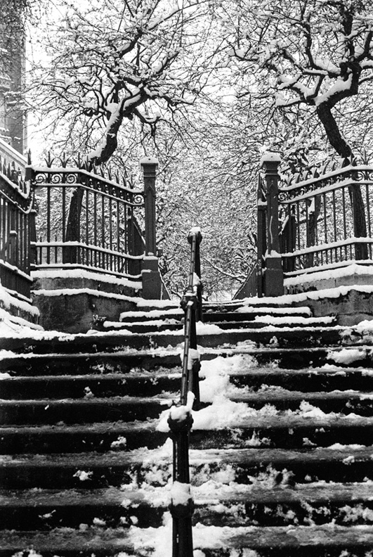
I had not developed Ilford HP5 in Rodinal in many, many years, so I decided to try it again with several rolls last month. Loved the results! These were all shot with 120 size HP5, at EI-320, and developed in Rodinal 1+50.

santa-coming.jpg


woodheath-christmas-1.jpg


woodheath-christmas-3.jpg


woodheath-christmas-2.jpg
 
Depends how you expose Frank. It's more grainy than 120 and if you hate grain there are better combinations, this scan from a print is acceptable (to me at least)

67445334.jpg
 
You can get away with it with 120 film, but this combo results in more grain than I usually like with 135 400 speed film.

I've used 35mm HP5 in Rodinal and liked the results. Much like Tri-X developed in Rodinal, HP5 has a grittier look than it would have developed in D-76 or Tmax Developer. I like it for some subjects. I usually develop Tri-X in D-76 1+1, but have never liked HP5 in D-76. PMK is my normal go-to developer for HP5.
 
I think he feels they are sharp, well exposed and clean/contrasty – just like HP5 in Rodinal shot on a Mamiya should be.... 😉


In my other thread about HP5 developed in PMK, mfogiel made the complaint that a landscape photo shot in the rain on a very foggy day had...get this...a white sky. Having liked most of my life in a place where rainy, foggy, overcast days are commonplace, I thought that's what the sky looks like on such days. I guess I must be blind.
 
Blindness is subjective Chris, (I mean no offence to anyone). I have no idea what the sky looks like, or is supposed to look like, what is 'digital' and what is filmlike.

I do think your images are nice, sharp and well exposed although my opinions are just that.

Film has a lot of combinations, looks and there is no right way.

Vive le différence as some might say....
 
They are sharp, clean and contrasty - but I would expect to see some detail in the snow or in the sky. On my monitor, both the sky and the snow look completely blown off. Given, that you certainly know how to expose, I think this is your personal way of presenting the images, and it reminds me blatantly the way, digital B&W looks most of the time. I am not trying to say, there is any "only" way in photography, but you are certainly gravitating towards that digital look.


MF20091306 by mfogiel, on Flickr

This is a photo I am not particularly proud about, but this was shot on an overcast day on HP5+ and developed in Prescysol EF. It has that problem with lack of detail in the sky, but to my eye, there is at least some. On your shots, the sky is pure white.
 
Having liked most of my life in a place where rainy, foggy, overcast days are commonplace, I thought that's what the sky looks like on such days. I guess I must be blind.


Its often the same where I live too Chris.
People down the camera club overcome this by importing a different , more dramatic sky , using PShop 🙂

I like the results you`re getting and am going to try this myself.
 
They are sharp, clean and contrasty - but I would expect to see some detail in the snow or in the sky. On my monitor, both the sky and the snow look completely blown off. Given, that you certainly know how to expose, I think this is your personal way of presenting the images, and it reminds me blatantly the way, digital B&W looks most of the time. I am not trying to say, there is any "only" way in photography, but you are certainly gravitating towards that digital look.


On your shots, the sky is 255 white.


The sky isn't 255 white. Learn to use Photoshop. If you open the photos in there and use the info palette, you'll see that the sky in the food store photo is between 238 and 242, depending on where you measure.

The two story house has a sky that reads between 236 and 241, depending on what part of the sky you measure.

The trees with the santa face have snow at 326 and sky at 252, close to 255 but not quite. The sky really looks like that here. You don't know that, you have never been here. Why should my photos of Indiana look like photos of Monaco?

The house with the flag has a sky that tops out at 247. Once again, the sky was flat white with no detail in real life. Once again, this is not Monaco. Since you keep harping on the look of skies in a place you know NOTHING about, and because you keep throwing the 'digital' label out as though it were a 'bad thing', one is forced to the conclusion that you're a little man with an axe to grind against digital work. This thread is not the place for that.
 
um, Im pretty sure if your response to "your sky looks white" is "you should open it in PS and you'll see it's basically white but very slightly off" then it's near as makes no difference white.

but hey Im sure you got it.
 
Good job there. I've tried HP5 in Rodinal, but don't like the results I got. Maybe something in the tap (fawcett) water here that gives me flat results, the negs seem underdeveloped. No probs with FP4 though.
 
funny ... before i worked my way down the thread i thought to myself, "flat winter skies just like here" and i live in southeast michigan. one great big detail-less softbox for half the winter, not a shadow in sight.
 
Yep the skies are almost white, but hey that's OK in snowy conditions they can be and there is nothing that is wrong with that.

I don't want to get into an argument but Chris' shots look less digital to me than the post No12 which has a halo round the tree, digital artefacts are more unpleasant to my eye.

Snow can make the sky white:
60034109.jpg


Nothing wrong with that....
 
Enjoy!
meanwhile, in some part of the world, we get 8 months of ugly, over the head sun with a 4-5 stops gap between sunlit and shadow areas... A pleasure to deal with 😉
 
Back
Top Bottom