JoeV
Thin Air, Bright Sun
No doubt HCB was a highly skilled and competent artist, but I can't help but think there's a bit too much over-analysis going on here. He couldn't previsualize the image's DOF in the viewfinder because rangefinders aren't TTL, nor is the framing that exact to account for subtle compositional elements near the frame's edge, regardless of his experience with the camera. So whatever compositional elements involving lines and planes of focus were most likely selected after-the-fact, in the editing of the contact sheet. He probably shot many frames in these kinds of portrait sessions.
I've read many other art critics who over-analyze an artist's work to the point of ignoring the mechanics of how the image-making process actually functions. Often times an artist simply does not have the degree of control over the subject environment that the critic claims for him, but rather relies on repetition and serendipity. It is the skilled artist who can repeatedly conjure those happy accidents time and again.
~Joe
brusby
Well-known
Although I've seen many HCB photos I really like, this isn't one of them. I don't mean to denigrate anyone else's tastes, just offering a counterpoint.
sparrow6224
Well-known
If you want to see a Cartier Bresson portrait in which the composition really is miraculous, check out his famous shot (one of many he did over a few years) of Albert Camus. Note the coat collar & lapels against the form visible in the background.
http://leblogdesovena.com/wp-conten...writer-Albert-CAMUS.-1944-e1349594564157.jpeg
sparrow6224
Well-known
On the golden ratio front, I have a postcard of this shot and have measured, the line that would divide the photograph laterally, measuring 1.61 up from the bottom, passes along Camus's right (on our left) eye. That line's counterpart, measuring down from the top, passes just along his chin. Two such lines measured from left to right and right to left perfectly frame his face. And the tip of his nose, the very tip, is in the exact center of the frame.
George61d
Member
Folks, thanks for the great comments and links to other work. I really enjoyed reading them this morning.
For sure HCB will have taken a number of shots, and then this one has surfaced not just from his editing table, but that of museum curators also. What I wanted to consider is why did this one get selected, what made it worthy of inclusion, while the others get left on the editing table.
I focused on the formal compositional elements and the potential linkage to the work of Rouault. I did not write about it but the expression of Rouault did give me cause for thought. I really like that others on this thread have contributed their thoughts, and have found different elements of worth.
So looking at a single image reveals levels of complexity and responses that I did not see at the start. Frankly when I saw it in the book my first thought was that it was not a good Image.
However looking at one image leads to conjecture, and perhaps over analysis. One must look at the image in the context of the body of work to try to understand the photograph and the photographer. When one stands back and and considers the body of work, you see that the use of formal composition, repeating lines and shapes and strong expressions area all key elements in a HCB portrait. These are the ones that survive the editing table.
Bit even in the end if we over think things it helps our understanding of the art in general.
mfogiel
Veteran
I don't think that composition is a particular "selling point" of that image. The combination of the facial expression and the hat probably are the elements that "make" the shot. BTW, the painting of Rouault you are showing is suggesting that HCB probably wanted to make a citation of his work. This photo may seem casual, but when you dig a bit deeper into HCB's habits when portraying artists, you find out that he often took a LONG time observing and getting acquainted, before deciding to photograph. A great example of this are the portraits of Matisse.
I would again recommend everybody to go through this series of articles:
http://www.adammarelliphoto.com/2011/11/surrealist-manifesto-part-i/
And perhaps look through more of HCB's photos - there are 5112 of his photographs available on the Magnum site here:
http://www.magnumphotos.com/C.aspx?VP3=SearchResult_VPage&VBID=2K1HZOU8XG4M7&SMLS=1&RW=1349&RH=605
raytoei@gmail.com
Veteran
bloody excellent read! thanks
steveniphoto
Well-known
I don't think that composition is a particular "selling point" of that image. The combination of the facial expression and the hat probably are the elements that "make" the shot. BTW, the painting of Rouault you are showing is suggesting that HCB probably wanted to make a citation of his work. This photo may seem casual, but when you dig a bit deeper into HCB's habits when portraying artists, you find out that he often took a LONG time observing and getting acquainted, before deciding to photograph. A great example of this are the portraits of Matisse.
I would again recommend everybody to go through this series of articles:
http://www.adammarelliphoto.com/2011/11/surrealist-manifesto-part-i/
And perhaps look through more of HCB's photos - there are 5112 of his photographs available on the Magnum site here:
http://www.magnumphotos.com/C.aspx?VP3=SearchResult_VPage&VBID=2K1HZOU8XG4M7&SMLS=1&RW=1349&RH=605
beat me to it. as soon as i saw the topic i was thinking of linking the article from adam's site.
George61d
Member
Interesting discussion, and George, an interesting analysis on your blog.
Now that said, a cigar is sometimes still just a cigar. HCB may have known Rouault well, and may indeed have intended to convey exactly what you've analyzed... and then again perhaps after a brief meeting, Rouault was getting ready to leave and HCB did the first shot with his hat on and asked him to take it off for the subsequent shots and the angle he shot at was what he could get... without notes or commentary from HCB, there's no way to know really.
It's interesting to conjecture though. It's always educational to look at a master's work.
Hi Thanks for the comment. I think HCB would have known Rouault. If not the man then certainly his work. I think this was a hall mark of his portraits that they did relate to the person.
George61d
Member
beat me to it. as soon as i saw the topic i was thinking of linking the article from adam's site.
George61d
Member
If you want to see a Cartier Bresson portrait in which the composition really is miraculous, check out his famous shot (one of many he did over a few years) of Albert Camus. Note the coat collar & lapels against the form visible in the background.
http://leblogdesovena.com/wp-conten...writer-Albert-CAMUS.-1944-e1349594564157.jpeg
That is a powerful shot. For grins I googled it and you can see various people have reposted it but cropped. The cropped versions don't work as well.
George61d
Member
Thanks PKR...Your loading me up with homework for the weekend
Sejanus.Aelianus
Veteran
I don't mean to denigrate anyone else's tastes, just offering a counterpoint.
I don't like it either. This whole discussion puts me in mind of the alleged theocratic arguments about angels and pins. On the other hand, if it keeps the participants happy, who are we to object?
Turtle
Veteran
An enjoyable read, with plenty of history and context to bring it to life.
Its a lot of fun, not to mention interesting, to analyse these things, but many photos are made with an inability, or lack of desire, to create a perfect set: in essence we are stuck with 'what is there'. I think this applies to this photo too, and a photographer can choose to accept the compromises, not take the photo, or take the photo and later reject it. The best we can do is work with the scene as best we can but I cannot help but feel some of the imperfections are later regarded as 'genius' and some of the coincidences or strokes of luck, as 'design.'
I think it all goes to show how important editing is. We get to decide what people see and can analyse...
The problem is that so many of the same 'rules' can be applied to banal images of the type that endlessly grace the 'how to' sections of photography magazines. I can't help but feel the real strength of images associated with the greats are due to factors far beyond the mechanics of image construction.
Sparrow
Veteran
It looks like a snapshot to me ... the focus is a little too far back, and had he stepped a bit to the right he'd have got rid of some of that clutter in negative space and placed the cross nicely in the corner ...
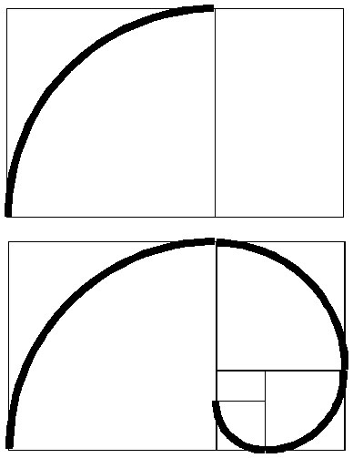
... I'm not saying Henri didn't understand the Golden Mean but rather that that photo doesn't exhibit it. This is how phi actually works and how he employed it


daveleo
what?
This wonderful discussion is much more interesting than the photo under discussion.
However, a fault that people have is they place the entire weight of HCB's skills and reputation behind every one of his pictures. Certainly his visual instincts were as incredible as reputed, but that doesn't mean that every picture he issued was incredible. Sometimes people over-analyze what they are looking at. This leads to wonderful discussions (like this one), but doesn't actually make the picture any better than what it is. If that shot was posted in the gallery here, it would probably get 3 "I like it" (not from me !) and that's about all.
George61d
Member
This wonderful discussion is much more interesting than the photo under discussion.
However, a fault that people have is they place the entire weight of HCB's skills and reputation behind every one of his pictures. Certainly his visual instincts were as incredible as reputed, but that doesn't mean that every picture he issued was incredible. Sometimes people over-analyze what they are looking at. This leads to wonderful discussions (like this one), but doesn't actually make the picture any better than what it is. If that shot was posted in the gallery here, it would probably get 3 "I like it" (not from me !) and that's about all.
I think that is a good point, and it is why I spent time with this image. It just not stand out as a great.
Nando
Well-known
It is refreshing to see a thread on RFF actually discussing HC-B's images instead of what lenses he used!
HC-B studied under André Lhote so he would have extensive knowledge of classical drawing and design. He used the golden ratio as well as the root system of design and he knew instinctively where everything sat in the frame. The 1.5:1 frame used with a Leica is close to the Golden Rectangle and also close to the Root-2 rectangle. The 1.5:1 frame can be constructed exactly with two overlapping Root-4 rectangles. HC-B used all of this knowledge for composing.
One thing that I really admire about HC-B is his use of a gamut; simplifying an image to just a few dominant lines. For example, the following photo where the dominant lines are the horizontal, the vertical and the 45-degree diagonal. This image is also composed very accurately using overlapping Root-4's.
© Henri Cartier-Bresson/Magnum Photos
Yes, I'm in complete agreement. Composition (geometry) is visual grammar and shouldn't necessarily be the subject.
HC-B studied under André Lhote so he would have extensive knowledge of classical drawing and design. He used the golden ratio as well as the root system of design and he knew instinctively where everything sat in the frame. The 1.5:1 frame used with a Leica is close to the Golden Rectangle and also close to the Root-2 rectangle. The 1.5:1 frame can be constructed exactly with two overlapping Root-4 rectangles. HC-B used all of this knowledge for composing.
One thing that I really admire about HC-B is his use of a gamut; simplifying an image to just a few dominant lines. For example, the following photo where the dominant lines are the horizontal, the vertical and the 45-degree diagonal. This image is also composed very accurately using overlapping Root-4's.

© Henri Cartier-Bresson/Magnum Photos
I don't think that composition is a particular "selling point" of that image. The combination of the facial expression and the hat probably are the elements that "make" the shot.
Yes, I'm in complete agreement. Composition (geometry) is visual grammar and shouldn't necessarily be the subject.
robklurfield
eclipse
The discussion of the Golden Mean, the cross and the lamp in this image is all interesting and perhaps somehow related to what HCB was aiming for here. That said, what grabs me about the image and what I consider to be the planes of action here are Roualt's face and hands.
If you're Annie Leibowitz, you set up a studio shoot and you control the mise-en-scene, adjusting the props as you wish. If you're HCB shooting a portrait, I suspect you're more likely to have captured your subject in his or her native habitat, in which case you're dealing with the totems that came with the setting. Still, the choice of where to frame those artifacts matters if you're any good at this, and I'm sure there was no accident here.
I suspect that given HCB's training and experience, he never had to really think, "gee, I'll frame for the rule of thirds and the golden mean here." I think it must have been reduced to a reflex. A very refined and well-calibrated reflex, but more a way of seeing that became automatic rather than needing to be calculated.
I'm no certainly HCB, but I've taken enough photographs as this point in my life that I make such decisions just because that's how I see the world.
On the topic of decisive moments, it helps to see examples of "outtakes" from HCB's (or anyone else's images for that matter) to realize that they didn't always catch what they wanted with just one frame. There was a very interesting show of Magnum images contact sheets a while back (it's been published in a book; see this link:
http://www.nytimes.com/2011/12/04/books/review/the-magic-of-magnum.html?_r=0
Quoting from that article in the NY Times, you get the perspectives of Cartier-Bresson, Elliott Erwitt and Leonard Freed:
“It’s generally rather depressing to look at my contacts,” Elliott Erwitt tells Kristen Lubben, the editor of MAGNUM CONTACT SHEETS (Thames & Hudson, $150), a magnificent compendium of raw images from the photography cooperative. “One always has great expectations, and they’re not always fulfilled.” Henri Cartier-*Bresson, a Magnum founder, so hated the idea of someone pawing through his outtakes that he once bragged about throwing out his negatives “in the same way as one cuts one’s nails.” Contact sheets “are mostly a waste of money,” the photographer Leonard Freed once declared, though he added: “Because it is a waste of money, I love them.”
charjohncarter
Veteran
Old book but it is all here and probably common amoung art students of HCB era:
http://www.scribd.com/doc/49231966/Art-Of-Composition
Share:
-
This site uses cookies to help personalise content, tailor your experience and to keep you logged in if you register.
By continuing to use this site, you are consenting to our use of cookies.