umcelinho
Marcelo
I've seen some photos of the M-E apart from the official ones and noticed no cyan tint, just a darker gray M. I like it. I don't miss the preview lever as well.
The question is still, is the camera UGLY?
That's like saying Grace Kelly was butt-ugly when she painted her nails in the wrong colour.
+1 for "I don't understand what the fuss is about".
How is slate grey more vulgar than black paint or chrome? I REALLY don't understand this. And, unlike many, I have seen the camera. Looks fine to me.Yes, the color scheme is vulgar. Like when auto manufacturers try to doll up a cheap cars by putting gold or chrome accents on them. Vulgar! But nothing a can of spray paint wouldn't fix.


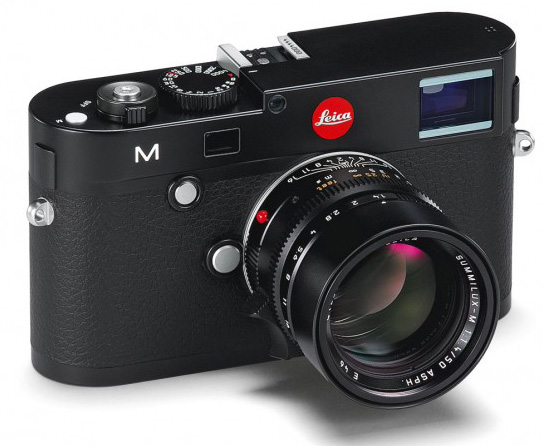
How is slate grey more vulgar than black paint or chrome? I REALLY don't understand this. And, unlike many, I have seen the camera. Looks fine to me.
What next: is an olive drab M1 ugly? Or a Three Crowns IIIg? Grey USAF M2? MP Anthracite? De gustibus non disputandum.
...
Cheers,
R.