Is this pciture great, ok or crap?

S

Socke

Guest
Sorry for posting it here but the critique forum dosen´t allow a single request for input and since I want lots of words this is not a w\nw.

Any moderator is invited to move this to an apropriate subforum 🙂

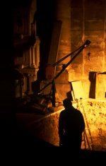
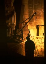
So to my question, what do you think about this picture?

Do you have any hints for postprocessing?

Any hints for retaking the shot if I ever get the oportunity?
It is straight out of the scanner without postprocessing, save for resizing, and no digital pushing.

Taken with a Contax G2 and 35-2 on Elitechrome 400 at 1\15th of a second.
 
I think it's pretty cool, but I think I would want to see more detail of the worker. Background is awesome, but it's not enough to carry the shot IMO.
 
It all depends on what image you are going for. You have stretched the limits of the film about as far as you can. In PhotoShop, you could go for a profile of the workman, or try to lighten it up to gain more detail. Its a pretty demanding scene.

Jim N.
 
I'd like to see more detail of the worker as well. Not necessarily more light on him, but perhaps a cleaner proflie. A lower angle so that he's larger in the frame would help.
 
well I would crop out a chunk of the black on the left and bottom of the image. Leave some in, but I don't think that much is needed. I like the shot over all, but I sorta feel like I am left thinking I want more to this story. Is it an old church being renovated? A theatre perhaps? I'd like to see a whole series on this!!!!
 
Yep, I'll get rid of some of the dead space on the lower left too. Highlights are a little blown. I'd prefer a closer shot of the worker, the silhouette is a nice idea but it would be great for a little more definition in the outline. Nice colors, makes a great avatar.
 
I wouldn't crop a thing. I think that negative space (the very dark area) adds to the picture. You should make those shadows black, not hazy dark grey, as it now looks. A little bit of saturation may add to the effect; you have a pseudo-monochromatic photo here, so the saturation may make the bright parts feel even brighter. I don't understand why people must always see details of all things all the time: shadows are also a means of expression, and not everything has to be shown.

This one has potential. I know that many people work magic with Photoshop, and will not share their secrets (I've asked and they've politely kept silent). I would share mine if I had any to share, but when it comes to scanned slides, my skills are very limited.
 
I like it :shrug:

What's he doing? What's that thing on the left in the background? It looks like a decoration of some sort. Is this underground or at night? Is there a dead body in the hole he's looking at, is he taking a small break and checking out his handiwork? In the abscence of context, the photo is probably more interesting than the actual scene lol.

In my opinion, the black space at the left and bottom serve to frame the image, and give an indication of depth. I wouldn't crop it out, IMHO.
 
Last edited:
I like it, but I'm not in love with it.. the colors are very appealing, altho I'd probably tweak it a bit to lose the details in the blacks and go for a silhouette.. the negative space works well, so I wouldn't crop it (much).. but the slight tilt bugs the hell outta me, so that would be the main thing I'd adjust

as for negative aspects.. I'm not crazy about the location of the figure.. or rather, I really don't like the line that's protruding from his shoulder off to the right.. all photo purists ignore the next comment, but I'd PS that out.. here's a quick example
 

Attachments

  • vh67.jpg
    vh67.jpg
    84.5 KB · Views: 0
This image perplexes me a bit. Firstly, it's anything but "crap", but there's nothing really pulling me in, piquing my curiosity beyond the somewhat interesting lighting (though not quite interesting enough to carry the whole image outright). Also, as far as viewing the image on my laptop screen goes, believe it or not, I think that a selective increase in contrast could help.

Beyond this, I leave it to you. My tendency toward critique is that I simply either like the image or not, quietly passing over the stuff I consider dross, and comment only on what I find at least somewhat interesting. This image is somewhat interesting to me, but simply needs work to be more interesting.

And, if you get a second chance at shooting at this site, in this light, I highly recommend you take it, and take some time to explore that space.

(I guess I'm not having a Simon Cowell moment tonight...)


- Barrett
 
Last edited:
one option

one option

I'd either leave it alone, as our junkie friend advises, or else make this of it. Too much post processing and it won't remain a photograph.
 

Attachments

  • vh67c.jpg
    vh67c.jpg
    188.1 KB · Views: 0
yes, it was in a church, or better the crypt beneath the Almudena cathedral in Madrid.
I took the shot and was pretty sure it wouldn't turn out at all since I shot as slow a speed as I dared.

Then it didn't look too bad on the lightbox so I scanned it and put it away as something to learn from, yesterday I went through that folder and liked the picture better than on the time I scanned it but didn't know what to do with it, crop out the shaddows, lighten them etc.pp.

I had the flash on my other body with the slower 28 loaded with E100 but I still think flash would have spoiled it, the colors are pretty much how I remember them.

The scene was pretty scary, the crypt is very dark accept in the middle where they have some lights in the arches pointing to the ceiling and at the outside are alcoves where important people are burried. This is in one of those alcoves.

Thanks for your input!
 
Has some indiana jones feel to it, but i am not sure i understand what it is. Maybe you will like it yourself because, just as someone upstairs said, 'you've been there.'
 
Back
Top Bottom