lubitel
Well-known
Hi All,
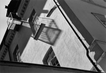
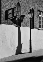
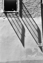
I would like to hear some opinions about the 3 photos here. Feel free to say what you feel, I am not looking for praise. I am just not sure what to think of them.
On one hand I like to take pictures in such situations where the shadows are long and contrast is high -- on the other hand I always have a feeling that I am doing something cheesy or overdone. What are your thoughts on this?