PetarDima
Well-known
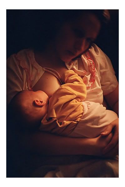
Dear RFF friends, I'm considering this shot for photo contest. It's taken under low light with BESSA R2M/Rokkor 40mm combo with Studio 35 ISO color film.
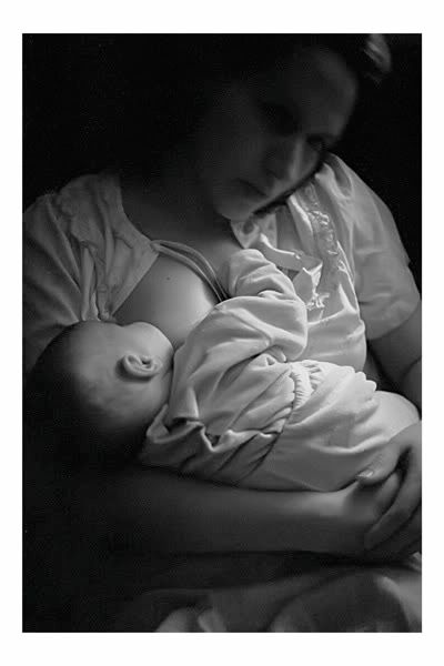
When I saw a scan for a first time I was happy to see that something was ''happened'' on that shot. Which one is better ?( of course, maybe both are bad ):


Carlos Cruz
Established
Great photo. I'll vote for colour version,it has uniform warm palette, the effect is really nice, no need to go B&W it's almost monochrome in colour, and really nice.
gb hill
Veteran
I like the color shot better. The film has nice skin tones and I like how the shadow in the mothers face looks. In the B&W print,and it just may be my monitor or my eyes, but to me the mothers face looks kind of blurred, in the color shot it does not look blurred but more soft as it should. But like I said it may be just me. Nice shot Petar and good luck with the contest.
yarinkel
yarinkel
Hi, I like the color shot better, the warm colors convey the feeling of, well, warmth better that the B&W version.
peter_n
Veteran
I like the color shot best too Vlad. Warm tones are perfect for the subject. Hope you and your family are well!
PetarDima
Well-known
great help for me, O.K. color wins 
PetarDima
Well-known


This is the rest for contest - both are taken with Fujifilm S 65oo fd digicam.
nico
Well-known
Beautiful photos as usual from you. About the nursing shots, I too prefer the colour one.
Ciao
Ciao
ferider
Veteran
These are great, Vlad. The color version of "Nursing" is outstanding !
Best,
Roland.
Best,
Roland.
Tuolumne
Veteran
Ok, I'll go against the grain here. I usually prefer color shots, but in this case I prefer the B&W. The color seems distracting. The B&W reduces everything to its essence and emphasizes the shapes, forms, and mood.
/T
/T
Rhoyle
Well-known
I'm glad I'm not the only one. I think the bw shot displays a much better mood than the color. The fact that the mother's face is blurred doesn't bother me at all. Her face isn't the subject, the nursing baby is. Also, the skin tone and smoothness if texture is quite beautiful in the bw. To me the color version looks like a great shot that needs to be color balanced. Could be I've missed the point, but the bw does it for me.
BH
BH
PetarDima
Well-known
Tuolumne said:Ok, I'll go against the grain here. I usually prefer color shots, but in this case I prefer the B&W. The color seems distracting. The B&W reduces everything to its essence and emphasizes the shapes, forms, and mood.
/T
Well ... here we go again !
I'm glad that I can see different opinions
In general, I prefer B&W shots ... I like it so much that I can almost say that 90%
of them are O.K. for me ... but there is several things to think about:
the rest is in color too ... I think that ''mixed'' photos ( color & B&W ) won't be
good solution for contest.
at the end, it's not question about good or bad photo, it's a matter of someones taste ... I like B&W ( did I said it again? ) blured photos ... but the gentleman
from photo clubs don't share my opinion
raid
Dad Photographer
Hello Petra,
Thanks for posting images and asking us for our opinions.
The light is dim and the facial features are unclear, so a B&W version is bland in my view. It is only an opinion that we have.
I would not just try to please the people at the photo clubs. Go with what you like and see as "good work".
If you go with the color version, I would slightly reduce the reds.
Attachments
PetarDima
Well-known
raid said:Hello Petra,
Thanks for posting images and asking us for our opinions.
The light is dim and the facial features are unclear, so a B&W version is bland in my view. It is only an opinion that we have.
I would not just try to please the people at the photo clubs. Go with what you like and see as "good work".
If you go with the color version, I would slightly reduce the reds.
Thank you, Raid! In original, that picture is more yellow, like your version, but
I thought that that won't be good solution : people shoot 99% digital these days,
and picture like that can be judged like '' wrong white balance '', right?
Because of that I put blue filter in PShop to get more ''cold'' colors.
raid
Dad Photographer
I meant "Petar", of course! My typo came out as "Petra". Sorry.
For the B&W version I would either add contrast and make the face of your wife darker so that the image is more abstract or go the other way and add with CURVES some details to her face. Try it out. Maybe you will like one of the options.
Attachments
Tuolumne
Veteran
There is alot that can be done to the B&W to emphasize differnt feelings, moods, etc. Here's an example, perhaps not to everyone's taste, but I like it. Petar, I think that ultimately you are going to have to use your own artistic judgement, since everyone here will just have their own.
/T
/T
Attachments
FrankS
Registered User
My preference is the B+W one Vlad. I'd darken (burn in) the bottom of the pic below mother's arm, and the right edge.
Very nice!
Very nice!
P. Lynn Miller
Well-known
Petar,
We took a vote at our house, the result was an even split between the color and B&W. I personally prefer the B&W, but also really like the color. I have a tendency of sticking with the original medium. If I shot the photo in color, then it will always remain color, and of course, if shot on B&W film, the image will always be B&W. Maybe it is because, when I am shooting, I am visualising the final image in the medium in my camera. So while I prefer the B&W, I would perfect the color for this magnificent image.
As for the gentlemen at the photo club, I would exhibit the work you believe is your best and let the chips fall.
S
Scarpia
Guest
I prefer the color (great shot) but agree with Raid that the red could be reduced a bit.
Kurt M.
Kurt M.
FrankS
Registered User
Share:
-
This site uses cookies to help personalise content, tailor your experience and to keep you logged in if you register.
By continuing to use this site, you are consenting to our use of cookies.