ferider
Veteran
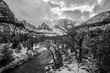
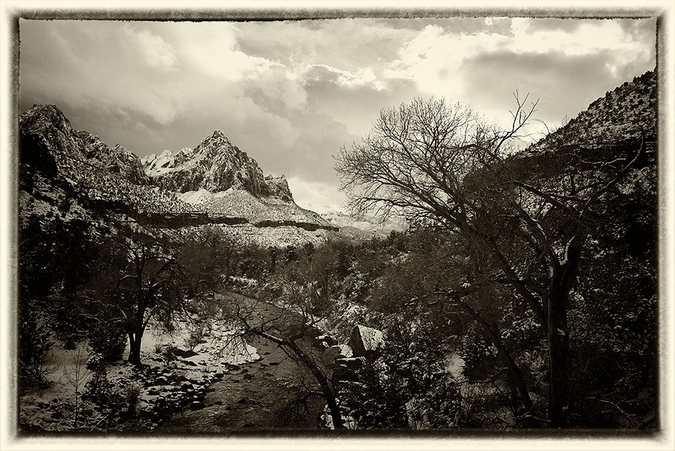
I've often wondered how much I loose due to lack of post-processing skills, and I know RFF has many experts. So, on the last day of 2016, let me pose you this challenge: Last week, I took 3 similar landscapes, in Zion National Park / Utah, on 2 different days, with two different lenses (28/2 Ultron and 21/2.8 pre-asph Elmarit), with my M240.
Here are three Lightroom exported "raw" color TIF files:
Day 1 / 28 Ultron: https://www.dropbox.com/s/yw4x7pyqmbqx8bb/L1000323raw.tif?dl=0
Day 1 / 21 Elmarit: https://www.dropbox.com/s/sr09vhyrv1eaxmt/L1000325raw.tif?dl=0
Day 2 / 21 Elmarit: https://www.dropbox.com/s/co2ti8931in50y5/L1000332raw.tif?dl=0
Here are my own PP results:


If you want to participate, show us what you can do with the above raw files. Pick your favorite of the three, and post-process however you like (any manipulation goes, color or B+W, dodging and burning, distortion correction, etc), and post the result in this thread in-line, 1200 pixel wide, please. And tell us what you did and with which tool (enough to teach me") ). I've been around RFF a while, and you know from my posts that I like color pictures too ....
). I've been around RFF a while, and you know from my posts that I like color pictures too ....
After 1 week, on January 7, 2017, I will pick whatever result I like best. The "winner" will get one of 3 lenses, her or his choice: either a black 35/2.5 Color Skopar LTM (v2), or a 40/2 CLE Rokkor (showing 35mm frame-lines), or a relatively late chrome Nikkor 85/2 LTM; the lenses work well and have clean glass.
And even if you don't want to participate, of course feel free to comment on the pictures that we will see.
You all have a happy new year !
Roland.
Here are three Lightroom exported "raw" color TIF files:
Day 1 / 28 Ultron: https://www.dropbox.com/s/yw4x7pyqmbqx8bb/L1000323raw.tif?dl=0
Day 1 / 21 Elmarit: https://www.dropbox.com/s/sr09vhyrv1eaxmt/L1000325raw.tif?dl=0
Day 2 / 21 Elmarit: https://www.dropbox.com/s/co2ti8931in50y5/L1000332raw.tif?dl=0
Here are my own PP results:
If you want to participate, show us what you can do with the above raw files. Pick your favorite of the three, and post-process however you like (any manipulation goes, color or B+W, dodging and burning, distortion correction, etc), and post the result in this thread in-line, 1200 pixel wide, please. And tell us what you did and with which tool (enough to teach me
). I've been around RFF a while, and you know from my posts that I like color pictures too ....After 1 week, on January 7, 2017, I will pick whatever result I like best. The "winner" will get one of 3 lenses, her or his choice: either a black 35/2.5 Color Skopar LTM (v2), or a 40/2 CLE Rokkor (showing 35mm frame-lines), or a relatively late chrome Nikkor 85/2 LTM; the lenses work well and have clean glass.
And even if you don't want to participate, of course feel free to comment on the pictures that we will see.
You all have a happy new year !
Roland.
Last edited:
excellent challenge and prizes!
tuanvinh2000
Well-known
Hi Roland,
From your 3 captures I enjoy the last one the most so i would pick it to try my editing workflow. This one has the most dynamic lighting so i thought it has potentials with a few adjustment. I use SilverFX first to convert to BW then lower the contrast, increase structure and add graduated filter on both side of the photos. The river and the snow creates a good contrast against the trees. Anyway what a view that you had in Zion!

From your 3 captures I enjoy the last one the most so i would pick it to try my editing workflow. This one has the most dynamic lighting so i thought it has potentials with a few adjustment. I use SilverFX first to convert to BW then lower the contrast, increase structure and add graduated filter on both side of the photos. The river and the snow creates a good contrast against the trees. Anyway what a view that you had in Zion!
gb hill
Veteran
Well you just proved to me you don't need to be like Ben Horn & lug a LF camera around Zion to get good photographs. eventhough I love his work & video's.
That Ultron is amazing. My favorite of the 3. Good luck to the participants. This competition is way out of my skills but will be fun to watch.
That Ultron is amazing. My favorite of the 3. Good luck to the participants. This competition is way out of my skills but will be fun to watch.
brbo
Well-known
You have to start with something like this when you shoot digital? Suddenly scanning negative film doesn't feel like that much trouble.
You'd probably get something like this shooting cheap fuji 200 film and using 1-hour minilab develop&scan (I used LR for processing):

Edit: As most participants explained in detail their thought process behind their rendition... here is mine:
- get some believable colours into the underexposed parts after correcting the exposure. I don't think there are too many trees up there now sporting the bright fresh greens of early spring that you get if you blindly lift the shadows. At the same time you need to create some color separation, this is probably the hardest challenge.
- create/keep the play between warm low winter sun and cold shadows. After setting general color temperature, use the brush to adjust parts of the scene. You want to feel the cold of the winter scene and...
- ...still squint your eyes because of all the sun hitting the scene. Don't try to get the reflections in the river in check, get them up to just below 100% so you can still control the color you want them to peak at.
- add clarity and grain to get rid of plastic digital feel
- if you are doing color version, make it attractive but keep it believable
With BW, pull out (almost) all the stops. My "Xpan" version:

You'd probably get something like this shooting cheap fuji 200 film and using 1-hour minilab develop&scan (I used LR for processing):
Edit: As most participants explained in detail their thought process behind their rendition... here is mine:
- get some believable colours into the underexposed parts after correcting the exposure. I don't think there are too many trees up there now sporting the bright fresh greens of early spring that you get if you blindly lift the shadows. At the same time you need to create some color separation, this is probably the hardest challenge.
- create/keep the play between warm low winter sun and cold shadows. After setting general color temperature, use the brush to adjust parts of the scene. You want to feel the cold of the winter scene and...
- ...still squint your eyes because of all the sun hitting the scene. Don't try to get the reflections in the river in check, get them up to just below 100% so you can still control the color you want them to peak at.
- add clarity and grain to get rid of plastic digital feel
- if you are doing color version, make it attractive but keep it believable
With BW, pull out (almost) all the stops. My "Xpan" version:
Huss
Veteran
Very generous of you Ferider.
Corran
Well-known
I preferred the dramatic clouds of the first. The low-contrast unlit foreground was several stops underexposed, so I wrenched the file around a lot to make this lonely, wintery scene:

List of Lightroom (5.3) edits:
Slight tweak to warm up the color temperature (+5)
+2 1/3 stop exposure
2-stop virtual GND filter for the top 3rd
Dodging around where the GND filter cut into the mountains
A bit of tweaking on the highlights/shadows/vibrance
Very slight S-curve
Wrenched around the colors to my liking, especially the blues
Removed chromatic aberrations that really messed up the tree branches against the sky
Slight vignetting
By the way, you stipulated 1200px wide, but the forum software is crushing it down to 1000px, making it a bit unsharp looking. Click the photo to see the 1200px version. I would post it at 1000px instead but I wanted to follow your rules.
Huss
Veteran
So many different ways to go, depending on taste. What is important is the fact that the exposure with your raw files allows you to do that. My attempt playing with it in LR, adjusting the sliders and giving it a bit of clarity.

expwmbat
Member
Number 2, B&W
Number 2, B&W
The second photo seemed like the biggest challenge, but I like the sharpness and potential, so I tried. Here's what I ended up with (and I can screenshot the LR adjustments if you want them).
BTW, thanks for the chance--this is a sweet opportunity.
Cheers,
Daniel
Number 2, B&W
The second photo seemed like the biggest challenge, but I like the sharpness and potential, so I tried. Here's what I ended up with (and I can screenshot the LR adjustments if you want them).
BTW, thanks for the chance--this is a sweet opportunity.
Cheers,
Daniel
Attachments
Last edited:
ferider
Veteran
Thanks, GB.
Good question (and PP). The way I've been observing others digital use over the last couple of years (i only shot film until 2014/E) is that people shoot either (1) jpg with in camera post and minimal manual post processing or (2) try to get max information in raw and do everything in post. The 240 can generate quite good jpg files with various film filters, etc. But I do (2), and tried to expose to keep max. Info in the raw files (consider the large dynamic range of the 3 scenes - which is why the foreground is underexposed).
Keep them coming all.
Roland.
You have to start with something like this when you shoot digital? Suddenly scanning negative film doesn't feel like that much trouble.
Good question (and PP). The way I've been observing others digital use over the last couple of years (i only shot film until 2014/E) is that people shoot either (1) jpg with in camera post and minimal manual post processing or (2) try to get max information in raw and do everything in post. The 240 can generate quite good jpg files with various film filters, etc. But I do (2), and tried to expose to keep max. Info in the raw files (consider the large dynamic range of the 3 scenes - which is why the foreground is underexposed).
Keep them coming all.
Roland.
tuanvinh2000
Well-known
i really like Corran color edit. thumps up!
Corran
Well-known
Thanks. I used to teach adult education courses on Lightroom and Photoshop so I know my way around them well (despite shooting mostly film!).
I couldn't resists doing one more, I hope you don't mind. I wanted to do a b&w edit, and this is my "Ansel" version:

This was mostly contrast edits, virtual red filter, local d&b and curve edits, and some Photoshop trickery.
I couldn't resists doing one more, I hope you don't mind. I wanted to do a b&w edit, and this is my "Ansel" version:
This was mostly contrast edits, virtual red filter, local d&b and curve edits, and some Photoshop trickery.
Brando
Member
maybe a little over processed

All in photoshop, using non-destructive smart layers
Cropped a little
Black and white conversion layer, then played with the sliders to mimic a heavy red filter
Levels adjustment 1 to bump up contrast in sky
Levels adjustment 2 to bring out highlights in everything not sky.
All in photoshop, using non-destructive smart layers
Cropped a little
Black and white conversion layer, then played with the sliders to mimic a heavy red filter
Levels adjustment 1 to bump up contrast in sky
Levels adjustment 2 to bring out highlights in everything not sky.
Hern
Established
 L1000323raw-1-2 by herniumhern, on Flickr
Done in Lightroom, using a lot of the Adjustment Brush tool and the curves. And of course the extreme crop to fit it to more the way I see the scene - it's the closest I can get to recomposing the shot!
johannielscom
Snorting silver salts
Roland,
nice challenge! Happy New Year to you and all!
I chose file #2, since it was my least favorite. I feel that if your skills in post processing are up to snuff, it shows in the ability to get a good result out of the toughest file, not the easiest.
Here's my result (in Lightroom, Photoshop is only reserved for cloning business but not tonality etc in my workflow), and alongside you can see most of the processing I did:

As you can see, I left the contrast slide alone. Its rendering mostly is way too coarse in my book.
Also, I do not convert the image to digital B&W. Instead, I keep the file a color file but set all saturations to 0%. That allows me to still wiggle each color's luminance and define 'acutance' between colors through that.
I use clarity to increase sharpness and leave the standard sharpening alone.
Further down (outside the screen shot) I also added a wee bit of lens vignetting so the image will 'beckon the viewer in' and a bit of grain and presto! your personal Ansel Adams shot! With some nice and rich curves from black to white.
I'll send you a download link off my web space for the full-sized file.
Thanks for a nice challenge, may the best (wo)man win!
And if fate will have it I get to pick a lens, I will put my own lens up to pay it forward.
nice challenge! Happy New Year to you and all!
I chose file #2, since it was my least favorite. I feel that if your skills in post processing are up to snuff, it shows in the ability to get a good result out of the toughest file, not the easiest.
Here's my result (in Lightroom, Photoshop is only reserved for cloning business but not tonality etc in my workflow), and alongside you can see most of the processing I did:
As you can see, I left the contrast slide alone. Its rendering mostly is way too coarse in my book.
Also, I do not convert the image to digital B&W. Instead, I keep the file a color file but set all saturations to 0%. That allows me to still wiggle each color's luminance and define 'acutance' between colors through that.
I use clarity to increase sharpness and leave the standard sharpening alone.
Further down (outside the screen shot) I also added a wee bit of lens vignetting so the image will 'beckon the viewer in' and a bit of grain and presto! your personal Ansel Adams shot! With some nice and rich curves from black to white.
I'll send you a download link off my web space for the full-sized file.
Thanks for a nice challenge, may the best (wo)man win!
And if fate will have it I get to pick a lens, I will put my own lens up to pay it forward.
KEH
Well-known

Image #2. After playing with BW, I decided that subtle colour would be best. The immediate problem is the patch of blue sky, so a crop to 16x10 gets rid of that. The rest is mostly basic LR tonality - black level, highlights, shadows, clarity. I pulled up the brightness with a curve and used the adjustment brush to tame some of the cloud highlights. Added a touch of warmth and saturation. That's it. I can send a screen shot if interested.
A larger version is here:
https://photos.smugmug.com/Temp/Test/i-CH2sdcb/0/O/L1000325raw-2.jpg
Kirk
kxl
Social Documentary
The scene called for sepia and rough borders.
benmacphoto
Well-known
Very nice idea for a thread.
Here is my version.
I used Silver Efex Pro 2 and adjusted brightness and contrast, color filters, film settings, and curves.

Here is my version.
I used Silver Efex Pro 2 and adjusted brightness and contrast, color filters, film settings, and curves.
peterm1
Veteran
OK. My thoughts on these images are these
1 The post processing you commit to all depends upon your vision for the picture. Don't fall for the trick of always using black and white (for example) because that is what you always do, let the image "speak" to you. OK I realize I am setting myself up for a fall here as most will know that I often shoot in color and process the final image to another color version of that color image. But I think this image cries out for some color to accent the snow and deep shadows. So - starting point....what is your vision for the image? Mine is as described above.BTW sometimes I change as I proceed with processing as I realize the image is just not working in color or just not working in black and white and then I take it the other way. But it always starts with a vision of how i think it will work best and then this is tested against reality. It is no good having technical skills if the artistic vision is missing (and of course, visa versa).
2 In this case the RAW images are pretty dark and gloomy as you often expect when shooting in snowy conditions given how this affects camera metering. So that's also a consideration in the final image. I am betting real life scene did not look like the files provided because images seldom come out of the camera looking like they did when they went in.
3 When working on any file, it is useful to have a standard workflow and to pretty well always start with that workflow before then applying the custom edits that you think the photo requires. I will explain mine in a moment.
4) It is also useful to have a good powerful set of editing tools that you have experimented with, used for a while and pretty well understand. Having said this you will often find that it is necessary to backtrack on your edits as you try them and perhaps find they are not working as you expected. Be prepared to try different things. I do not usually use "layers" much these days, with one or two exceptions, as they are complex and a bit slow to use, at least for me. Instead I use the Nik tool set which is available free on the internet. I run the Nik suite under either Lightroom or Corel Paintshop Pro. Or if you prefer you could use Photoshop or something else as the host program. It does not really matter as most of the hard lifting is done by the Nik products. They are quite easy to learn and powerful. But the basic workflow can be done in any image editing software.
5) So here is my routine. First start with the basic workflow. You can use any image editor (Lightroom, Photoshop, Photoshop Elements etc) you favor with these edits as they are standard to them all. My starting point always is fixing camera noise. In modern sensors this is less of a problem than it used to be just a few years ago, but its still part of my process as even if there is only a bit of noise it is good to get rid of it. Then I move on to adjusting overall image brightness to lift the image if needed. This image did need it. I then adjusted tone and global contrast. In this image global contrast needed reducing as contrast was harsh as is often the case in images like this with snow etc. which results in deep shadows and bright areas. This cna be done using the "curves" tool but if you are proficient in using layers you can create a layer mask to lower contrast. That is too difficult to explain here. I will also adjust color at this time as sometime color balance is off and if nothing else, I want that right before moving on to the next stages. Finally I adjust image sharpness. If there are no further edits sharpness should come last (some argue it should anyway) But as I am not going for strict sharpness I am happy to use this tool partway through my overall process as the danger with images like this is that excessive sharpness in things like leaves and twigs can introduce harsh artifacts into the image. Often the image sharpness I put in at this stage I undo a little in the next. Its all about control and having the "foundation processing" of the image right before trying any custom adjustments in the next stage.
Having got to a point where I am happy with the basics and the image is looking OK I then save it (in case I screw up something in the next stage and need a backup) and move to the fancy stuff - the customized processing. Remember as you work on each edit - "Genius is the infinite capacity for taking pains". I am not sure who said that but in post processing its true - its all about the details and getting each bit right. (Sorry but that is how it is). If you do not like what you see, undo any edits you have just made and make another save of the file at a point where you are happy with it and then work on another version from there. You may end up with multiple versions of the same image till you are happy with one final image. I often do this.
6) The next stage is where Nik products really come into its own and will save a lot of time and effort. Basically you need to rely upon two tools in the image files we are playing with in this thread. These are Nik Color Efex and Nik Viveza. Using Color Efex first I adjusted the micro contrast using the Tonal Contrast tool. This tool is fantastic and can add a lot of detail back into an image that is otherwise lost. Be careful not to overdo it though as it produces ugly artifacts if applied too strongly. Then I used the Darken / Lighten Centre tool to brighten the foreground area of the image. I used this tool as I have learned that its an easy way to selectively apply either lightening or darkening effects to any images rather than doing it globally. (I used the slider on the tool to prevent the darken effect from darkening other areas though as in this case I was only after a lightening effect on the foreground). There is not much that can be done with the blown highlights in the sky except to keep the edges soft to prevent ugly transitions and to keep them looking like clouds and sky. This can be done with the Nik Selective tool to make sure that this area stays unworked on when applying other edits. I am happy with how the sky looks given that there are blown highlights present - normally they do not look anywhere near so natural. I then lifted the color saturation in the green foliage areas and the red earth / rock areas using Viveza to give it some punch. For me, the two color aspects in the image that work best are foliage along the river and the red in the hills beyond as in real life it is these that might stand out on a cold day when the sun pokes thought the clouds - which is what I was going for in this case as that is exactly what the sun seems to be doing. I also like the tone and detail in the trees in the foreground which appear very naturalistic to me. This kind of image detail adds to the overall effect. I worked hard to make sure that both the brightness and the tonality of this region was "right" to get this outcome as in real life the foreground is the area where you would naturally expect the greater detail to be discernable. If you look carefully you will see that this gives a kind of three dimensional quality to the image even though its not obviously much sharper than the rest of the image.
By the way it helps when processing images like this, to try to get some variation in brightness, tonality and contrast across the image (i.e. to different parts of the image) as that is how it would look in real life. If global edits are applied only there is a risk that the entire image ends up with much the same tone and contrast which gives a somewhat "flat" result. Using the tools I describe (Nik products) it is easy to apply edits selectively to different parts of the image by using the Nik "selective tool" which is in each filter set. In this image the sun appears to be poking through the clouds so my message about variation in brightness, tonality, contrast is especially relevant for a realistic effect in the final image.
7 That's about it. My final touch was to pull the color vivacity back a tad using the Color Efex Brilliance/Warmth filter to make sure the color that I introduced in the last steps was not overdone - this kind of "fiddling" with the image is often needed and must be expected. Oh and I also gave the warmth slider in the above tool a tweak towards blue side as a slightly blue hue always predominates in conditions like those in which the image was taken (too much warmth would look artificial in a snowy scene.) Does this final result look like the scene? I do not know I was not there, but it looks picturesque enough to look as if it could be real and that can sometimes be what matters. (Unless of course you are going for a different outcome as I often do but in images like this I think that this kind of result works).
8 By the way, the above results in an image which when you are done processing in color, could then form the basis for a pretty darn good black and white version of the same image if you want to carry the editing on to that stage - but that's another story. It may seem a lot of work but again - "infinite capacity for taking pains........." etc.
That's it - complicated perhaps but it took me much less time to actually do than it took to explain. I hope this helps. Let me say thank you for your generosity in offering a prize and win lose or draw, I appreciate it. One final thought. Everyone including myself has their favorite methods and tools. I like the Nik ones and Corel Paintshop Pro but there is no reason why much the same edits that I applied could not be applied using other editing tools. It is just I find this mix most efficient for me.

Competition File by Life in Shadows, on Flickr
1 The post processing you commit to all depends upon your vision for the picture. Don't fall for the trick of always using black and white (for example) because that is what you always do, let the image "speak" to you. OK I realize I am setting myself up for a fall here as most will know that I often shoot in color and process the final image to another color version of that color image. But I think this image cries out for some color to accent the snow and deep shadows. So - starting point....what is your vision for the image? Mine is as described above.BTW sometimes I change as I proceed with processing as I realize the image is just not working in color or just not working in black and white and then I take it the other way. But it always starts with a vision of how i think it will work best and then this is tested against reality. It is no good having technical skills if the artistic vision is missing (and of course, visa versa).
2 In this case the RAW images are pretty dark and gloomy as you often expect when shooting in snowy conditions given how this affects camera metering. So that's also a consideration in the final image. I am betting real life scene did not look like the files provided because images seldom come out of the camera looking like they did when they went in.
3 When working on any file, it is useful to have a standard workflow and to pretty well always start with that workflow before then applying the custom edits that you think the photo requires. I will explain mine in a moment.
4) It is also useful to have a good powerful set of editing tools that you have experimented with, used for a while and pretty well understand. Having said this you will often find that it is necessary to backtrack on your edits as you try them and perhaps find they are not working as you expected. Be prepared to try different things. I do not usually use "layers" much these days, with one or two exceptions, as they are complex and a bit slow to use, at least for me. Instead I use the Nik tool set which is available free on the internet. I run the Nik suite under either Lightroom or Corel Paintshop Pro. Or if you prefer you could use Photoshop or something else as the host program. It does not really matter as most of the hard lifting is done by the Nik products. They are quite easy to learn and powerful. But the basic workflow can be done in any image editing software.
5) So here is my routine. First start with the basic workflow. You can use any image editor (Lightroom, Photoshop, Photoshop Elements etc) you favor with these edits as they are standard to them all. My starting point always is fixing camera noise. In modern sensors this is less of a problem than it used to be just a few years ago, but its still part of my process as even if there is only a bit of noise it is good to get rid of it. Then I move on to adjusting overall image brightness to lift the image if needed. This image did need it. I then adjusted tone and global contrast. In this image global contrast needed reducing as contrast was harsh as is often the case in images like this with snow etc. which results in deep shadows and bright areas. This cna be done using the "curves" tool but if you are proficient in using layers you can create a layer mask to lower contrast. That is too difficult to explain here. I will also adjust color at this time as sometime color balance is off and if nothing else, I want that right before moving on to the next stages. Finally I adjust image sharpness. If there are no further edits sharpness should come last (some argue it should anyway) But as I am not going for strict sharpness I am happy to use this tool partway through my overall process as the danger with images like this is that excessive sharpness in things like leaves and twigs can introduce harsh artifacts into the image. Often the image sharpness I put in at this stage I undo a little in the next. Its all about control and having the "foundation processing" of the image right before trying any custom adjustments in the next stage.
Having got to a point where I am happy with the basics and the image is looking OK I then save it (in case I screw up something in the next stage and need a backup) and move to the fancy stuff - the customized processing. Remember as you work on each edit - "Genius is the infinite capacity for taking pains". I am not sure who said that but in post processing its true - its all about the details and getting each bit right. (Sorry but that is how it is). If you do not like what you see, undo any edits you have just made and make another save of the file at a point where you are happy with it and then work on another version from there. You may end up with multiple versions of the same image till you are happy with one final image. I often do this.
6) The next stage is where Nik products really come into its own and will save a lot of time and effort. Basically you need to rely upon two tools in the image files we are playing with in this thread. These are Nik Color Efex and Nik Viveza. Using Color Efex first I adjusted the micro contrast using the Tonal Contrast tool. This tool is fantastic and can add a lot of detail back into an image that is otherwise lost. Be careful not to overdo it though as it produces ugly artifacts if applied too strongly. Then I used the Darken / Lighten Centre tool to brighten the foreground area of the image. I used this tool as I have learned that its an easy way to selectively apply either lightening or darkening effects to any images rather than doing it globally. (I used the slider on the tool to prevent the darken effect from darkening other areas though as in this case I was only after a lightening effect on the foreground). There is not much that can be done with the blown highlights in the sky except to keep the edges soft to prevent ugly transitions and to keep them looking like clouds and sky. This can be done with the Nik Selective tool to make sure that this area stays unworked on when applying other edits. I am happy with how the sky looks given that there are blown highlights present - normally they do not look anywhere near so natural. I then lifted the color saturation in the green foliage areas and the red earth / rock areas using Viveza to give it some punch. For me, the two color aspects in the image that work best are foliage along the river and the red in the hills beyond as in real life it is these that might stand out on a cold day when the sun pokes thought the clouds - which is what I was going for in this case as that is exactly what the sun seems to be doing. I also like the tone and detail in the trees in the foreground which appear very naturalistic to me. This kind of image detail adds to the overall effect. I worked hard to make sure that both the brightness and the tonality of this region was "right" to get this outcome as in real life the foreground is the area where you would naturally expect the greater detail to be discernable. If you look carefully you will see that this gives a kind of three dimensional quality to the image even though its not obviously much sharper than the rest of the image.
By the way it helps when processing images like this, to try to get some variation in brightness, tonality and contrast across the image (i.e. to different parts of the image) as that is how it would look in real life. If global edits are applied only there is a risk that the entire image ends up with much the same tone and contrast which gives a somewhat "flat" result. Using the tools I describe (Nik products) it is easy to apply edits selectively to different parts of the image by using the Nik "selective tool" which is in each filter set. In this image the sun appears to be poking through the clouds so my message about variation in brightness, tonality, contrast is especially relevant for a realistic effect in the final image.
7 That's about it. My final touch was to pull the color vivacity back a tad using the Color Efex Brilliance/Warmth filter to make sure the color that I introduced in the last steps was not overdone - this kind of "fiddling" with the image is often needed and must be expected. Oh and I also gave the warmth slider in the above tool a tweak towards blue side as a slightly blue hue always predominates in conditions like those in which the image was taken (too much warmth would look artificial in a snowy scene.) Does this final result look like the scene? I do not know I was not there, but it looks picturesque enough to look as if it could be real and that can sometimes be what matters. (Unless of course you are going for a different outcome as I often do but in images like this I think that this kind of result works).
8 By the way, the above results in an image which when you are done processing in color, could then form the basis for a pretty darn good black and white version of the same image if you want to carry the editing on to that stage - but that's another story. It may seem a lot of work but again - "infinite capacity for taking pains........." etc.
That's it - complicated perhaps but it took me much less time to actually do than it took to explain. I hope this helps. Let me say thank you for your generosity in offering a prize and win lose or draw, I appreciate it. One final thought. Everyone including myself has their favorite methods and tools. I like the Nik ones and Corel Paintshop Pro but there is no reason why much the same edits that I applied could not be applied using other editing tools. It is just I find this mix most efficient for me.
Competition File by Life in Shadows, on Flickr
ferider
Veteran
Thanks, Peter. Since I did have b+w and red filter in mind when shooting, I'm surprised at your nice color result.
Also - again - the foreground is dark to avoid high lights blowing out. When jpg is the target, the 240 has about 6 stops dynamic range in the shadows that can be used to pull in post.
Typically I bracket 3 shots and select the best for post in conditions like this (snow, etc).
Btw, I am a Corel PSP fan, but don't use any other tools (other than LR for import) - yet.
Roland.
- Status
- Not open for further replies.
Share:
-
This site uses cookies to help personalise content, tailor your experience and to keep you logged in if you register.
By continuing to use this site, you are consenting to our use of cookies.