OK. My thoughts on these images are these
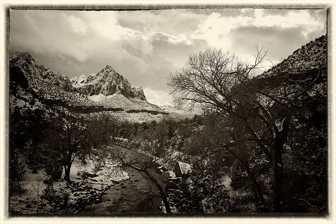
1 The post processing you commit to all depends upon your vision for the picture. Don't fall for the trick of always using black and white (for example) because that is what you always do, let the image "speak" to you. OK I realize I am setting myself up for a fall here as most will know that I often shoot in color and process the final image to another color version of that color image. But I think this image cries out for some color to accent the snow and deep shadows. So - starting point....what is your vision for the image? Mine is as described above.BTW sometimes I change as I proceed with processing as I realize the image is just not working in color or just not working in black and white and then I take it the other way. But it always starts with a vision of how i think it will work best and then this is tested against reality. It is no good having technical skills if the artistic vision is missing (and of course, visa versa).
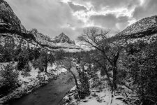
2 In this case the RAW images are pretty dark and gloomy as you often expect when shooting in snowy conditions given how this affects camera metering. So that's also a consideration in the final image. I am betting real life scene did not look like the files provided because images seldom come out of the camera looking like they did when they went in.
3 When working on any file, it is useful to have a standard workflow and to pretty well
always start with that workflow before then applying the custom edits that you think the photo requires. I will explain mine in a moment.
4) It is also useful to have a good powerful set of editing tools that you have experimented with, used for a while and pretty well understand. Having said this you will often find that it is necessary to backtrack on your edits as you try them and perhaps find they are not working as you expected. Be prepared to try different things. I do not usually use "layers" much these days, with one or two exceptions, as they are complex and a bit slow to use, at least for me. Instead I use the Nik tool set which is available free on the internet. I run the Nik suite under either Lightroom or Corel Paintshop Pro. Or if you prefer you could use Photoshop or something else as the host program. It does not really matter as most of the hard lifting is done by the Nik products. They are quite easy to learn and powerful. But the basic workflow can be done in any image editing software.
5) So here is my routine. First start with the basic workflow. You can use any image editor (Lightroom, Photoshop, Photoshop Elements etc) you favor with these edits as they are standard to them all. My starting point always is fixing
camera noise. In modern sensors this is less of a problem than it used to be just a few years ago, but its still part of my process as even if there is only a bit of noise it is good to get rid of it. Then I move on to adjusting overall image
brightness to lift the image if needed. This image did need it. I then adjusted
tone and global contrast. In this image global contrast needed reducing as contrast was harsh as is often the case in images like this with snow etc. which results in deep shadows and bright areas. This cna be done using the "curves" tool but if you are proficient in using layers you can create a layer mask to lower contrast. That is too difficult to explain here. I will also adjust color at this time as sometime
color balance is off and if nothing else, I want that right before moving on to the next stages. Finally I adjust
image sharpness. If there are no further edits sharpness should come last (some argue it should anyway) But as I am not going for strict sharpness I am happy to use this tool partway through my overall process as the danger with images like this is that excessive sharpness in things like leaves and twigs can introduce harsh artifacts into the image. Often the image sharpness I put in at this stage I undo a little in the next. Its all about control and having the "foundation processing" of the image right before trying any custom adjustments in the next stage.
Having got to a point where I am happy with the basics and the image is looking OK I then save it (in case I screw up something in the next stage and need a backup) and move to the fancy stuff - the customized processing. Remember as you work on each edit -
"Genius is the infinite capacity for taking pains". I am not sure who said that but in post processing its true - its all about the details and getting each bit right. (Sorry but that is how it is). If you do not like what you see, undo any edits you have just made and make another save of the file at a point where you are happy with it and then work on another version from there. You may end up with multiple versions of the same image till you are happy with one final image. I often do this.
6) The next stage is where Nik products really come into its own and will save a lot of time and effort. Basically you need to rely upon two tools in the image files we are playing with in this thread. These are
Nik Color Efex and
Nik Viveza. Using
Color Efex first I adjusted the micro contrast using the
Tonal Contrast tool. This tool is fantastic and can add a lot of detail back into an image that is otherwise lost. Be careful not to overdo it though as it produces ugly artifacts if applied too strongly. Then I used the
Darken / Lighten Centre tool to brighten the foreground area of the image. I used this tool as I have learned that its an easy way to selectively apply either lightening or darkening effects to any images rather than doing it globally. (I used the slider on the tool to prevent the darken effect from darkening other areas though as in this case I was only after a lightening effect on the foreground). There is not much that can be done with the blown highlights in the sky except to keep the edges soft to prevent ugly transitions and to keep them looking like clouds and sky. This can be done with the
Nik Selective tool to make sure that this area stays unworked on when applying other edits. I am happy with how the sky looks given that there are blown highlights present - normally they do not look anywhere near so natural. I then lifted the color saturation in the green foliage areas and the red earth / rock areas using
Viveza to give it some punch. For me, the two color aspects in the image that work best are foliage along the river and the red in the hills beyond as in real life it is these that might stand out on a cold day when the sun pokes thought the clouds - which is what I was going for in this case as that is exactly what the sun seems to be doing. I also like the tone and detail in the trees in the foreground which appear very naturalistic to me. This kind of image detail adds to the overall effect. I worked hard to make sure that both the brightness and the tonality of this region was "right" to get this outcome as in real life the foreground is the area where you would naturally expect the greater detail to be discernable. If you look carefully you will see that this gives a kind of three dimensional quality to the image even though its not obviously much sharper than the rest of the image.
By the way it helps when processing images like this, to try to get some variation in brightness, tonality and contrast across the image (i.e. to different parts of the image) as that is how it would look in real life. If global edits are applied only there is a risk that the entire image ends up with much the same tone and contrast which gives a somewhat "flat" result. Using the tools I describe (Nik products) it is easy to apply edits selectively to different parts of the image by using the Nik "selective tool" which is in each filter set. In this image the sun appears to be poking through the clouds so my message about variation in brightness, tonality, contrast is especially relevant for a realistic effect in the final image.
7 That's about it. My final touch was to pull the color vivacity back a tad using the Color Efex
Brilliance/Warmth filter to make sure the color that I introduced in the last steps was not overdone - this kind of "fiddling" with the image is often needed and must be expected. Oh and I also gave the
warmth slider in the above tool a tweak towards blue side as a slightly blue hue always predominates in conditions like those in which the image was taken (too much warmth would look artificial in a snowy scene.) Does this final result look like the scene? I do not know I was not there, but it looks picturesque enough to look as if it could be real and that can sometimes be what matters. (Unless of course you are going for a different outcome as I often do but in images like this I think that this kind of result works).
8 By the way, the above results in an image which when you are done processing in color, could then form the basis for a pretty darn good black and white version of the same image if you want to carry the editing on to that stage - but that's another story. It may seem a lot of work but again -
"infinite capacity for taking pains........." etc.
That's it - complicated perhaps but it took me much less time to actually do than it took to explain. I hope this helps. Let me say thank you for your generosity in offering a prize and win lose or draw, I appreciate it. One final thought. Everyone including myself has their favorite methods and tools. I like the Nik ones and Corel Paintshop Pro but there is no reason why much the same edits that I applied could not be applied using other editing tools. It is just I find this mix most efficient for me.
 Competition File
 by
Life in Shadows, on Flickr