peterm1
Veteran
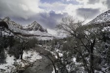
Thanks, Peter. Since I did have b+w and red filter in mind when shooting, I'm surprised at your nice color result.
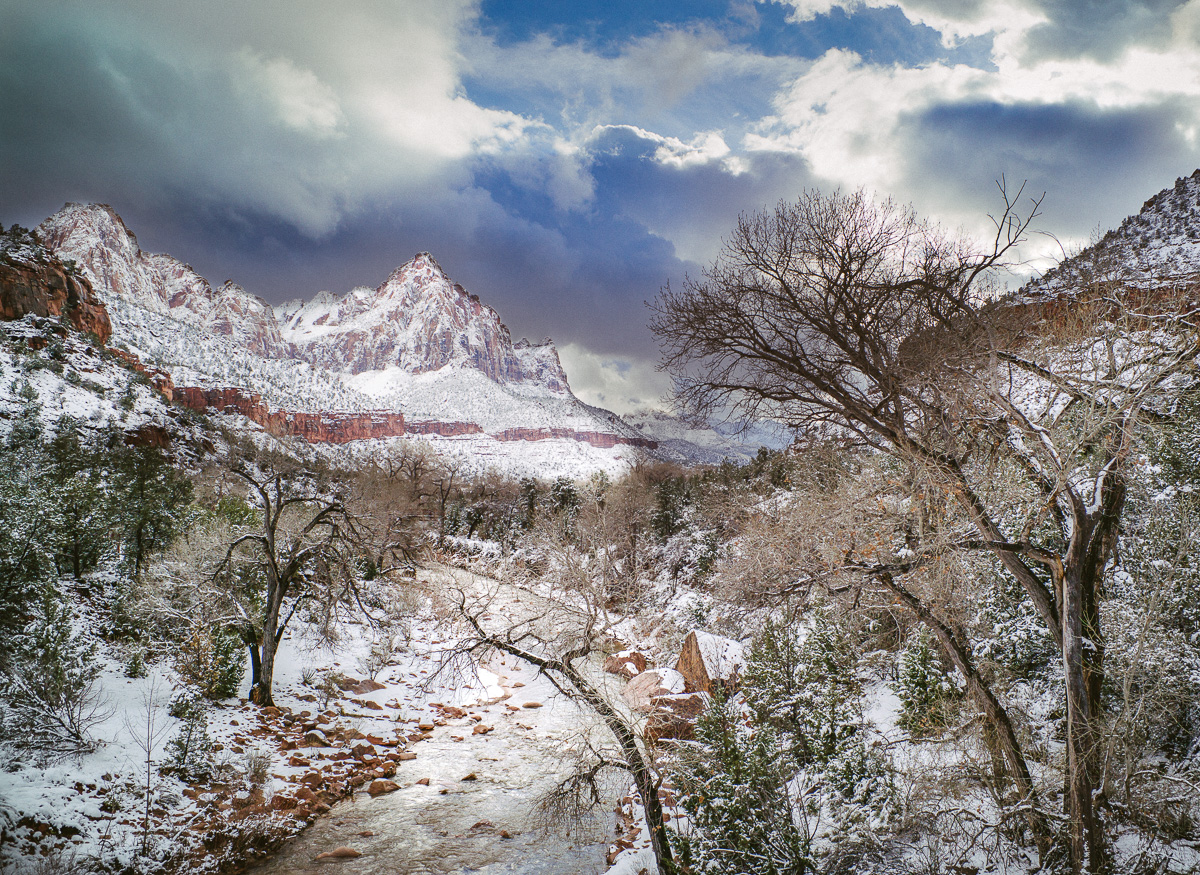
Also - again - the foreground is dark to avoid high lights blowing out. When jpg is the target, the 240 has about 6 stops dynamic range in the shadows that can be used to pull in post.
Typically I bracket 3 shots and select the best for post in conditions like this (snow, etc).
Btw, I am a Corel PSP fan, but don't use any other tools (other than LR for import) - yet.
Roland.
Thanks Roland. I find PSP does everything I need with the addition of the Nik plug ins which provide a lot of power. Much of it could be done in PSP natively but some of it would be harder and take longer - especially the selective editing which I think is very important to many images. Only problem is that the latest 64 bit versions of PSP (they change regularly) do not support the final version of Nik. But I have the older version of Nik to run under my older version of PSP and this still works OK for me.
I habitually shoot a third of a stop under what is metered to minimize blown highlights but in some situations it just can't cope even then. Perhaps I should take three different exposures and merge them. Its something I keep forgetting to do (old habits and all that).
As to the foreground I kept that area a little darker as it appeared to be naturally so given the cloud / sun position. As I said I think that having different areas of an image with different levels of brightness, contrast and tonality can work as the world on a sunlit day is like that naturally. So the image can look more natural too. I lightened the foreground image from that in the RAW file, but kept it a tiny bit darker than the central and background region in the final image as noted above. I also tried a version with stronger foliage and earth colors but it looked too overcooked no matter how I experimented. I guess because colors tend to be muted on a snowy winters day even when the sun is out. One thing you can do with the Nik products though is to selectively apply stronger colors to part of the image then using a global filter pull the overall color in the image back a bit. This still leaves the selected areas a bit more colorful than the other areas though when done this way. That provides a nice accent as with the foliage colors and earth colors in this image.
If you have questions on specifics please let me know I am only too pleased to share info.
lynnb
Veteran

My interpretation tries to bring out the drama and depth in the landscape, particularly the light shining on that central peak and the way the river leads towards it. The dark right foreground is the theatre curtain that provides depth, as does the light illuminating the snowy river bank and river in the left hand corner.
What we have is alternating layers of shadow and light leading into the picture, creating layers of depth: dark right foreground and mountain, sunny lower left snowy river bank and tree and the river itself, dark middle distance in the valley and up the left hand mountain side, sunlit distant slopes and mountain top contrasting against the darker sky behind. The far background has lower contrast which is an atmospheric diffaction artefact of distance.
In fact I see this entire scene as a dramatic theatre of nature. I’ve tried to give that theatre the depth and drama I think it deserves while preserving a natural (believable) looking picture.
Edit: all done in LR4 only
Colour
Custom
Temp 0
Tint -60 (very green) to give better bw tone rendition when saturation=0
Exposure -1.50 to bring highlights within histogram
Contrast -17
Highlights -5
Shadows -17
Whites 0
Blacks +34
Presence +15 to increase edge contrasts/visual ‘bite’
Saturation -100 then using Temp and Tint to adjust tones
Tone Curve
Highlights +40
Lights +25
Darks +68
Shadows +22
Point Curve=linear
sharpening amt=40 Radius=0.8 Detail=35 Masking=0
Four local brush adjustments:
1 sky: Exposure -0.24 Contrast -100, to bring out texture in the clouds and avoid blowing highlights
2 entire foreground/middle ground excluding middle distance mountains
Exposure +0.89 Contrast -43, to get brightness levels near perceptual normal for the light conditions
3. Sweep of river enclosing left hand foreground corner of picture
Exposure +1.12 Contrast +27 Hightlights -50, I saw the snowy river bank and tree on left hand side as important visual elements and wanted to emphasise them, and accentuate the light which is falling on them, which also gives greater depth cues in the picture, as the eye goes from foreground to the feature of the central mountain peak
4. Mountain range in central middle distance including high peak on left
Exposure +1.34 Contrast +100 Hightlights +53 Shadows -43, to me this is the visual focus and given that it’s under a bright hole in the clouds, it needs to be shown as bathed in light (which also illuminates the snowy river bank and water in the left foreground).
grouchos_tash
Well-known
So, here goes...
Global settings:
Exposure +1.35
Contrast +42
Highlights -71
Shadows +33
Whites +25
Blacks 0
Clarity +20
Added a little Sepia to the shadows
Sharpening +60
Post crop vignetting -11
Grain +30
Now here it getting a bit complicated
Graduated from top:
Exposure -1.28
Contrast 0
Highlights -26
Shadows 0
Clarity -15
Graduated from bottom left corner:
Exposure -0.46
Contrast 0
Highlights +97
Shadows +48
Clarity 0
Graduated from bottom right corner:
Exposure +2.04
Contrast 0
Highlights -42
Shadows -55
Clarity 0

(Flickr doesn't do 1200 wide!)
willie_901
Veteran
The exposure for these is excellent. There are no dynamic range issues whatsoever.
Their optimal exposure means file rendering is not limited by signal-to-noise ratio. So the number of aesthetically pleasing renditions is unlimited. These are very nice files.
I was surprised by the purple fringing I saw on the bare tree branches (closest tree on the right) in the first file. I removed these by selectively desaturating the purple hue in LR CC. Lens corrections (defringing slider) worked too. But I preferred the results from selective hue desaturation. This is a nit pick though as I doubt the fringing artifacts would survive in a reasonably sized print.
daveleo
what?
I consider(ed) myself very good at postprocessing effects.
But you folks here are light years beyond anything I can do.
Super stuff !
Gonna sell my computer
But you folks here are light years beyond anything I can do.
Super stuff !
Gonna sell my computer
Scapevision
Well-known

L1000323raw-Edit by Scapevision, on Flickr
Chose to go with colour and the 28 summicron. I liked the drama in the sky and feel like the composition wasn't particularly bad, a great use of the rule of thirds and leading lines. Most importantly, the sky is interesting. So here goes.
1. Put it into Lightroom and use the "Remove Chromatic Aberration" under Lens Corrections. This is to remove any unwanted fringing for when we later boost certain colours. Zoom into the image here.
2. Improve the exposure (develop it for a good print like in the olden days).
I always approach any post processing as a 'fixing' matter. Whatever your camera failed at I can fix. So, in "Basic" adjustment panel I add a bit of yellow and magenta tint (+7, +10), "Exposure" (+0.23), "Contrast" (+7), "Shadows" (+84, seems like your sensor can handle it), remove some "Vibrance" (-18, to make the colour more uniform and slightly desaturated look), add some "Clarity" (+64, again sensor is good).
3. Let's do some sky glorification here. Go to "HSL" panel and use the "eyedropper tool" (looks like a circle with a dot inside) on the "Luminance" tab I click and drag down on the blue portion of the sky to bring it down in luminance. Then do the opposite on the bright portion of the tree to make orange/yellow/red brighter. (My settings were: Blue -63, Orange and Red +100, Yellow +56) Go to "Hue" tab and adjust Blue to the green side a bit (-4). Personal preference here. Go to "Saturation" and add some to Red (+49) to make the cliff face stand out.
4. Take the resulting image to Nik Software Viveza (the best colour adjustment software available free, as it handles colour separately from luminance, much like the LAB mode) and add some "Saturation", don't go crazy here. Add some "Structure" (which is a finer "Clarity" tool). Don't go crazy here as the image is already pushed to the limits of visible artifacts.
5. Back in Lightroom. Use the "Adjustment Brush" to add a bit more "Exposure" to the foreground. Paint it in (+0.75) on the mountains, river and trees, unaffecting sky. Do a bit of desaturation on the sky (-19) and dial down the clarity of sky (-25) using a new brush, covering only the sky portion and a bit of the top of the mountains.
6. Sharpen if needed.
This particular example may be a bit overdone as I did it right after turning my monitor on, so it wasn't exactly representing true calibrated tones and colours, but you get the idea. I believe, this is how modern National Geographic etc images are done
Excuse the softer Flickr resize (I made the photo private, so you probably won't see it on my Flickr, only inline here).
ColSebastianMoran
( IRL Richard Karash )
No. 1, A Lot of Dodging and Burning
Good Challenge.
My focus:
- Dramatic sky
- The peak center left should pop
- Snow should be vivid; the stream should sparkle
- The horizontal rock band (from left to center) has some color. Should show.
- Want to see some detail in foreground trees lower right
- Crop a bit from lower right, but maintain your 28mm point of view. (Cropping into the central peak would be no-fair for this.)
Here's my result. Done with a lot of dodging and burning (Brush adjustments in Lightroom, varying exposure, highlights, shadows, and contrast). Added Clarity at +30 throughout the image.
Probably better done in Photoshop where one has better facilities to create precise masks.

kuuan
loves old lenses
amazing competition, thank you very much ferider!
image No.1, tried to get colors and dynamic range right.

competition red. by kuuan's lens tests, on Flickr
played with all 3, imported them into PS and clicked on an "action" that I set up and which does: auto level, auto curves, auto tones, auto contrast and auto colors. I do that often to see what it does and if it does any good. in these cases the images got brighter with warmer colors, a bit too red and I wanted more green, but I did not revert any step and left it there to be my new starting point.
for the photo seen above:
opened in Color FX pro, add filter "pro contrast" > color correction to +90, add filter "tonal contrast" highlights 25%, midtones 50%, shadows 25%, and saved as jpeg.
in PS tweaked "Hue & Saturation" and "Color Balance" but sorry, don't have the detailed settings.
re-imported into LR, selected sky / clouds with adjustment brush, color ballance to blue ( -24 ), added contrast ( + 21 ) and clarity ( + 18 )
( I was playing around, possibly did not recorded all steps )
ferider
Veteran
So many great and early submissions - more than I expected, thank you all so far.
I changed my mind on the duration of the project: I will look at all results this Saturday, 1/7, so if you want to participate, do so this week, please.
Roland.
I changed my mind on the duration of the project: I will look at all results this Saturday, 1/7, so if you want to participate, do so this week, please.
Roland.
Jake Mongey
Well-known
Heres my attempt at a color edit as i rarely shoot color and wanted a challenge, heres the shot:
First thing I did was take it into lightroom and apply the adjustment brush to the sky, for this adjustment i took the exposure down by -0.27, the temperature -2 and then boosted the shadows all the way and took down the whites by -26
After this I then worked onto the left hand side onto the snow and boosted it to the point where it was near blowing out but still retained some detail, looking back in the left hand corner its uneven which i didn't notice in lightroom :bang:
Then I went in on the left hand side in the red rocks and boosted the contrast and took down from the whites which i thought in this part of the scene distracted from the red of the rocks by adding a tone brighter than the red.
The hardest part was making the right hand part look right as it was shadowed and had almost no contrast and was too cold however, when i tried changing the temperature it just looked 'wrong' i dont know why. Eventually I decided to make it colder for dramatic effect as doing what seemed 'correct' didn't work, I boosted the whites in the snow and boosted the contrast +27
After this i exported to Photoshop where i did levels adjustments and lens corrections.
Attachments
aicardi
Established

I chose #2 as I really like the composition.
I am a long time Linux user and used GIMP for this.
Basically this is a Gorman-Holbert method for GIMP taken from a PS tutorial.
I found this several years back and modify as I go.
Selective burning and dodging after.
1. Start with color image
2. Go to Colors>Components>Decompose and select "LAB" as the color model, making sure "decompose as layers" is checked.
3. Go to Image>Mode and set image back to RGB
4. Open up the layers dialog. Delete the A and B layers.
5. Duplicate the background layer
6. Pick some interesting color (like sepia) as your foreground color
7. Back to layers dialog. Create a new layer, filled with foreground color.
8. Set layer mode to multiply.
9. Right-click top (solid color) layer and select "merge down"
10. Set blend mode of new, colorized layer to "overlay"
11. Duplicate bottom (background) layer again, ensuring that it is between the bottom and colored layers.
12. Set blend mode of non-colored background copy to "multiply"
13. Change opacity of colored layer to achieve desired toning (20%?)
Vince Lupo
Whatever
Alright, gave it a shot. Chose #2 as black and white.

Combination of PhotoShop and Siver Efex Pro II. I felt like you weren't getting enough out of the sky, so I isolated it from the foreground and worked on them separately. The file seemed a bit dark to me, so I really had to bring up the light levels in the foreground and shadows. Then I brought two separate images into Silver Efex - one for the sky and one for the ground. I added grain to the sky as it looked like it needed some texture to enhance the drama. For the 'ground' image, I tried to balance out the shadows and highlights a bit better. Finally, I brought both saved images from Silver Efex back into PhotoShop, copied the sky from the one and pasted it in the other. I also dodged the edge of the sky along the mountains on the left - I liked the idea of a bright highlight of sky going right along the edge of the mountain there - almost like snow blowing off the crests of those mountaintops (or perhaps some kind of energy coming up from behind them?).
Here's #3 as a colour image:

PhotoShop and Color Efex -- challenge with this shot was the fact that you were almost shooting into the light, so there was haze on the left side. I chose to leave it hazy. Here again, I found the shadow areas to be dark, so they needed to be balanced with the brighter areas.
ColSebastianMoran
( IRL Richard Karash )
amazing competition, thank you very much ferider!
image No.1, tried to get colors and dynamic range right. ...snip...
Kauan, you got to about the same place I did for the land, but sky is different.
Lots of different ways to visualize and render this image.
Brings back memories... I really did enjoy darkroom work, way back then.
Huss
Veteran
There is some excellent work posted here. Not that I have a say in this, but I cannot decide which one I like the most! An abundance of riches.
p.s. this shows how good the initial files are.
mfunnell
Shaken, so blurred
Here's what I came up with, from your 1st photo, using a quick run with my more-or-less standard workflow:

I wanted to bring out some of the colours, especially in the sky, the stream and some of the rock formations. I started out by using Bridge to process it through ACR so I could make some ACRish adjustments, most especially using a graduated filter to lower the exposure of the sky (not shown) then making a corresponding increase to global exposure and winding the clarity and vibrance sliders to bring out some colour, like so:

I then used some standard canned actions I've acquired or built to mask off the highlight regions then adjust levels, contrast and saturation in the shadow regions and to set overall contrast using an action I built by trial-and-error (based on an old magazine article) to apply contrast adjustments using a layer mask (I then alter the effect via the opacity slider):

(I did do some hand-drawn quick masking of the stream.)
I tried to then look at a black and white interpretation by further adjustment to what I'd built for colour, using further hand-drawn masking:

..but decided that didn't work so well. I'd really have to go back to the start, I think, for black and white - so instead I gave up at this point. The result before I abandoned things can be seen here:
https://www.flickr.com/photos/mfunnell/32063585185/
..if anyone's interested.
I'll support what others have said that the exposure used made the file quite easy to work with and would easily allow for many interpretations. I wasn't there, of course, so I could only approach things as a fond imagining of what it might have looked like while you were there.
astro8
Well-known
mich rassena
Well-known

Here's what I was able to do with one of the images in ACR. My usual technique is to enhance what was already in the scene. I started by boosting the exposure and restraining the highlights on the whole image. Then I worked through the various areas, near the water, pulling in more blacks, giving more contrast in order to let the highlights seem more dramatic. In the bare trees I upped the shadows and pulled back the blacks a little selectively to give the small branches more body. Manipulating the blacks this way didn't affect the background sky. The evergreens needed a boost in the highlights to give them more roundness. The reflection in the water, I pulled up a bit to blow the highlights. I find it pleasing to not blow the highlights most of the time, as in the snow, but in select areas if you do, that pure white really comes across as a bright focal point.
In the background, I added contrast to the rocks, then came along later and added selective highlights to the sun-facing portions and also to the ridge of red rock that comes into the foreground. I think that made it appear a little more painterly and give it some definition. I tried to restrain the flare in the center a little, since it comes across as a very warm globe, and didn't feel very natural. I messed up trying to pull back on the smaller purple flare in the background, but that would be a job better done in Photoshop. Another mistake was trying to manage the haze in the top left corner. I put a little too much green into the tree line, which seems a bit unnatural as it moves toward the background due to the bluing of the rest of the objects. Likewise, the haze needs to be brought down a bit in the top left, as it seems a bit unnatural now that the haze in the background is reduced. The top left quadrant seems to be the weakest area of my processing, but I've spent too much time on it already.
One thing I resisted is adding too much saturation. There's a temptation with this sort of scene which makes it look like a calendar image or as if it were shot on Velvia. I like to keep things more natural.
One final bit of technique, since I used half a dozen manipulation brushes in ACR, I noticed a significant slow down when making changes. The mouse cursor would move rigidly and I would have to wait for the preview to be generated. I saved the image out to a new lossless TIFF file from ACR and continued making changes to the new file. I suppose you could do this any number of times and not lose quality. It certainly made the whole process move more smoothly.
Vince Lupo
Whatever
Nice job on this one - so far this one is my favourite.
BlackXList
Well-known
I've just downloaded them on the wrong computer haha, I'll redownload on the right one and have a play
ferider
Veteran
I collected all results posted so far in a Smugmug gallery (file names = RFF user name). Please have a look and let me know if I'm missing a post, or want to change yours. I will continue updating the Smugmug gallery until end of week.
https://ferider.smugmug.com/Technical/RFFPostProcessingChallengeResu
Thanks,
Roland.
https://ferider.smugmug.com/Technical/RFFPostProcessingChallengeResu
Thanks,
Roland.
- Status
- Not open for further replies.
Share:
-
This site uses cookies to help personalise content, tailor your experience and to keep you logged in if you register.
By continuing to use this site, you are consenting to our use of cookies.