Personally I like the notifications, the old system rarely if ever notified me if there was a reply to a thread to which I had subscribed.
The new system is not sending email notifications either, even though I have them enabled.
Although for some reason when "Notifications" is clicked, there is a drop down, and this needs to be clicked again, before the notification page appears. No reason for this extra click.
If you don't want notifications, they can be disabled here:
https://www.rangefinderforum.com/settings/notifications
farlymac
PF McFarland
Why are there two "Trending" boxes on the Landing Page? Seems overly redundant to me. And all you have to do is look at a New Topic in the Forums and it disappears from the list you're going through, only to reappear on the Landing page. So the Landing page topics list is separate from the Forums topics list, which is very confusing as to where one should look for any new topics or replies. And how does a topic become new again just because someone replied to it?
PF
PF
Definitely redundant, but it's a work in progress, i'm sure there are lots of tweaks and adjustments that will fine-tune the experience.
The landing page shows 'latest' which appears to be latest posts, not latest threads.
If the site were updated more often than every 15 years there would be less of a jolt.
The landing page shows 'latest' which appears to be latest posts, not latest threads.
If the site were updated more often than every 15 years there would be less of a jolt.
olakiril
Well-known
it can definitely be reworked. But, its not that much different than the old one. Look at the attached image. Its almost identical. gallery on top, recent forum stuff middle, ads on the bottom etc ...
Thanks for the update MP Guy, already looking better (but I preferred the detailed panel as you changed it yesterday)
I have actually modified the HTML code to implement the other two changes a) removed clutter from the top b) HOF on the side
Not sure the following are that much useful:
i)What's Going On
ii) Tag Cloud
iii) Today's Birthdays
iv) Calendar
I just can't make the HOF to expand the image height so it fills the allocated vertical space. But I see there is also a scrolling ability on the image section which once the images are on the side it would be very nice to have! (Same goes for the recent activity)
I think these changes make the front page look even better

Archiver
Veteran
Don't forget in the meanwhile you can use this workaround posted by olakiril in another thread:
I've just bookmarked that workaround and am making it the default bookmark link for RFF in my browser shortcuts. It's exactly what I'm after.
shawn
Veteran
Can we get back the thing i circled in red? It is helpful when there are multiple pages within a thread.
Yes, having to go to a thread then either type in the last page at the top or scroll to the bottom of the first page to select the last page is unneeded compared to how it was.
Shawn
raydm6
Yay! Cameras! 🙈🙉🙊┌( ಠ_ಠ)┘ [◉"]
I've just bookmarked that workaround and am making it the default bookmark link for RFF in my browser shortcuts. It's exactly what I'm after.
Yes me too. Thanks for this >> workaround << olakiril.
One thing that is curious about the new software, when clicking on a notification (or clicking a link to a topic on the home page) it takes me to the topic using the default layout of ‘Latest Activity.’
This sorts the posts in reverse order, latest post at the top.
The is counter intuitive, confusing, and not the way the previous site was organized. This requires extra clicks every time, by clicking on ‘Posts', possibly having to click on the next page of the thread, and potentially lots of scrolling. It's disorienting and irritating.
It should instead default to the ‘Posts’ layout, and clicking on a notification should bring up the latest unread post, sorted from old at the top of the window, new at the bottom.
Here is a video illustrating all this extra effort.
I see that Aquilasfx has replied to a topic 45 minutes ago, if I click on the topic, it should shouldn't take me to a reply in that thread from 3 days ago, but that's what it does:
https://vimeo.com/627460444
After a week of the site being down I would have expected to arrive at a fully debugged, operational site that mimicked the original site. We are in fact interacting with a ‘live’ site while it’s still under development.
The software does seem speedy and there are many features the old software lacked (not surprising as it was ancient.)
PS>videos should be embedded in the thread, not just hyperlinks. It's 2021 after all.
raydm6
Yay! Cameras! 🙈🙉🙊┌( ಠ_ಠ)┘ [◉"]
PS>videos should be embedded in the thread, not just hyperlinks. It's 2021 after all.![]()
I tried the insert video button above and it appears to embed the video.
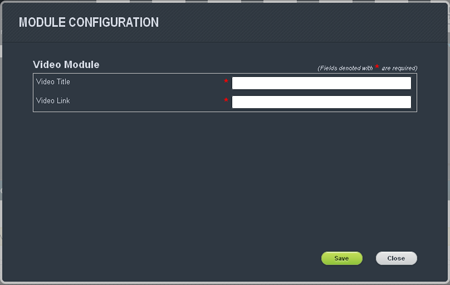
Not sure if this is an admin configuration as noted in the vBulletin Manual to add the Title:
vBulletin Manual 5.6.4 Patch Level 1
Administrators / Site Builder / Module List - Documentation and Customization / Admin Modules / Video | « Previous | Up | Home | Search | Next » |
Video

The Video module is used to display a video on a page. This module currently supports from YouTube, Vimeo, DailyMotion, MetaCafe videos. It is in the module category Generic.
The Video module has two different options:
Video Title
This is the title that will show above the video on the page.
Video Link
This is the full link to the youtube video you wish to have embedded on the page.
Share:
-
This site uses cookies to help personalise content, tailor your experience and to keep you logged in if you register.
By continuing to use this site, you are consenting to our use of cookies.