Generally, and I must repeat the word generally, when the positive space (often and usually the physical subject) extends beyond the frame (in any form of visual art/expression not just photography), it causes tension.
This is for many reasons. One of the simplest is that we go from the concrete to the implied as the limb (or whatever is the positive space) "disappears" into thin air as it crosses the edge of the frame. Another reason it causes tension is it breaks up the negative space (sometimes but not always the non-subject/background/field) forcing us to consider the context of the subject each time we encounter the negative space (above the arm, below the arm, etc...)
Rules about cropping limbs are subsets of these observations which were derived long before photography existed.
Generally. Generally. Generally. Think in terms of tension and release - a subject well known to painters and musicians. Think in terms of antecedent phrase, consequent phrase, (musicians and writers).
It is wise, generally, if you wish to produce an aesthetically "pleasing" image to observe many strictures among which may be found rules about cropping limbs. But they are all based on larger ideas.
So, are you making Hallmark© cards? Then less tension is probably desirable. Maybe. Tension and release between the cover of the card and the inside image is very successful for them. So maybe again generally perhaps.
Are you trying to find a balance in tension and release in your image? Then regard framing that cuts/crops your subject as an opportunity.
The more truncated the subject (positive space) is and the more interrupted the background/field (negative space) is, the more tension you will create in your image.
The image of the young man at the easel with the brush is lovely because it captures gesture (the paintness of the paint, the articulation of the artist's brushstroke, the engagement of the painter with the painting), the subject (the young man) is not truncated and the background is not interrupted.
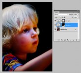
This leads us to various possible interpretations. For instance, the first image plays between the joy in the young man's expression and the tight cropping of the subject and the negative space interruption. A dynamic. This might make it successful. The second image takes us nowhere because there is only tension, and perhaps no payoff.
The image of the young artist at the canvas with a roller is my favorite (MY favorite) - it is interesting from a gesture (the act of rolling) but tension wins and the eye is not distracted from his engagement with the paint and roller and easel. There are no elements of distraction in the background and the negative space (the black background) is continuous but stark, a shadow, unknowable, a powerful contrast to the young man's concentration. I wish it was a stop or so cooler, but....
The image of the young man at the easel is a "Hallmark" restful, but with strong gesture, physical engagement of the subject and lighting that takes us to more or less the right places. The tension of the crop is balanced by the gesture of joy. They vibrate. It's nice. But not as powerful as the roller image.
This is all visual theory and you can find it in any art class. Painting is a good place for photographers to hone their visual literacy.
None of the components in this language is arbitrary. At its heart is long observation of human response dating back to the earliest of histories. No academic invented it. They stumbled across it. Discovered it. Then, becoming cognizant of it, applied it.
If you are aware of the nature of response to visual signals, you may ignore "rules" as the become irrelevant in the face of your awareness.
Now, Harpofreely, just how much tension, and how much release do you want?