Assaf
Well-known
So far I only shot BW, but somehow a few rolls of Superia 100 got into my camera. Now, I try to scan them and I'm in a mess. I don't manage to balance the colors and I get wierd color shifts.
I use V700 scanner and Vuescan software, though also tried Epson scan and Silverfast and got similar colors.
In Vuescan I choose film type "generic" and color balance - white balance and scan to dng.
Then open the dng in PS and balance the white using costum white balance.
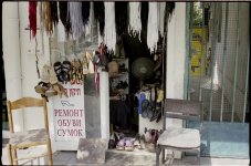
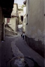
Then I get the attached colors, very saturated, very wierd, I assure you, buses in Tel Aviv are plain red 🙂
So, what am I doing wrong? I guess that minilabs very easily get balanced colors so why shouldn't I?
Or maybe I just don't know how color film looks like?
Thank you all and good night
Assaf
I use V700 scanner and Vuescan software, though also tried Epson scan and Silverfast and got similar colors.
In Vuescan I choose film type "generic" and color balance - white balance and scan to dng.
Then open the dng in PS and balance the white using costum white balance.
Then I get the attached colors, very saturated, very wierd, I assure you, buses in Tel Aviv are plain red 🙂
So, what am I doing wrong? I guess that minilabs very easily get balanced colors so why shouldn't I?
Or maybe I just don't know how color film looks like?
Thank you all and good night
Assaf