
You are using an out of date browser. It may not display this or other websites correctly.
You should upgrade or use an alternative browser.
You should upgrade or use an alternative browser.
Scanning Portra 160, advice please
- Thread starter zauhar
- Start date
- Latest activity Latest activity:
- Replies 29
- Views 6K

rulnacco
Well-known
Hi, Randy! Actually, that neg--and your scan--don't look bad at all. In the final image you posted above, there is simply a rather strong blue cast. Using the Curves adjustment to reduce the blues and add maybe a bit of red--or, as Jan pointed out above, using Color Balance, although that doesn't give you quite as fine control as Curves does--will get the image looking very nice.
I don't think your film is either over-exposed or over-developed. You're still getting lots of information and detail in the whites, which you'd lose if either of those were the case. One problem with your flesh tones in this particular shot is that it was taken on a grey, overcast day. That's probably not the ideal situation in which to use Portra, which is not the punchiest film available, and shows its best qualities when exposed under suitably warm and/or well-tuned light. Shot in the proper light, Portra gives skin a lovely glow.
You're on the right track, so don't be discouraged. Take advantage of some of the excellent advice offered by various posters above, and keep practicing until you find the workflow that works best for you.
(Personally, I use Vuescan to scan in RAW mode. I then normally use ColorPerfect, which usually gives a very good starting point on which to operate. I've also found that using Vuescan to open the RAW file later--Scan from File--and selecting Color Negative as the media type works well for some images. I'm still refining my own technique, and I'm also going to try a few of the tips recommended above.)
rulnacco
Well-known
By the way, hope you don't mind my playing about with it a bit, but here's what I was able to get from your final image, with a bit of tweaking of color and contrast in Curves, and by adding a few points of Saturation:

It's pretty close to what Jan got, although I didn't warm mine up quite as much--I used the dress to get a neutral white, and left the rest a bit cool as that was the prevailing condition of the light. So, yes, you do have a good negative and scan to work with!
It's pretty close to what Jan got, although I didn't warm mine up quite as much--I used the dress to get a neutral white, and left the rest a bit cool as that was the prevailing condition of the light. So, yes, you do have a good negative and scan to work with!
rulnacco
Well-known
One last comment--you can see in your shot a little of what Portra does particularly well. It makes lovely and subtle pinks! (Which is connected to its ability to do great skin tones.) I used to process my own color film, and print Portra 160NC in the darkroom. I once printed (on Supra Endura) a medium format neg of a girl wearing a pink silk dress, and that color was *amazing* in the print.
DSLRs can't really achieve with pink and some of the red hues quite what Portra can produce. So an excellent reason to keep on shooting it!
DSLRs can't really achieve with pink and some of the red hues quite what Portra can produce. So an excellent reason to keep on shooting it!
philipus
ʎɐpɹəʇɥƃı&
I think the photo's colours - esp the skin colour which doesn't look "Portra-like" at all - are affected by the fact that you shot at 100. This will give Portra 160 pale pastel-like colour. In my experience it's a pretty big difference to images shot at box speed. The same happens to the 400 variant shot at 200.
My take on VS is to get the most info possible from the neg which will result in a very dull looking scan. So that means None for Color Balance. I leave any colour corrections to ColorPerfect and Photoshop, meaning I turn off VS's film types and scan at Negative Vendor Generic unless I discover in the preview that it looks all strange in which case I will set the closest film type. I definitely don't use the film presets in CP which I find to be much too drastic.
My take on VS is to get the most info possible from the neg which will result in a very dull looking scan. So that means None for Color Balance. I leave any colour corrections to ColorPerfect and Photoshop, meaning I turn off VS's film types and scan at Negative Vendor Generic unless I discover in the preview that it looks all strange in which case I will set the closest film type. I definitely don't use the film presets in CP which I find to be much too drastic.
mszargar
Established
How to make sure the devil is not in the scan
How to make sure the devil is not in the scan
My understanding is that Portra 160's skin color rendering is kind of pale as compared to 400 and 800. But still, very far from flat.
Like many others, I have my own scanning process, that works perfectly for me. I share many points with the others, but I use NegFix8 instead of ColorPerfect, because it automates many more manual steps involved in scanning with much better results. I do own ColorPerfect, and I find it an excellent piece of software, but still find NegFix much more practical. I use Coolscan V ED for my 35mm negatives and I do as follows:
First, you have to make a linear raw scan with the orange mask cancelled. For this I scan all negatives as positives.
1) Preview your negative, making sure you have enough orange mask visible.
2) Check ‘Lock exposure’ in the ‘Input’ tab.
3) Preview again.
4) Check ‘Lock film base color’ in the ‘Input’ tab.
5) Go to the ‘Color’ tab and record the film base values.
6) Assuming the ‘film base red’ number is the highest (it should be), divide it by ‘film base green’. This is your green analog gain value. Set it in the ‘Input’ tab.
7) Do the same for blue.
8) Uncheck ‘Lock film base color’.
9) Make your scan.
(copied from http://125px.com/articles/photography/digital/colorneg/)
I scan the whole role with the same settings. I have never ever got any clipped channel with Portra 160 using this method yet - even with very contrasty scenes. No need for multi-exposure either.
Then I batch-invert all the negatives using NegFix8 with -cs (contrast stretch) option. For NegFix to work properly, you need to scan your negatives with some 20 pixels of frame spacing (unexposed negative) included on at least one side of each shot.
You can get NegFix8 for free on the website of the developer:
https://sites.google.com/site/negfix/howto
For Portra 160 portrait works, all I need to do next is to open the file in Photoshop, assign the working sRGB color profile to the image, run Auto Contrast, apply a little bit of unsharp mask, and add vibrance +10 and saturation +10 (well, this last one is just my preference). Portra 400 and 800 never need added contrast for portrait shots.
Here is a Portra 160 shot taken in a rather good lighting condition, scanned using the above method:

Here is a Portra 800 shot taken in a very hard lighting condition, and on top of that underexposed, scanned using the above method:

You can see that despite all that, skin tones are still preserved. I have done zero manipulation on the images apart from what I mentioned before. That's the magic of NegFix8...
If you run this method, and still you get flat skin tones, then you have to search the culprit elsewhere...
Hope it helps!
How to make sure the devil is not in the scan
My understanding is that Portra 160's skin color rendering is kind of pale as compared to 400 and 800. But still, very far from flat.
Like many others, I have my own scanning process, that works perfectly for me. I share many points with the others, but I use NegFix8 instead of ColorPerfect, because it automates many more manual steps involved in scanning with much better results. I do own ColorPerfect, and I find it an excellent piece of software, but still find NegFix much more practical. I use Coolscan V ED for my 35mm negatives and I do as follows:
First, you have to make a linear raw scan with the orange mask cancelled. For this I scan all negatives as positives.
1) Preview your negative, making sure you have enough orange mask visible.
2) Check ‘Lock exposure’ in the ‘Input’ tab.
3) Preview again.
4) Check ‘Lock film base color’ in the ‘Input’ tab.
5) Go to the ‘Color’ tab and record the film base values.
6) Assuming the ‘film base red’ number is the highest (it should be), divide it by ‘film base green’. This is your green analog gain value. Set it in the ‘Input’ tab.
7) Do the same for blue.
8) Uncheck ‘Lock film base color’.
9) Make your scan.
(copied from http://125px.com/articles/photography/digital/colorneg/)
I scan the whole role with the same settings. I have never ever got any clipped channel with Portra 160 using this method yet - even with very contrasty scenes. No need for multi-exposure either.
Then I batch-invert all the negatives using NegFix8 with -cs (contrast stretch) option. For NegFix to work properly, you need to scan your negatives with some 20 pixels of frame spacing (unexposed negative) included on at least one side of each shot.
You can get NegFix8 for free on the website of the developer:
https://sites.google.com/site/negfix/howto
For Portra 160 portrait works, all I need to do next is to open the file in Photoshop, assign the working sRGB color profile to the image, run Auto Contrast, apply a little bit of unsharp mask, and add vibrance +10 and saturation +10 (well, this last one is just my preference). Portra 400 and 800 never need added contrast for portrait shots.
Here is a Portra 160 shot taken in a rather good lighting condition, scanned using the above method:
Here is a Portra 800 shot taken in a very hard lighting condition, and on top of that underexposed, scanned using the above method:
You can see that despite all that, skin tones are still preserved. I have done zero manipulation on the images apart from what I mentioned before. That's the magic of NegFix8...
If you run this method, and still you get flat skin tones, then you have to search the culprit elsewhere...
Hope it helps!
Pete B
Well-known
I have downloaded Negfix a couple of times but, being computer illiterate, can never work out how to use it. I would dearly love to see a YouTube vid of how this software is used.
Pete
Pete
mszargar
Established
Since NegFix is a command line tool, I don't think a YouTube video will be of much help. But feel free to PM me, if you need help setting it up on your computer. At least on Mac, I have found a very easy way to set it up. It shouldn't be complicated on the other platforms either, and once it is set up, it is rather simple to operate.
zauhar
Veteran
Hi All,
First, I didn't look here for a while, and missed some responses. I wanted to thank all of you for your advice and comments, including those of you (Jan and Rulnacco) who gave a go at improving my result.
I have tried to act on everyone's advice, without digging myself deeper into a hole. Here is my summary:
1) Pete B and others suggested locking the film base and color. I believe I did this correctly, although honestly the resulting scan looks essentially the same. Either I'm missing something, or the raw scan can't really be improved on. In fact, the scan I see in photoshop looks just like the negative if I hold to the light.
2) Several suggested using ColorPerfect. I had a 'meh' experience with this tool a while back, but upon your suggestions I gave it another shot. Here is the scanned negative as initially processed by colorPerfect:
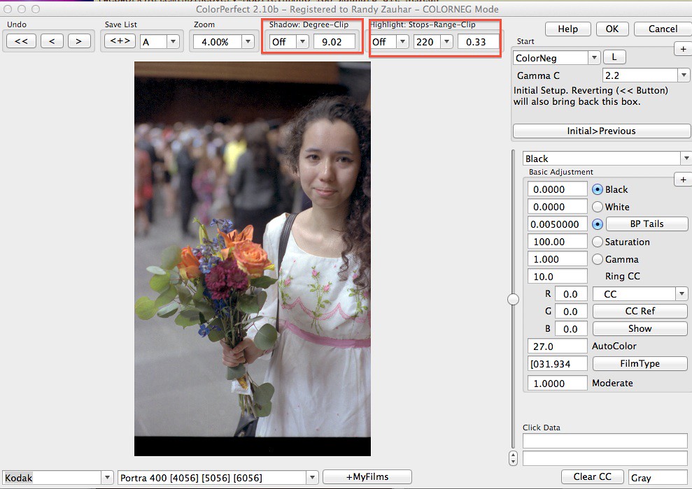
There are two fields which represent clipping of shadow and highlights (I put these in boxes). You can choose to 'add black' or 'add white' , using the slider, to broaden the tonal range - this is an unusual approach that sounds like it comes from the print world, not additive color! I adjusted to reduce clipping, the result a washed-out image:

However, back in photoshop, the histogram is broad and less clipped ...

.. and after levels and minor curve adjustment, I think I have something similar to what Jan and Rulnacco achieved:

So with this I am pretty happy with ColorPerfect, at least for the moment.
3) Jan suggested that I may have developed too long with the tetanal kit. I tried a couple of rolls with reduced development time, 3:00 instead of 3:30 at 39 C, and the densities were not clipped - here is one twilight shot and the histogram with adjusted development time:

After processing with colorPerfect, and I am pretty happy with the color rendering:

Here is another image from the same roll, this was very tough light, very bright sky and the sculpture in complete shadow:

So at this point I am continuing on, feeling a little better about the results I am getting. I appreciate everyone's advice and comments.
Randy
First, I didn't look here for a while, and missed some responses. I wanted to thank all of you for your advice and comments, including those of you (Jan and Rulnacco) who gave a go at improving my result.
I have tried to act on everyone's advice, without digging myself deeper into a hole. Here is my summary:
1) Pete B and others suggested locking the film base and color. I believe I did this correctly, although honestly the resulting scan looks essentially the same. Either I'm missing something, or the raw scan can't really be improved on. In fact, the scan I see in photoshop looks just like the negative if I hold to the light.
2) Several suggested using ColorPerfect. I had a 'meh' experience with this tool a while back, but upon your suggestions I gave it another shot. Here is the scanned negative as initially processed by colorPerfect:
There are two fields which represent clipping of shadow and highlights (I put these in boxes). You can choose to 'add black' or 'add white' , using the slider, to broaden the tonal range - this is an unusual approach that sounds like it comes from the print world, not additive color! I adjusted to reduce clipping, the result a washed-out image:
However, back in photoshop, the histogram is broad and less clipped ...
.. and after levels and minor curve adjustment, I think I have something similar to what Jan and Rulnacco achieved:
So with this I am pretty happy with ColorPerfect, at least for the moment.
3) Jan suggested that I may have developed too long with the tetanal kit. I tried a couple of rolls with reduced development time, 3:00 instead of 3:30 at 39 C, and the densities were not clipped - here is one twilight shot and the histogram with adjusted development time:
After processing with colorPerfect, and I am pretty happy with the color rendering:
Here is another image from the same roll, this was very tough light, very bright sky and the sculpture in complete shadow:
So at this point I am continuing on, feeling a little better about the results I am getting. I appreciate everyone's advice and comments.
Randy
sojournerphoto
Veteran
Really nice to see Randy. I may have a go at some more C41 sometime, having seen this.
Glad you reported back
Mike
Glad you reported back
Mike
Similar threads
- Replies
- 0
- Views
- 334
- Replies
- 6
- Views
- 369
- Replies
- 0
- Views
- 386
- Replies
- 8
- Views
- 1K