Shooting headshots

The last one is the best, with the middle one in second -- interesting poses, some depth to the image. The rest look a little over-flashed and somewhat flat, there are no catchlights in the eyes (as in the last one). With her fair skin, it's probably very tricky to get the flash NOT to do that.. perhaps a combination of colored lights (e.g. gold reflector?). I have 0 experience with lighting, but my comments are based on things I've heard. Also, it looks like you are considerably taller than your sister.. perhaps get the camera a little lower, so you are on her level.
 
Shutterflower,

Like said already... she's a very cute girl. Your portraits keep getting better, but I don't think you've maximized the possibilities. The last shot is definitely the best so far. Here are a couple of observations:

1. She has GREAT eyes. Picture 1 shows them best, but that's the only thing really good about that shot. Unfortunately her chin disappears into nothingness. Try to capture those big blue eyes in your future efforts. She tends to squint when smiling.

2. Watch out for her neck. There's some unflattering features that appear prominent. Not "chicken-neck" or anything like that, just a tendency toward the appearance of a prominent esophagus. Try having her extend her neck a bit as you shoot. My favorite photog refers to that as "doing the turtle neck" and keeps repeating "feels bad, looks good."

3. There's something about her cheeks and chin that you might want to look into. Maybe it's a loss of focus; maybe it's foundation; maybe it's "peach-fuzz". (I'll bet you've never looked at your sister that close... have you?) Something's looking muddy.

4. She has really nice lips. The only exception is the second photo you posed whre they look a bit crooked. Use her lips and her eyes! In every photo, her lips are a bit washed out. Don't over-exagerate them, but pump them up a bit.

Keep at it... it looks like you have a very willing and cooperative model!
 
BrianShaw said:
4. She has really nice lips. The only exception is the second photo you posed whre they look a bit crooked. Use her lips and her eyes! In every photo, her lips are a bit washed out. Don't over-exagerate them, but pump them up a bit.

Have her say, "Whiskey" and snap the photo just as she completes the word. That'll get a nice combination of lips + eyes.
 
for portraits I would consider vertical angle instead of landscape angle. A softbox is great as is available light - in the shade of course.

The foto you showed is a bit too lit up for my taste, but it isn't bad compositionwise. You may also want to consider backing up a little, then cropping, especially since its MF.
 
BrianShaw said:
The girl doesn't look 21 yet... do you have a "kiddie" version? 😉

I have a notorious history with determining age, but leave that for another topic.

With the words, make sure they "say" the word and not mumble it, just at the point of exagerrating each syllable.

Try..

Whisker
Petunia
Brittney
Luigi
Butt (not but, but Buuuutttt .. exaggerate the u sound)
Rump (make them ennounce the "p" and snap just as the puff of air at the end puffs out)
Leica (for a surprised look.. have the girl pretend she just sat on a pin and say "leica", this usually makes for a fun photo)
Antidisestablishmentarianism (and snap the photo when they go.. "wha?")

Plenty of other words.. the idea is to get the lips to pucker first, then end on a half-open syllable with a little exhalation. W, P, OO, and other syllables just before the last one work best.

One can also think of different "scenarios" to tell the model to use.. think of some before hand, and have the model put her/himself in the frame of mind. Should be easy if they are into acting 🙂

jano
 
Comp card/headshot

Comp card/headshot

Honestly, I like the very first black and white image you opened the thread with is better than any of these.

Hopefully I'm not going to come off like and A$$hole here, but this is what I do for a living, so I'm not going to sugar coat.

The last one is the best as far as lighting and composition, but it looks like she is smiling with her face, but not her eyes. She looks like she is uncomfortable.

The make-up is horrible, it looks completely flat and does not complement her at all. Now I'm guessing the agency, or someone told you "no make-up" look for the headshot, this is not what they mean, she should look fresh and clean, with a glow. If you used a professional make-up artist for this fire him/her and get another.

Being the the headshot is generally the front of the comp card, it really needs to engage the viewer, use the light to shape her face and show off her assets while hiding any "imperfections"

Using the 645 RF for the comp is probably fine, best to use a camera you are completly comfortable with so you can concentrate on the girl. If you have one and feel good with it, I'd use a 35mm SLR, they are generally faster to use and you get a lot more shots 😉

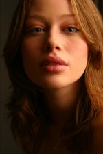
I'll post a few headshots that agencies have loved.. The first is more of a commercial type model, shot in open shade with a white fill reflector.

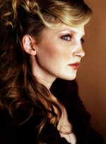
The second girl is from click which is a bit of a commercial/fashion agency, this girls lips are obviously a major selling point, so that's what we focused on.

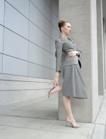
The third is not exactly a headshot, more of a "beauty" shot, because this girl is a fashion model. She's got a great profile, tiny nose, thus the angle.

The last two are obviously studio shots, but in both cases I only used one large light source, so you could do similar shots outside.
 

Attachments

  • 102_0289.jpg
    102_0289.jpg
    44.5 KB · Views: 0
  • katie042_RT8.jpg
    katie042_RT8.jpg
    81.4 KB · Views: 0
  • Sandra4.jpg
    Sandra4.jpg
    116.4 KB · Views: 0
jano said:
The last one is the best, with the middle one in second -- interesting poses, some depth to the image. The rest look a little over-flashed and somewhat flat, there are no catchlights in the eyes (as in the last one). With her fair skin, it's probably very tricky to get the flash NOT to do that.. perhaps a combination of colored lights (e.g. gold reflector?). I have 0 experience with lighting, but my comments are based on things I've heard. Also, it looks like you are considerably taller than your sister.. perhaps get the camera a little lower, so you are on her level.

I didn't use any lighting at all. All my stuff is natural light, no reflectors even. Just find a place with good frontal lighting. The last one is shot in an opening to a hallway with the sky and trees and a road lighting the model's face.

I used Portra for some, Superia for one, and NPH for another. meh.
 
thanks for the great advice, everyone. This week is comp card week - so I'm going to be thinking about the smiling eyes, makeup (she did it herself last time), lighting (didn't have any), esophaguses, lips askew, and maximizing the assets.

who needs fashion/modeling photography classes when you have RFF! Like taking class from a group of teachers and personal, one on one instruction.

thanks tons
 
Here is the comp card, part 1

Here is the comp card, part 1

I have begun working on the comp card. Shooting with the Bronica RF645 and 65mm lens. I think I'll try the 45mm next time, just for variety.

These are all on Kodak Portra 400 NC, my favorite portrait film, shot in and around the new Westin hotel in Bellevue, WA.

I'd like some critical commentary, since this, like my headshot experience, is a first for me, and I really have no idea what I'm doing.
 

Attachments

  • christy-westin-1RFF.jpg
    christy-westin-1RFF.jpg
    165.5 KB · Views: 0
  • christy westin 62RFF.jpg
    christy westin 62RFF.jpg
    207.1 KB · Views: 0
  • christy-westin-7RFF.jpg
    christy-westin-7RFF.jpg
    137.4 KB · Views: 0
  • christy-westin-8RFF.jpg
    christy-westin-8RFF.jpg
    142.4 KB · Views: 0
Last edited:
I like the concept of # 1,2, and 4 though the framing of the subject in 1 and 4 throws me off a bit. For the subject to be that far to one side of the image there should be something that balances the subject in terms of light/shadow. # 1 has a nice tension to it. #2 has the best balance in terms of graphic weight. However in all of the shots but #4 I would suggest a reflector of some sort for a bit more fill on the shadowed side of the face. Also I would suggest paying closer attention to the drape of the clothing on the subject. There are wrinkle or fold lines that could have been smoothed for a better end effect.


Perhaps not quite so full a profile would imo be better for this subject. The straight side shot is not her best angle.


And lastly the subject looks tense rather than regally composed which is what I took to be the intended effect. A deep breath and an assurance from the photographer that she is looking good might help .

.

Having said all that I want to complement you on the concept of the shoot. It fits your subject well imo.

additional note: I looked some more at number one and I think the balance on that is working. It is #3 and 4 that don't work for me.
 
Last edited:
Yeah, tense is right. She's my sister, and it's war just to get her to grin, let alone smile. And relaxation is out of the question. And the Westin employees were hovering around. We were breaking laws, surely. Oh well.

Thanks for the input. I think I'd do some cropping on number 2, a little fill for #1, and probably have shot the other two a little differently. I only shot one roll of film, and all of these are on that roll, so my hitrate will probably increase as I implement the advice.

Thanks.
 
I really dig #3 and #4. Yeah, tense isn't even close to describing her attitude, and the balance is way off to the right, but I really thought both were intentional. Cause, you know, it works.

It's 50s fashion photography. And I love it.
 
The lighting in the second shot is the most interesting to me. The last two shots look monotone which could be good if her skin/eyes popped out at you but they don't here.
A last thought, I was just looking at some photos I took recently and the pictures of one woman in particular gets a lot of compliments. The thing is this woman isn't very attactive in person but she really likes getting her picture taken and it shows on camera. Her body language and facial expression are so warm and inviting that they make a good photo. Your sister's attitude could go a long way to making your photos better.
 
#2 is excellent, her pose, poise, lighting, everything. Excellent. Maybe try a little closer next time, or crop it up from the sofa (i.e. too much sofa at the front?)

#1 is getting there, but something bugs me about it.. maybe the way her feet are cut off. Photo should either include all of her feet, or crop up higher. Also, the electric outlet at the bottom should come out, it's hiddeously distracting.

#3 looks out of focus (her eyes don't look sharp), and #4 looks very uncomfortable and unnatural.
 
Yes, the feet are a real problem for me. If you look at my portraiture, the majority of my work cuts something off of the subjects. I have a REALLY hard time framing to keep the feet in. I think that is my biggest problem is framing well for portraits. I think it's really just getting used to the framelines, since I've never used a rangefinder for portraiture until this project, I have not really gotten used to things. I should probably slow down a bit, and make a point of checking all my parts and lighting before firing a shot.

She just doesn't hold still for long.
 
Sorry... can't comment right now. My wife just walked by and said that I'm looking at your sister just a *little* too long and *way* too hard.

I like #1 and 2 the best. Try cropping #1 to a square format and get rid of the area below the knees. I also like the monocrhromatic concept of #4, but I'm a bit bothered by her placement on the far right, looking to the right. Maybe if she were looking the other way?? Lie someone else said... I miss here eyes... she has great eyes! Her hand could be a little more relaxed, also.

Keep at it... she's a lovely model and you're heading toward some nice portraits of her!
 
I'm going to disagree with most here and say that #4 is the best of the lot as far as "fashion" However it (and the other one I like #2) are both good shots for a photographer, not necessarily a model. For this type of photography, it's not about you the photographer, the client (looking at a comp to hire a model) doesn't care if you have interesting composition or perfect lighting, they care about what the model looks like and how she can move/act in front of the camera.

Like I said before, I think you need to think less high fashion and more commercial.. Ok, so you have her in a business suit in a hotel.. think of any advertisements you've seen with models in this situation, maybe IBM or A hotel ad or a cell phone ad, what are the models doing, what is the vibe of the shot.. this is what you need to try and recreate as best as possible.

keep at it, you definitely have a great eye, just need to refine it a bit towards this subject matter..

Daniel
 
Back
Top Bottom