jaapv
RFF Sponsoring Member.
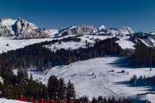
Same place,same lens (Tri-Elmar) This morning, M8

Last Februari, Fuji Sensia

Admitted, the trees have some more detail on the original slide. But not even close to the M8. And I had to use a polfilter for the film to avoid a pale sky. And I oversharpened the film shot.
Last Februari, Fuji Sensia
Admitted, the trees have some more detail on the original slide. But not even close to the M8. And I had to use a polfilter for the film to avoid a pale sky. And I oversharpened the film shot.
Last edited:
rool
Well-known
Same light? Honestly, I don't see the point.
Comparative shots bore me to death but when it's not even at the same time... I really don't understand.
And I have absolutely nothing against the M8, I whish I was shooting one!
Comparative shots bore me to death but when it's not even at the same time... I really don't understand.
And I have absolutely nothing against the M8, I whish I was shooting one!
Last edited:
Flyfisher Tom
Well-known
maybe it is just the effects of viewing online, but the bottom one looks like it has more detail on my monitor
Sparrow
Veteran
You had better snow last year, what’s it like where you are?
akptc
Shoot first, think later
Beatiful place, on both pictures. Btw, Jaap, can you remind us where it is?
Ben Z
Veteran
What you're seeing here is not a comparison of the M8 to film, it's a comparison of
two different workflows. The bottom shot (which looks like it was underexposed to begin with) is limited by the sharpness and dMax of the scanner, and the operator's skill at scanning. The top shot, IMO, reminds me of 1970's Kodachrome-X: pale, washed-out color. But that too could be switched up in processing.
two different workflows. The bottom shot (which looks like it was underexposed to begin with) is limited by the sharpness and dMax of the scanner, and the operator's skill at scanning. The top shot, IMO, reminds me of 1970's Kodachrome-X: pale, washed-out color. But that too could be switched up in processing.
B&W Norway
Established
Is it correct that the one on top is M8
Sailor Ted
Well-known
Somehow I wish I hadn't
Me too. .
Me too. .
FrankS
Registered User
I don' tthink that how images look on a computer monitor is the ultimate criteria of success. I think comparing prints is the thing to do. M8 + inkjet print on the one hand, Velvia + traditional wet darkroom print on the other.
jlw
Rangefinder camera pedant
Oh, no, your M8 seems to be producing the dreaded "red fence" and "extra trees" artifacts...
FrankS
Registered User
Well the comparison shots is kind of like the M8 digital versus the M6 with slide film, but then you go and mess with the slide by scanning/digitaizing it as well, so in the end it's digital too. Make prints. One workflow stream would be all digital, the other should be all analogue.
Slides are meant to project or print, and are not ideal media for scanning due to their high dynamic range.
I should have left this thread alone.
Slides are meant to project or print, and are not ideal media for scanning due to their high dynamic range.
I should have left this thread alone.
N
Nick R.
Guest
The second one looks better to me, at least visual impact wise. The top one is the M8 and I couldn't describe it better than Ben Z "reminds me of 1970's Kodachrome-X: pale, washed-out color. "
ywenz
Veteran
The 2nd shot is much better by far. It's your post-processing technique that needs work. Shots straight out of the M8 are poor like that, like most other digital camera.s
N
Nick R.
Guest
Too be fair though, the sky on#2 is way oversharpened. With some work, #1 could be better.
jaapv
RFF Sponsoring Member.
Other profile:

I still like #2 better. But that is me. I like the darker sky. the cooler tones and the detail. Let me see if I can improve upon the film version. If its ok, can I post it?
ywenz
Veteran
The cyan sky of the M8 pic is very P&S digicam like.
Trius
Waiting on Maitani
I don't quite see the point. Apples/oranges.
aad
Not so new now.
To be fair, compare M8 on a monitor with Velvia/Provia/Sensia on a light table w/loupe.
blakley
blakley
The difference in the two photos is mostly color balance. If you eyedropper the snow in the Sensia shot you get about 164,168,193 - a very blue cast which is clearly visible to the unaided eye, and which produces most of the visual difference here. A very short time's worth of playing in Photoshop converted the M8 shot to this color rendition, which has a lot more blue bias than the original (143, 143, 168) but still not nearly as much as the slide.
Attachments
Share:
-
This site uses cookies to help personalise content, tailor your experience and to keep you logged in if you register.
By continuing to use this site, you are consenting to our use of cookies.