Somehow I wish I hadn't

jaapv

RFF Sponsoring Member.
Local time
7:25 PM
Joined
May 6, 2005
Messages
8,374
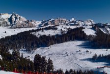
Same place,same lens (Tri-Elmar) This morning, M8
L1000223.jpg


Last Februari, Fuji Sensia

corvara0170-after.jpg


Admitted, the trees have some more detail on the original slide. But not even close to the M8. And I had to use a polfilter for the film to avoid a pale sky. And I oversharpened the film shot.
 
Last edited:
Same light? Honestly, I don't see the point.
Comparative shots bore me to death but when it's not even at the same time... I really don't understand.
And I have absolutely nothing against the M8, I whish I was shooting one!
 
Last edited:
What you're seeing here is not a comparison of the M8 to film, it's a comparison of
two different workflows. The bottom shot (which looks like it was underexposed to begin with) is limited by the sharpness and dMax of the scanner, and the operator's skill at scanning. The top shot, IMO, reminds me of 1970's Kodachrome-X: pale, washed-out color. But that too could be switched up in processing.
 
I don' tthink that how images look on a computer monitor is the ultimate criteria of success. I think comparing prints is the thing to do. M8 + inkjet print on the one hand, Velvia + traditional wet darkroom print on the other.
 
Oh, no, your M8 seems to be producing the dreaded "red fence" and "extra trees" artifacts...
 
Well the comparison shots is kind of like the M8 digital versus the M6 with slide film, but then you go and mess with the slide by scanning/digitaizing it as well, so in the end it's digital too. Make prints. One workflow stream would be all digital, the other should be all analogue.

Slides are meant to project or print, and are not ideal media for scanning due to their high dynamic range.

I should have left this thread alone.
 
The second one looks better to me, at least visual impact wise. The top one is the M8 and I couldn't describe it better than Ben Z "reminds me of 1970's Kodachrome-X: pale, washed-out color. "
 
The 2nd shot is much better by far. It's your post-processing technique that needs work. Shots straight out of the M8 are poor like that, like most other digital camera.s
 
Too be fair though, the sky on#2 is way oversharpened. With some work, #1 could be better.
 
I still like #2 better. But that is me. I like the darker sky. the cooler tones and the detail. Let me see if I can improve upon the film version. If its ok, can I post it?
 
The difference in the two photos is mostly color balance. If you eyedropper the snow in the Sensia shot you get about 164,168,193 - a very blue cast which is clearly visible to the unaided eye, and which produces most of the visual difference here. A very short time's worth of playing in Photoshop converted the M8 shot to this color rendition, which has a lot more blue bias than the original (143, 143, 168) but still not nearly as much as the slide.
 

Attachments

  • fixed.jpg
    fixed.jpg
    519.3 KB · Views: 0
Back
Top Bottom