peterm1
Veteran
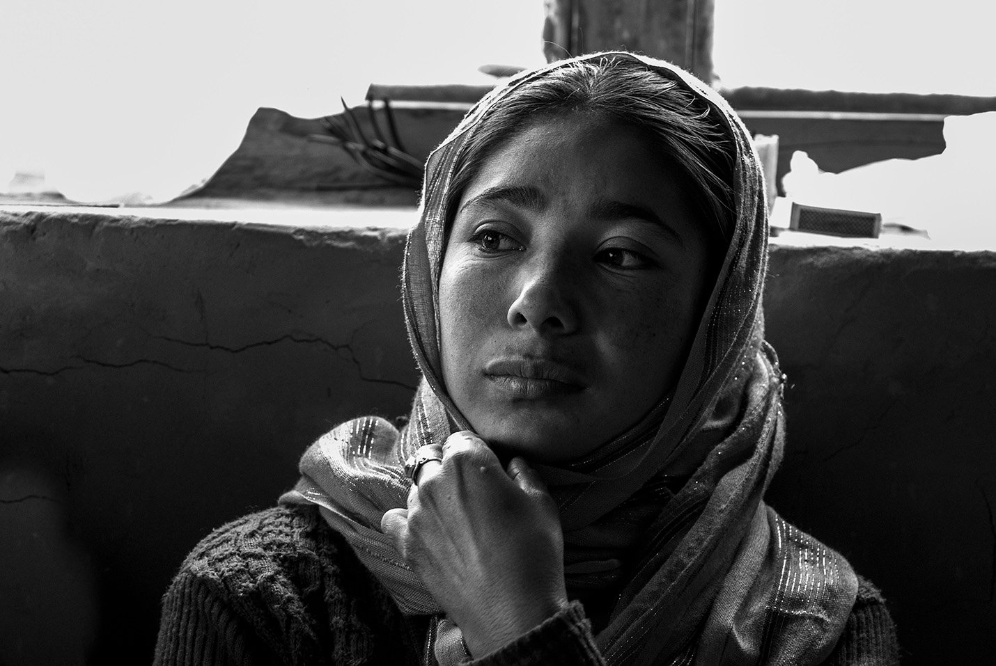
I think one of thee advantages of black and white is that it is all about shadows and light - and the essence.
 Girl on a Bus_2 by Life in Shadows, on Flickr
But this is not necessarily limited to black and white. I think this one achieves something of that sort in a color sort.
 One Moment in the Street by Life in Shadows, on Flickr
Girl on a Bus_2 by Life in Shadows, on FlickrBut this is not necessarily limited to black and white. I think this one achieves something of that sort in a color sort.
One Moment in the Street by Life in Shadows, on Flickr