rogerzilla
Well-known
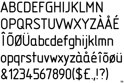
As used on current lenses, except the cheaper Summarits, and the M9 shutter dial, among other places.
Who likes it, and who thinks it's terminally naff?
Apparently it's a proprietary font, but fairly close to Eurostile.
Who likes it, and who thinks it's terminally naff?
Apparently it's a proprietary font, but fairly close to Eurostile.
sc_rufctr
Leica nuts
I like it but I'm not really into fonts. Although I do understand their importance.
It's like the Porsche Boxter font. It took them a long time to select the font for the instruments in that car.
Pirate
Guitar playing Fotografer
I don't have one of those lenses, but I like the font.
35mmdelux
Veni, vidi, vici
never thought about it.
tlitody
Well-known
I have that font but also one called Metrostyle which is more or less identical. I think it looks better in "extended" rather than "regular".
jbielikowski
Jan Bielikowski
ok, I'm a bit of font geek (www, posters, DTP stuff), and I hate it, look like taken from Digilux 1. even MP with classic engraving look terrible because of this.
but thats me, I'm also paying loads of attention to girls nose.
mtargz
Established
It's one of the most legible fonts I've seen for digits.
I wouldn't fill a table with it, but for lone digits - such as those on a lens - it's very easy to read and understand.
squirrel$$$bandit
Veteran
I'm very much into design cues like this, and I quite like the font.
biakalt
Long Tran
i thought it's close to Bank Gothic than Eurostile. there was a thread a while ago on photo.net. there's a proper name for the font, specially developed for Leica.
btw, was it DIN on the older Leicas (M3, M2, M4...)? i'm not too sure
Rob-F
Likes Leicas
I'm reasonably font of it.
Roger Hicks
Veteran
Dear Rob,I'm reasonably font of it.
Shame! Shame! Aaaargh!
To me it looks rather old fashioned. The font, not the joke, which is VERY old fashioned. But to return to Leica: not old fashioned as in 100 years ago, but as in 15 years ago.
Then again, I like Caslon.
Cheers,
R.
N
Nikon Bob
Guest
The first thread I have seen for Leica fontlers. I know, but it just had to be said. Happy fontling to all.
Bob
Bob
Last edited by a moderator:
squirrel$$$bandit
Veteran
not old fashioned as in 100 years ago, but as in 15 years ago.
Yes, I agree--that's what I like about it!
tlitody
Well-known
Not so fast...
i.e. The design is 60 years old...
But then all western fonts are Latin based and how old is that. Seems there a lot of people re-inventing the wheel to suits subjective tastes.
Eurostile is one of the most important designs from the Italian font designer Aldo Novarese. It was originally produced in 1962 by the Nebiolo foundry as a more complete version of the earlier Microgramma(1952), a caps-only font designed by Novarese and A. Butti.
Eurostile reflects the flavor and spirit of the 1950s and 1960s. It has big, squarish shapes with rounded corners that look like television sets from that era. Eurostile has sustained the ability to give text a dynamic, technological aura. It works well for headlines and small bodies of text. The Eurostile font family has 11 weights, from roman to bold and condensed to extended.
i.e. The design is 60 years old...
But then all western fonts are Latin based and how old is that. Seems there a lot of people re-inventing the wheel to suits subjective tastes.
Last edited:
Frank Petronio
Well-known
It's great and it stands out.
Rob-F
Likes Leicas
Not so fast...
Where did you find that black type? In the lost and font?
tlitody
Well-known
Incidentally, it is very easy to create a custom font using fontographer. Just load any existing font and play around with some glyphs and save as your own font. This is why there are so many variations of original designs. So LG 1050 WILL be a copy of Microgramma/Eurostyle with minor glyph changes.
To all intents and purpose they look the same to me. But I prefer Metrostyle which is a copy but it has had the tops and bottoms of characters such as C O S slightly rounded making it a slightly softer looking font.
Don't like it, it has no soul.
henry fool
Member
It's a custom font but similar to Isonorm. Teutonic and technical in form I think it's perfectly suited to its application.

taskoni
Well-known
As long as it reads Summilux - I love it 
I think is good for the lenses only. I hate it on my R7
Share:
-
This site uses cookies to help personalise content, tailor your experience and to keep you logged in if you register.
By continuing to use this site, you are consenting to our use of cookies.