giganova
Well-known
When I convert 16-bit TIF images (from the scanner and then enhanced in Photoshop) into 8-bit JPGs in Photoshop, the photos loose the rich blacks and look rather poor in terms of contrast.
What's the work flow to make the JPGs look like the original TIF files?
My goal is to use these photos in InDesign for a photo book. Should I import the TIF files into InDesign and convert everything into a printable PDF file from there? I'm concerned about the files size because the book will have 100 photos, and each of the TIF files has 50 Mbytes, while the JPGs are only round 7 MBytes.
Thanks!
charjohncarter
Veteran
I've never had that problem, but you certainly have one. Have you tried moving the TIFF file to a different edit program to see if it happens again? If you don't have another program send the TIFF to me (or part of it, 50mb is too much to email), I'll convert and send back.
I just tried converting a 16bit greyscale TIFF to a 8bit greyscale JPEG. I saved both and put them on Picasa 3 because you can easily click back and forth: no difference. I used Photoshop Elements, under compression for the TIFF save I choose 'NONE'.
I just tried converting a 16bit greyscale TIFF to a 8bit greyscale JPEG. I saved both and put them on Picasa 3 because you can easily click back and forth: no difference. I used Photoshop Elements, under compression for the TIFF save I choose 'NONE'.
Shac
Well-known
My goal is to use these photos in InDesign for a photo book. Should I import the TIF files into InDesign and convert everything into a printable PDF file from there? I'm concerned about the files size because the book will have 100 photos, and each of the TIF files has 50 Mbytes, while the JPGs are only round 7 MBytes. [/IMG]
Like charjohncarter - I haven't run across this problem.
However - I did the same as you plan to do re a book. But I used large tifs (ca. 50MB) and brought them into InDesign, then converted the complete layout to a pdf - worked out quite fine.
kxl
Social Documentary
Like charjohncarter - I haven't run across this problem.
However - I did the same as you plan to do re a book. But I used large tifs (ca. 50MB) and brought them into InDesign, then converted the complete layout to a pdf - worked out quite fine.
This is what I have done as well.
Dwig
Well-known
...
My goal is to use these photos in InDesign for a photo book. Should I import the TIF files into InDesign and convert everything into a printable PDF file from there? ...
Yes, but...
... there is no need to use 16bpp images in an InDesign document targeted for printing. There is always a some quality loss when creating a JPEG and any reprocessing (e.g. export to PDF) will increase the loss further. I would recommend converting the images to 8bpp TIFFs. I prefer to scale images in PS to the exact size that they are placed in InDesign and at an appropriate resolution. I do not resize the images in InDesign. That way I can control the resampling method in Ps.
The lack of a good black is likely to be the result of the color profile (yes, I realize these and "B&W" images, but JPEG is always an 8-bit color image) use during the resampling and/or format conversion.
Chriscrawfordphoto
Real Men Shoot Film.
Does your TIFF have adjustment layers? A JPEG cannot have layers, so when a layered TIFF (or a PSD) is converted to a JPEG, it is flattened. I have noticed many times that flattening a file with adjustment layers results in a lower contrast file than the layered file!
Researching it found info from Adobe's forums saying that it is because of how Photoshop renders files on screen when the file is shown smaller than 100% on screen. If you take the layered TIFF and look at it 100%, then flatten it, you'll see NO DIFFERENCE, but if you look at the file at a lower magnification on screen, you'll see a loss of contrast when flattening.
Researching it found info from Adobe's forums saying that it is because of how Photoshop renders files on screen when the file is shown smaller than 100% on screen. If you take the layered TIFF and look at it 100%, then flatten it, you'll see NO DIFFERENCE, but if you look at the file at a lower magnification on screen, you'll see a loss of contrast when flattening.
sepiareverb
genius and moron
You should prepare files specifically for the book. Resize your tiffs to the dimensions they will appear in the book, then flatten them. Even if you resize them to the largest they could appear in the book and flatten them you would do fine, InDesign will easily handle very large image files, even multilayer psd files. Jpegs will not do your images any great service, even after the printers ink has its way with them.
charjohncarter
Veteran
Does your TIFF have adjustment layers? A JPEG cannot have layers, so when a layered TIFF (or a PSD) is converted to a JPEG, it is flattened. I have noticed many times that flattening a file with adjustment layers results in a lower contrast file than the layered file!
Researching it found info from Adobe's forums saying that it is because of how Photoshop renders files on screen when the file is shown smaller than 100% on screen. If you take the layered TIFF and look at it 100%, then flatten it, you'll see NO DIFFERENCE, but if you look at the file at a lower magnification on screen, you'll see a loss of contrast when flattening.
Excellent answer; I rarely use layers so this is a new one on me, thanks
giganova
Well-known
If I understand the above correctly, I could resize the TIF files to the size they will appear in the book (not larger than the size of the book, e.g., 8x11 inches) at 300 psi and 8-bit, with CMYK color profile (even if they are b&w), and import these TIF files in InDesign, correct?
RichC
Well-known
If I understand the above correctly, I could resize the TIF files to the size they will appear in the book (not larger than the size of the book, e.g., 8x11 inches) at 300 psi and 8-bit, with CMYK color profile (even if they are b&w), and import these TIF files in InDesign, correct?
Yes.
Make sure you're using the same CMYK profiles in both Photoshop and InDesign, and that you embed it in the image in Photoshop. That said, print-standard CMYK profiles are all very similar, so not doing the aforesaid often makes little or no difference - which isn't an excuse for sloppy practice! So you control the colour, not the software, don't import RGB images into InDesign and allow InDesign to output a CMYK press-ready PDF.
Even if your photos truly B&W (as in shades of true grey only), I'd suggest converting them to CMYK. You could use actual greyscale images and a greyscale colour profile, but it's an extra and step - possible worth doing if you want smaller files, as they're smaller than CMYK images.
I prefer TIF to JPG, but in reality if all you're doing is saving your images from Photoshop and importing them into InDesign, either format is fine - provided you use the high- or maximum-quality JPG option (never low unless you like JPG artefacts!). I've done loads of books with JPG files, so if you want keep file sizes sensible, do not hesitate to use high-quality JPGs. TIFFs and JPGs will (or at least should!) appear identical if saved from Photoshop correctly.
I also prefer to always flatten my images in Photoshop for use in other programs. Images with complex multiple layers can change appearance inside InDesign, not to mention the massive size of images with layers. JPGs cannot have layers anyway, as has been mentioned.
There is no need for 16-bit images, as pointed out. Feel free to to do post-production in 16 bit (though personally the gain is so minimalist, if anything, I never bother), but convert to 8 bit for export to InDesign.
As to why the contrast is changing in your images, I haven't a clue! I'm a graphic designer, and have never seen this! It shouldn't happen. If your images use layers, flattening them should make no difference to the appearance. Perhaps your scanner attaches a weird colour profile? Anyway, as a first step in Photoshop, make sure your images are RGB with a "normal" profile - sRGB, Adobe RGB, Prophoto RGB (doesn't matter that match - contrary to what some people say). As the very last step, after you've tweaked your image, convert to CMYK. As an aside, always make sure you convert a colour profile in Photoshop, never apply one!
jbielikowski
Jan Bielikowski
save them jpgs in sRGB.
bobbyrab
Well-known
For what it's worth I have had the same result when converting to CMYK, it's a bit of a minefield and I've never spoken to anyone who fully understands it, I've sent the same artwork to different magazines and one will be fine the other will be much lower contrast with a colour shift, Condé Nast sent me instructions for CMYK conversions with so many variable options I ended up sending them the accompanying sRGB files so they had a target to aim for.
I think there are many forms of CMYK with options for each of how to convert and the conversions often differ from the original colour space. I tried out some this morning, on my laptop the default setting is with the black point compensation box ticked, on my main computer it's not ticked, with the box unticked I get far too heavy blacks as I convert, it's more as was when ticked, but there is still a change in Blue/green contrast and more so from 16bit Pro RGB than from 8bit sRGB, so try converting into other colour spaces before the move to CMYK, and try the different Blackpoint compensation and dither boxes.
It sounds to me that you have an odd profile from the scans, and it may be there's something quirky about starting from a negative.
As a safety measure I would actually try and speak with the printer directly and send them a sample sRGB file so they know what they should be aiming for.
bobbyrab
Well-known
And just to be clear, as some of the statements about jpegs here sow seeds of doubt about their quality. A high quality jpg is just as good as a tif, the only difference is if you go on to make subsequent changes and multiple saves to the file, then you will get degradation to the file, but nobody can tell the difference form a fist or second generation jpg and a tif.
nukecoke
⚛Yashica
31 points of "black" was lost during conversion. That's why the jpg looks rather poor in terms of contrast.
My quick fix would be dragging in the brightness and contrast histogram to fill some gap or simply go Auto Level. You dont get what's lost back but it makes the image a bit better (unless you want them look pale/washed away, which some presets/filters make so).
My quick fix would be dragging in the brightness and contrast histogram to fill some gap or simply go Auto Level. You dont get what's lost back but it makes the image a bit better (unless you want them look pale/washed away, which some presets/filters make so).
Attachments
Scapevision
Well-known
Any time you're working in InDesign you keep all the media in highest quality possible, and use the indesign pdf media compression only when exporting the output pdf file for the printer. Don't use JPEG for importing into indesign.
Dwig
Well-known
If I understand the above correctly, I could resize the TIF files to the size they will appear in the book (not larger than the size of the book, e.g., 8x11 inches) at 300 psi and 8-bit, with CMYK color profile (even if they are b&w), and import these TIF files in InDesign, correct?
To get the best quality, you need to start by contacting the printer. DO NOT blindly convert to CMYK !!!
You need to find out from the printer whether RGB, CMYK, or possibly greyscale is best for the images. It will depend on their printers. Classic offset presses yield the best results with a CMYK or K-only (greyscale) workflow while some of the new short run print-on-demand systems actually do better with RGB images. If they want CMYK, you then need to find out what CMS profile to use when converting your images.
Rob-F
Likes Leicas
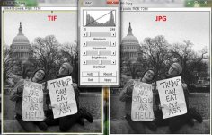
giganova: Wouldn't even your TIFF have to be a JPEG in order to upload to RFF?
giganova
Well-known
giganova: Wouldn't even your TIFF have to be a JPEG in order to upload to RFF?
Haha, good point! What you see is a screen grab from a TIF (left) and a JPG (right) side by side.
giganova
Well-known
To get the best quality, you need to start by contacting the printer. DO NOT blindly convert to CMYK !!!
The printer gave me instructions to convert to CMYK with "Japan Color 2001 Coated" profile.
kxl
Social Documentary
One last comment - ***IF*** the original Photoshop document has text and vector content in text and shape layers, TIFF is the wrong format to use for placement into InDesign. Save the Photoshop document as a PDF file without "flattening" the text and vector content and place the resulting PDF file into InDesign instead of the TIFF.
As stated, use CMYK color mode and set the text to 100% K. You also need to make sure there is no color conversion during the save as PDF.
As stated, use CMYK color mode and set the text to 100% K. You also need to make sure there is no color conversion during the save as PDF.
Share:
-
This site uses cookies to help personalise content, tailor your experience and to keep you logged in if you register.
By continuing to use this site, you are consenting to our use of cookies.