What do you think? 5 comments

FrankS

Registered User
Local time
7:04 PM
Joined
Aug 23, 2004
Messages
19,348
Here's a photo that I wouldn't mind a few comments upon. After say, 5 comments, feel free to post a new photo for 5 comments. We could keep this running, with a photo, 5 comments, then a new photo, followed by 5 comments, and so on.

Be honest, and give reasons supporting opinion. No thin skins or hurt feelings! The picture poster should try to refrain from replying. Just be quiet, listen, and maybe/hopefully learn.
 

Attachments

  • image.jpg
    image.jpg
    29.5 KB · Views: 0
This photo does not say anything to me. It looks like a snow/ice scene but does not transmit a feeling or emotion. The contrast is low and the image definition to my eyes is hazy.
When I do a winter scene, I want people to feel cold just from seeing it.
 
I agree with Marc above with most of his comments. I am also capable of appreciating a picture purely for aesthetics or it's composition. Aesthetically, it does not do much for me but it's composition does.
 
If you told me this picture came from the Curiosity Rover on Mars I would call it amazing!

Otherwise, the light is a bit flat, which is why for me it doesn't cut it. Composition wise it's not bad - minimalistic, difference in size of the two visual elements. Side lighting showing more texture might bring it to life.
 
Not enough contrast. Almost a white-out. Other than that, I like it. Now I guess I have to dig up a 5-comment photo. I'm looking.

PF
 
As-is, this does nothing for me.

Also . . . at first it looks like an opportunity to create an "abstract expressionist" type image; but after staring at it, I don't think that I (personally) could get there from here.

I can't see anything very exciting coming out of this (from me ! ) - maybe just an interesting play of the lines and edges.

Please accept my comments not as destructive or offensive criticism.
 
Confused subject matter. i see the nice border between the water and the ice, with nice wave texture on the water, and somewhat interesting shadows on the ice. The intrusion of branches in 3 of the 4 corners of the frame is distracting and not supportive of the image.
 
не рыба не мясо.

Its not a "shadows-on-snow" picture, nor a water picture.

If you would have used a longer exposure to smooth the water out, then the transition of water and snow would have compelled more to me and this angle could have worked.

On the positive note, the tones are lovely. :)
 
An image like this would be more interesting to me if it lacked the intruding border elements of the branches and grass, and lacked the bottom edge shadow from, I think, the lip of the snow pile. When it's more about pure patterns juxtaposed, that's when a photo like this is more striking, to my eyes.
 
I'll jump the gun here to keep this thread alive . . .

I'll jump the gun here to keep this thread alive . . .

Please comment on this . . .

teapot001.jpg
 
Nice idea, but I can't decide what is in focus and what isn't.
Looks very 'soft' so I decide the lens used would do 'better' stopped down.
Use a pm to hit me over the head if you feel that way inclined! LOL

jesse
 
For me this photo has a nice soft pleasant mood. That early morning feel when one is still in the process of becoming alive to the day shaking off a restful sleep. Soft window light & warm brown tones of the pot look inviting for a good coffee.
 
I don't mind the (very) soft focus. I think the sort-of-soft border makes it look more intentional than perhaps it was.
 
I recognize this as the probably original of http://www.cafephotos.net/Gallery1/Gallery1.html, more of an extreme-post-process to use Peterm's recent phrase. About this version I have the same puzzlement as Jesse, though comparing this to many of your exceptionally sharp and well-seen CafePhotos suggests that the soft focus or use of the declarification slider is intentional.

In a shot this tightly framed (or cropped) by a usually sharp clear photographer, absence of clarity translates to one of two possibilities for me: 1/Sentimentalization of the object. I can imagine the pot has sentimental value to the photographer, but the image does not embody this to me, the visual skeptic. 2/Metaphor. The pot conveys comfort, warmth, containment, roundedness; the window frame in its proximity conveys edges, limits, essential difference. It could be a photograph about the differences between a long-married couple, or between an individual's own conflicted impulses. But my effort to discover metaphor is too arduous for this slight and fuzzy-warm domestic image. It's seen as though through tears, but tears of what? So again, it does not answer a skeptic's query about its apparent sentimental impulse.

Did I overthink or overstate this? Probably. But that's the only way I can practice critical thinking. I'm glad to have Dave's other images to compare with this one, which by contrast seems relatively weak. I really am glad Frank has started this exercise, and thank him and Farlymac and you, Dave, for submitting images so far.

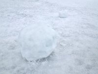
I also notice that Farlymac did not get a 5th comment! I like the 3 main elements of that image--water, ice, shadows--and agree with Frank that the corner-branches are distracting rather than framing. If this is a crop, I could see further cropping and more attention to the contrast of the shadows; but I'd also like to see a wider view with more of the branches (again, if this is already a crop).
 
When you make a table top study, I think it really has to be thought out well, i.e. the composition should work, the colours (if any) should work, the texture (or lack thereof) should work too.
This photograph, is an "almost" shot - almost interesting composition, almost harmonious colours, and a texture, which is almost soft. If you fancy this kind of work, you should try to do better.
An example from this genere, which somehow works well, can be seen in the middle of this page:
http://www.magnumphotos.com/C.aspx?VP3=CMS3&VF=MAGO31_10_VForm&ERID=24KL53ZVNE
 
OK, I will join in. Dave, I think that the mix of colors in your image is very interesting. My suggestion is that it might be better if more aggressively abstract, perhaps not shot at an oblique perspective, but head on so that everything is flattened into "elementary" shapes.

Here is my contribution, please comment:

U41022I1363747279.SEQ.4.jpg
 
I like this image very much, just as I liked the ''over-processed'' version that Dave posted previously.

Everything about this image is in balance, everything gels.

The framing is perfect, the degree of overall softness is exactly right, the catchlight on the pot is an attractive centre point, and the colours complement each other to perfection, with the orange stopper a lovely touch.

This image is eye-catching for all the right reasons, it's very nicely shot, and I'd gladly find space to hang it on my wall....
 
For me I find the sinage too distracting...boring. I find the angle of homes interesting. Love how the tree branches drape across the photo pointing it's finger like branches toward it's group of beautiful old cherished homes.
 
Back
Top Bottom