thegman
Veteran
If you can get it, look up Argenti Godochrome, and Vivid Arrow:
http://www.foto-r3.com/argenti-godochrome-200-35mm-36.html
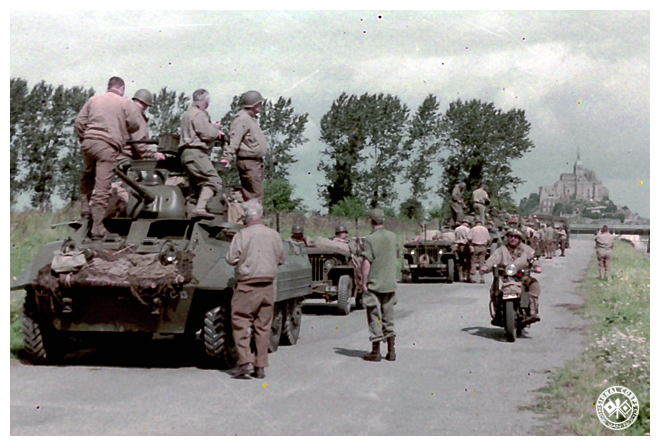
They certainly both have a retro look, and pleasing if you're into that sort of thing. I really like the look of them. No idea what film this is or where it comes from.
http://www.foto-r3.com/argenti-godochrome-200-35mm-36.html
They certainly both have a retro look, and pleasing if you're into that sort of thing. I really like the look of them. No idea what film this is or where it comes from.