js670
Member
I've been shooting with a rangefinder for quite a while now, and have taken, IMO, some reasonable images. However, I've been slightly frustrated in realising the finished image. I just can't seem to get the level of 'snap' I'm looking for - whether it's a question of luminosity or '3D feel', I can't really tell, so I'm asking for help!
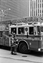
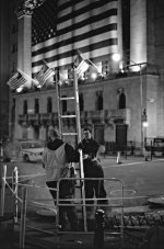
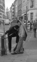
I've attached two images I'm reasonably pleased with (the fire truck and the ladder), which will hopefully shed some light on what I'm looking for, and one I'm less pleased with (the umbrella). I'm not sure what I'm looking for - I'm happy with the composition, it's just the look of the image I don't like (are they too flat? too dull?). For information, these are taken on HP5 with a ZM 50/2.
I realise this is an extremely lazy and vague request, but if any of you could spare any time to give me your thoughts on these (whether its with regard to camera technique or post processing, I'd be really grateful.
If it's any use, an image which does seem to jump out at me is this http://farm2.static.flickr.com/1308/1198187075_464e9aa11c.jpg by Maddoc; obviously it's colour, so not a great comparative, but it really seems to have punch.
Thanks!