rbiemer
Unabashed Amateur
Folks,
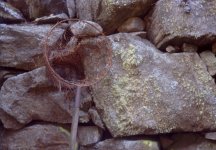
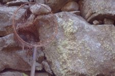
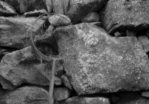
I usually don't have this issue but I have two versions of the same negative and I can't quite decide betwen the two.
So, I'm attaching both to this post in hopes that I'll get some opinions.
Aside from the cropping, minimal levels adjustments and unsharp masking were applied.
I'm pretty thick skinned so don't worry about hurting my feelings and please tell me what you think (well, about the photo.😀 )!
Thanks,
Rob