Which is better

Sparrow

Veteran
Local time
5:06 PM
Joined
Feb 25, 2006
Messages
12,418
Which of these is the better photo? or least worse maybe


3016600639_62b4952421.jpg


3016589909_305d610762.jpg


3016575343_d5f8d46c2e.jpg


PS
The contrast may be a little off as I’m using an odd profile


http://www.flickr.com/photos/19217760@N05/
 
The middle one is the best as it stands, though I would have liked to see you get closer to the girl.

The other two could use serious cropping.

#1 the people on the right side of the frame are distracting and I would like to actually see what is going on the leg.

#3 No real center of visual interest here at all. Crop out the third lady, maybe.
 
questions like this show the limited helpfulness of asking a self-selecting group of online people to do your editing ... It is impossible to say definitively which is best or better without having some shared standard and since none of us know what your intended use or standards are, we are all left to just make pronouncements based on our own personal (and idiosyncratic) standards and, unless each of the responders tells you explicitly what their standard is, you don't really have any way to evaluate the standards we are using to make our choices either!

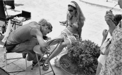
In this case, I agree with Scamper that #3 has no real "punctum" for me. #2 is pleasant but still rather bland. I personally like #1 the best and would never crop out the righthand figures, because (for me) they are the center of interest here; we cannot see the work being done on the leg (I am guessing it's henna), but what we can see (obliquely) is the curiosity and idle gestures of the two onlookers: the lady watching the proceedings and idly chewing on her glasses and the little boy, who is obviously also watching, idly itching his nose.

Even though it breaks some of the canonical "rules of composition", I personally feel it has more drama and human interest than the other two. But, again, I have to emphasize that this is just my own personal reaction, based on my own standards of what makes a good photograph.

As an unrelated question, I am seeing a lot of images on flickr lately that have those bars (white or black) on just two sides of the frame and I cannot for the life of me understand why people leave them on instead of cropping them out. Is there an aesthetic reason for this? I find it mystifying...
 
Last edited:
The middle one is the best as it stands, though I would have liked to see you get closer to the girl.

The other two could use serious cropping.

#1 the people on the right side of the frame are distracting and I would like to actually see what is going on the leg.

#3 No real center of visual interest here at all. Crop out the third lady, maybe.

I actually prefer #1 the way it is and is my pic for the best of the three. I enjoy the people on the right side of the frame. and overall #1 has a great deal of angles leading you around the image

#2 and #3 seem like exercises to me and are quite static.
 
I will admit out of the shoot that "street" is not my specialty. But IMHO, photos 1 and 2 tell a story and are improved with some cropping.

The third photo is simply too busy and uninteresting (IMHO).

Contrast needs some work – all three seem washed out to me.
 

Attachments

  • 1 Picture 1.jpg
    1 Picture 1.jpg
    46.2 KB · Views: 0
  • 1 Photo 2.jpg
    1 Photo 2.jpg
    60.2 KB · Views: 0
If the people peering at the Henna Girl are the center of visual interest, then the frame should have moved more to the right.

As it stands, they just distract, imo. Plus you have a big merge there with the kids head and the woman's arm.

Nothing wrong with a good crop here or there. :angel:
 
Thanks for the input, #2 was the best to “illustrate” the text but in the end I couldn’t live with my framing error (I too didn’t like the missing feet)

So in the end I settled on #1 re-scanned to recover more of the highlights and switched the page order round so the part figure framed the pair of pages, looks better I think?

3019441661_a7dafbcf4d.jpg
3019602913_a6d930288c.jpg


I get too close sometimes
 
Last edited:
I actually prefer #1 the way it is and is my pic for the best of the three. I enjoy the people on the right side of the frame. and overall #1 has a great deal of angles leading you around the image

#2 and #3 seem like exercises to me and are quite static.

I think that’s correct, I probably should have asked “do I use the better image or the better illustration”


thanks everybody

:)
 
As a set of 3 I like them - they illustrate what you see on a walk-about. Individually they don't have the same impact, as they are then isolated scenes without much to connect the image to anything. The girl at the right of the first one is great.
 
Back
Top Bottom