
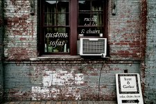
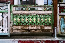
I have been playing with PS and adjusting color and contrast on some pic. Origina vs doctored. Which do you like best?
You are using an out of date browser. It may not display this or other websites correctly.
You should upgrade or use an alternative browser.
You should upgrade or use an alternative browser.
Which set looks best
- Thread starter MP Guy
- Start date
- Latest activity Latest activity:
- Replies 17
- Views 1K
here is the other
trittium
Well-known
The first photos in each look too saturated, but the second photos are too dull. In my opinion, some healthy medium should be reached. The contrast in the first frames are spot on.
OldNick
Well-known
I agree with trittium. Of the two examples, I would pick the first in each set.
Jim N.
Jim N.
Ergo
Observer
i concur 100%
Andrew Touchon
Well-known
trittium said:The first photos in each look too saturated, but the second photos are too dull. In my opinion, some healthy medium should be reached. The contrast in the first frames are spot on.
Ditto...... 🙂 🙂 🙂
R
Rich Silfver
Guest
RayPA
Ignore It (It'll go away)
The first ones look better than the originals, but I agree that there is probably a point in between. I think you're doing the right thing and going in the right direction.
🙂
🙂
sf
Veteran
I like the second image in both sets better than the first. Looks more natural. Maybe a touch more saturation and very very slightly more contrast would make them even better.
The first in each set is too saturated and contrasty for my tastes (but it could be my LCD monitor as well).
find a spot in between, then you'd have it.
The first in each set is too saturated and contrasty for my tastes (but it could be my LCD monitor as well).
find a spot in between, then you'd have it.
jmilkins
Digited User
On my monitor (hp p1120 , 21 " flat trinitron) the first images are too saturated to my taste.
Mind you, I need to calibrate my monitor as there is quite a difference bwtween the Monitor RGB and the Windows RGB settings in PS CS which is annoying when I try to print on the hp 8150 printer....
Mind you, I need to calibrate my monitor as there is quite a difference bwtween the Monitor RGB and the Windows RGB settings in PS CS which is annoying when I try to print on the hp 8150 printer....
c.poulton
Well-known
I don't think it is a monitor issue - the consensus is that the first images are too saturated. (I agree with this as well) The second set are too 'flat' for my liking, so perhaps just a touch of saturation would help.
I like what Rich did with the image. I have been looking for the look but can never seem to PS it.
R
Rich Silfver
Guest
Jorge Torralba said:I like what Rich did with the image. I have been looking for the look but can never seem to PS it.
1) A bit of sharpening
2) Clipping the levels a bit
3) Desaturate about 40%
4) Increase contrast 20%, decrease brigthness 10%
5) Save
🙂
Wayne R. Scott
Half fast Leica User
Personally I think if you are going for drab scenes you may as well make them monochrome. But then what do I know?
Wayne
Wayne
Toby
On the alert
I think that sometimes when you struggle to find the right 'look' for an image and scratch around in photoshop trying to find something to really latch onto style-wise, the problem can be that, even on a subconscious level, you're not as happy with the image as you might be. In the first picture the air conditioner spoils it for me. In the second the metal bracket to the left of the gate is distracting and it all seems a bit busy to me. Both shots to my mind are near misses and although playing with PS settings is good practice, I've often found that if the image itself isn't quite there, it's very easy to get bogged down in the post production side. I think there is certainly something to be built on stylistically, and this theme is worth pursuing, but I would go and improve on these shots as I'm sure you can, and then come back to this problem, the stronger the pictures are the easier you'll find this part of the process.
T
Todd.Hanz
Guest
RicardoD
Well-known
My preference is towards the first, but as others have suggested, perhaps a bit too saturated.
My favorite would be the one where that window unit air conditioner is removed!
Interesting to see others apply their techniques to get the many looks. It inspires me to continue to improve my digital darkroom techniques as well.
My favorite would be the one where that window unit air conditioner is removed!
Interesting to see others apply their techniques to get the many looks. It inspires me to continue to improve my digital darkroom techniques as well.
R
Rich Silfver
Guest
Funny how different we see things. I think the airconditioning unit is essential to the photo 🙂
Similar threads
- Replies
- 14
- Views
- 2K
- Replies
- 6
- Views
- 373
- Replies
- 3
- Views
- 784
F
- Replies
- 6
- Views
- 776