Lumpy
Established
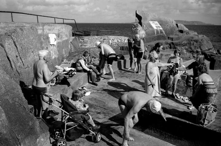
A few from a project I've started in a small local swimming area. Any comments and feedback would be greatly appreciated.

Good start, I think you might need some water level views...
This looks like a good start for your project. I would probably drop the third from top altogether (although I guess you want to have at least one overview) and reshoot the second.
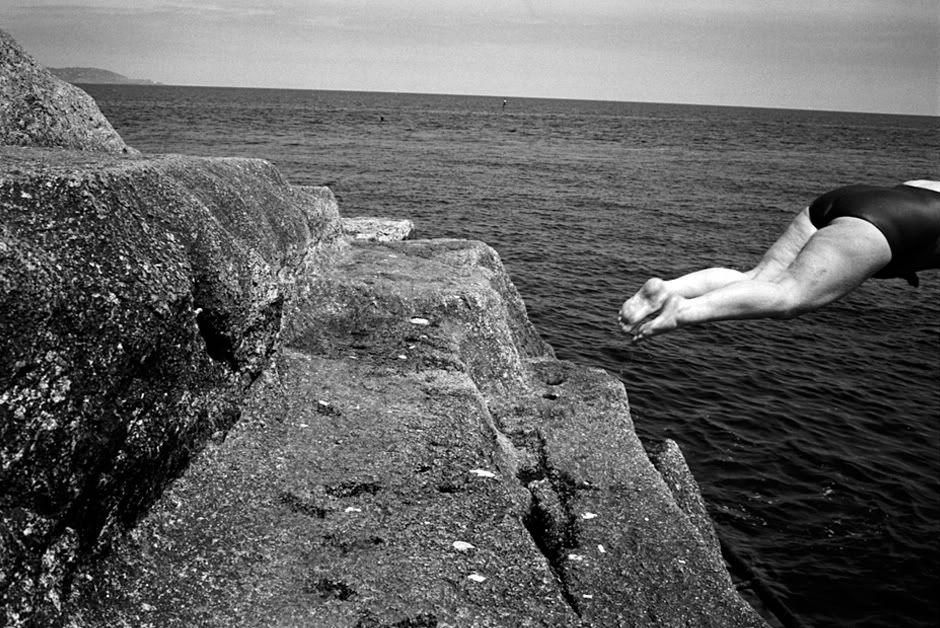
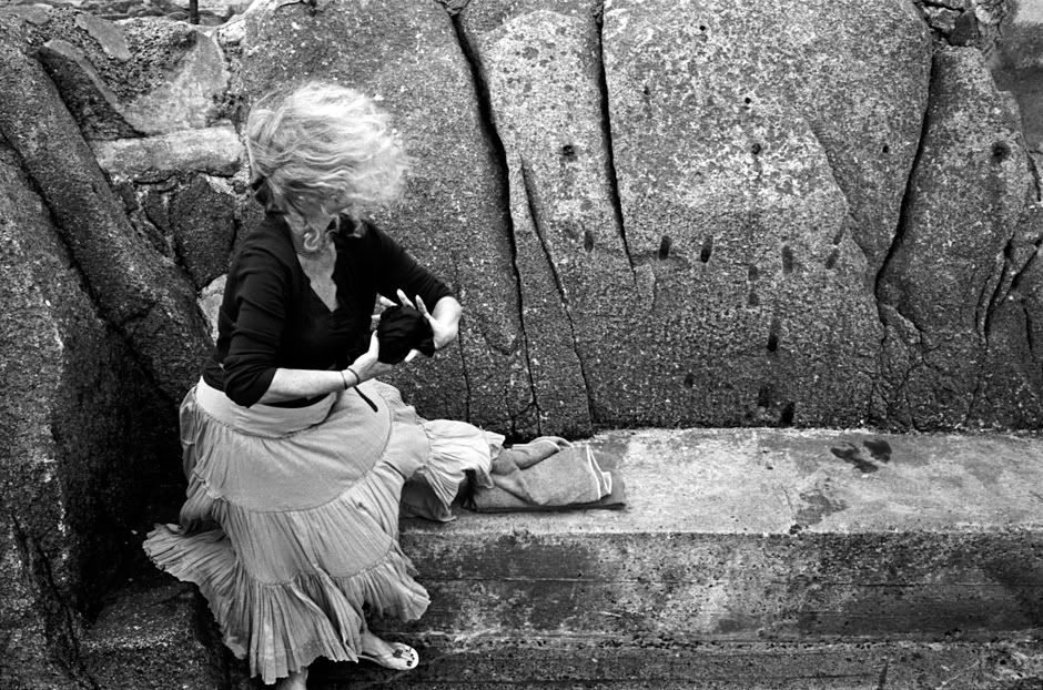
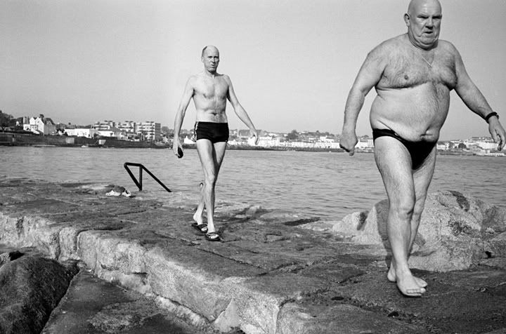
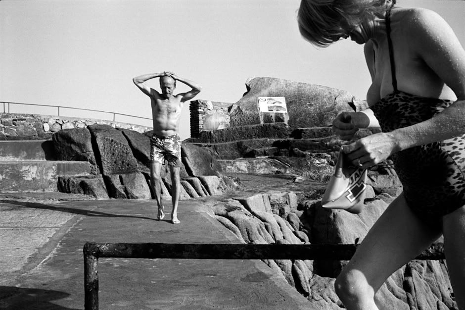
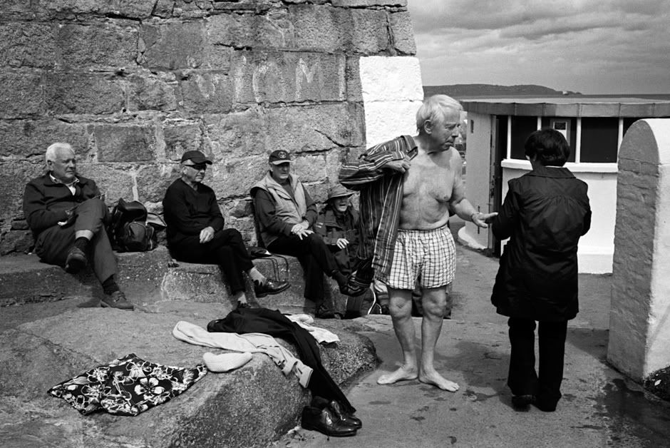
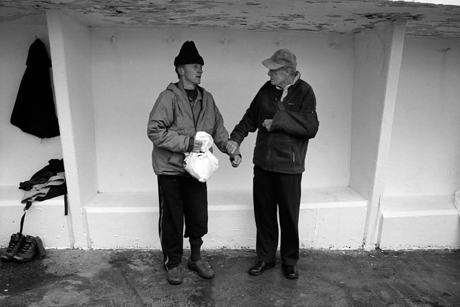
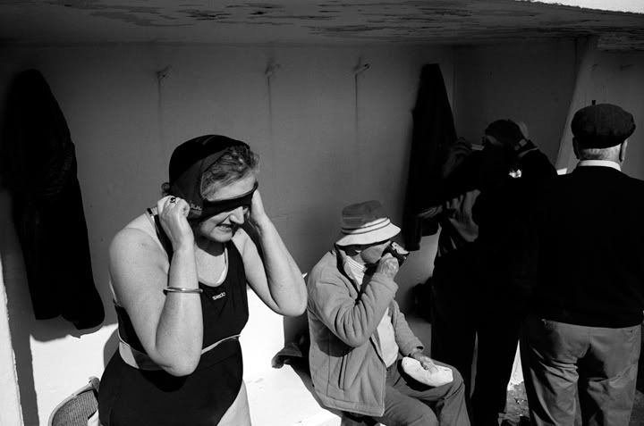
Three photos I really like: the one with the woman pulling a swimming cap on and the man drinking from a mug; the one with the (half of a) woman jumping into water; and the two bald men walking. In addition, the one with the man with hands on his head and the woman climbing from water is also good, although I don't really like the framing (a bit too tight on the right). The one with two men standing, one holding the arm of the other, is pretty funny.
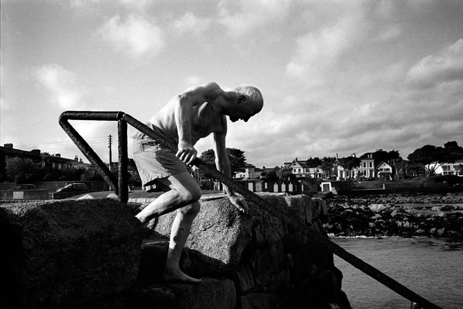
Sorry, what I mean is that the idea and view in the image is quite central to get a good understanding of what this swimming place is like: that's the point (or one of them) where you go into water and get out. But the photo is not as strong as some of the others you have, so I would make more frames with a similar composition and only keep the best for the project. I'm not saying your shot is bad, but I think you can get a better one (you have a very good eye), perhaps one with some interaction with the subject, I don't know.Not quite sure what you mean by "reshoot the second"?
...The others I like far less.
Can you explain why?
I'll try; please don't feel offended, it's just my opinion...
For the record, #1, 9, and 10 I find very good.
#2: I can see your idea, but somehow the picture doesn't work for me. Probably the stairs are too much in the center?
#3: Foot and wheel cut off, DOF too shallow (or image not very sharp), scene not very interesting (this is probably due to DOF being too shallow: one can't see good enough what's going on).
#4: Four people, but I cannot see any of their faces.
#5: Head cut off for no apparent reason. Don't know what this is supposed to 'mean'.
#6: Body cut in half. Looks like you simply pressed the shutter too late.
#7: I don't know why I do not like this. It's not bad.
#8: I want to see the face of the woman wringing her bathing suit (or whatever she's doing)!
#11: This is a type of photograph that can work well printed very large and in high quality. In low resolution I can only speculate.
#12: As the similar shot above, DOF too shallow, not very interesting.
#13: I don't know. Maybe you're just too far away.
I feel a little uncomfortable criticizing your images so directly. Again, please don't feel offended. My opinion is just one among billions others. Don't give it too much thought if you think it's bull****.
(...) You are confusing shallow depth of field by the way, as this image ha, in fact, a deep DOF. (...)
Oh my... I'm confusing nothing. I said either DOF was too shallow (not shallow; do you understand the difference?) or the image was not very sharp.
Lumpy, what part in my lines "Again, please don't feel offended. My opinion is just one among billions others. Don't give it too much thought if you think it's bull****" did you not understand?
You can't prove to me or anyone else that all your images are great. It's a matter of taste in the end. To me they aren't, but I took quite some time to explain to you why I think so -- because you asked and I thought you really would like to have some feedback. The decent way to reply would have been to say 'thanks for the trouble' -- and not repeatedly declaring me an ***** who hasn't even understood what depth of field means.
Next time, please, do not ask for feedback if you can't really handle it.
And don't bother to reply again. I've said my piece and you, of course, will know it all better. I'm unsubscribing this thread and will not read any private messages from you.
Lumpy, it's always dangerous to ask for criticism, as you might get some!
You will like my comments better - I think these are marvelous on the whole. The only one I really don't like is #3, which is simply too busy.
My taste is very different from Thomas - I like images where bodies are obscured/cut off, as this can add interest and sense of dynamism. The lady with the windblown hair is among my favorite in the set, because I CAN'T see who she is.
(In fact, my own tendency to always get the subject in the frame is what makes many of my shots amateurish and unsatisfying, and that is something I am fighting against.)
I think your compositions are very effective, and technique is very good as well.
Randy