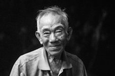
2 versions digital B&W converted portrait: which one?

No offence, but your is monitor calibrated? Certainly everyone can have different calibrations and should be in the ballpark.. What you describe sounds way off..

I'm pretty confident in my monitors, but you are certainly welcome to stop by some time and we can look at them together. I often will download and play with pictures from here and other sites, and am pretty convinced that there's no way to drag shadow values out of large areas of 0,0,0, though. :) The reason I mentioned the histogram add-on is that it confirms a lot of what I'm saying.

For reference, http://www.shorpy.com has been a bit light for my taste recently, but if you go back 500 pages or so, I think those renditions are as close to perfect as anything.

I'm sure there's a component of taste involved here. My general reference is to try to match large format, not what most people do with 35mm. One of the things that's striking to me when I go to the Art Institute of Chicago, a block from my shop, to see old photo exhibits, is that the standard of printing used to be very different from what you see today, and a lot better, in my opinion. I have a feeling a lot of the people here would hate the original Robert Frank prints I've seen, as well as many things from the 30s.
 
Robert I am very grateful for your wise comment and advice.How very well you read this face. Thank you for acknowledging the photo for what it is and to describe it eloquently. His blind eye, to get this detail right, a wonderful suggestion.
coming back in a month must be very sound advice of the experienced. Thank you to John again, I shall take this serious.
not to sentimentalize nor to stylize, I shall remember that. Trying to show the beauty of the outwardly plain or common, which might get overlooked, has been my biggest driving force. I want to show that directly, 'plainly', not 'enhanced', but shall be more careful again not to sentimentalize. Not to produce oneself is tricky, it has happened that someone disregards my photos because he assumes that I am proud because of getting around a lot.

usually I develop, fast.. and upload the same day I take a photo and leave it at that. That has not made me learn much of editing.
Now that my request has been honored by so many answers, thoughts, suggestions, advice, even re-works, thank you all! - I feel obliged in the best way possible: I must take the challenge, follow this through until I get it right!

my latest go

Untitled by andreas, on Flickr

Here is a quick B&W conversion.. added a little bit of grain just looks sterile without it.. If I had your original file could fine tune it more.. I hope your cool with others working on your image:)
 

Attachments

  • 26426274702_775b208248_b-2.jpg
    26426274702_775b208248_b-2.jpg
    21.9 KB · Views: 0
As has been said, it's a lovely shot but the only b&w version I like is that suggested by ABrosig. For me, in all the other versions the highlights are too bright -- although Keith's are moving in the right direction -- and also somewhat too contrasty. I still like the way film renders in b&w, it seems softer and less analytical.
 
I agree with Robert about his eyes. I attempted an interpretation in LR/CS6 but I must admit to liking Keith's subtle rendering as well.

26511057336_cb7ee51faf_o.jpg

thank you very much for your effort Lynn!
your's looks very good to me. I am happy to see that there is another active thread which asks a similar question which also gives me good input. I shall follow the advice and come back after a while to review the different versions again and to try a new conversion myself. In the meantime I shall try to leanr more about the topic.
thank's, cheers, andreas
 
When I see threads like this, I always wonder what I'd see if I were looking at each person's rendition on his own monitor! Most of the versions here look too contrasty to me, with too much black in the face but I also see that in general people don't mind empty shadows as much as I do.

For looking at pix on the web, I downloaded a Chrome add-on called Image Histogram that offers a right-click menu item to give a histogram for any webpage image, and often I'll turn that on if I see something I like or don't like, to see what's going on. Here, there's quite a bit of bunching up near black in most renditions that the original color version doesn't have--so much that I think the facial tonality ends up being exaggerated in a way that looks too dirty for my taste.

I only work in PS, so I'm not much help here, but with portraits I always end up separating highlights and shadows and working on them separately, bringing facial bright areas down and enhancing their contrast a bit, and pulling shadows up. That pulls things away from the ends of the histogram and puts them more in the middle, which is actually the way our eyes see things--look around you and see how many shadows there are that are so deep you can't see into them, and how many faces are so bright you are blinded by their whiteness being right next, on the grey scale, to the pure white of the sun--that just doesn't happen.

In Windows PS, Ctrl-Alt-Shift-~ selects highlights above mid-point, and Ctrl-Alt-I inverts that selection for working on the histogram's lower half, if I'm remembering that right. I do that in layers so I can keep messing around until it looks right. After I think I have it right, I'll throw it up on the web and check how it looks on every computer I have access to, but usually my Android phone gives the best, most average version, which I've confirmed by looking at various greyscales on the web, so I give that the most weight.

On my phone, the first example in Kuuan's post #13 is my favorite version so far.

yes, monitor used is an important issue for me. I had mentioned that I am on a 15" notebook, do all my viewing and editing on it and close to never get to see my images on any other screen, e.g. this portrait I have not sen on any other yet. This made me a bit shy to ask to start with, and I was eager to get input about the blown highlights.

your shortcuts..thank's a ton! I shall try to find out more about your workflow, give it a try myself, thank you so much. anyway, often I care more about the blown highlights and less about the details in the lows, will try to 'get more to the middle', as you suggested
 
Not a problem, I choose the cropped version because that was the last one that I saw.. I'm not sure which one I prefer in terms of composition. I'm inclined to lean toward the original, but the cropped version is more personal. The thing I don't like about the cropped version is it feels more like a senior portrait if you will in terms of crop.. Do make any other versions with different compositions? Letting it sit for awhile and then come back to it as someone else mentioned that's a good idea and I would echo that thought...

right! the crop is that of a 'conventional portrait', as if done in studio, might not fit this photo. I shall do as you and many other suggested, let it sit for a while and come back later and see what I come up with then
 
Best one yet, IMO, kuuan. It seems closest to your initial version.

John

which one are you referring to John? My last attempt in post #40?
I tried to get better details on the blind eye, but now, after just a day or two, the face in total looks too bright to me
 
Here is a quick B&W conversion.. added a little bit of grain just looks sterile without it.. If I had your original file could fine tune it more.. I hope your cool with others working on your image:)

thank you very much! of course I am very please if anyone gives it a go! Looks great to me. I admit that I usually don't add grain, in case I use a film simulation preset in Silver FX I would take out the grain again. You tell me to embrace grain, I will remember that!
 
As has been said, it's a lovely shot but the only b&w version I like is that suggested by ABrosig. For me, in all the other versions the highlights are too bright -- although Keith's are moving in the right direction -- and also somewhat too contrasty. I still like the way film renders in b&w, it seems softer and less analytical.

thank you for that Lawrence. I tend to agree that I best like ABrosig's version and I shall try to emulate his process which sounds very interesting
 
I played a little with your B&W version.
Is this "OK"?
RFF%20image%20for%20discussion%20copy%20copy-XL.jpg

thank you very much for your effort Raid!
it looks very impressive, very contrasty and sharp, or is it what a 'clarity' slider does, not sure. Maybe a bit too contrasty detail for my taste, in all other aspects, namely exposure, details of both highlights and shadow it loos perfect! The colorversion looks to me as if it got all of the above right, again a bit more blue than my last color version and even moe so than that of Vince and Marko. I'd be curious what others think of it, cheers, andreas
 
Back
Top Bottom