A Study in Color and Composition

Meleica

Well-known
Local time
3:25 PM
Joined
Mar 28, 2005
Messages
680
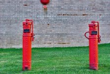
I think this is a really fine photo, mainly for ( I think ) its perfectly balanced composition. What do you think ?

redd.jpg


thanks
Dan
 
Last edited:
I like it Dan. Obviously the colors are great; in addition, the slight diagonals are very original and keep my eye searching.

Thanks for posting,

Roland.
 
I would never think of taking a photo like that. I like the red uprights and the bell or whatever on the wall. The light gray makes the reds stand out, and the grass keeps it from becoming boring. Nice shot!:cool:
 
Looks like something that Eggleston would shoot :)

I would say it makes a good study of color, although it doesn't look finished to me.
 
I'm more of a B+W guy, it brings out form and texture. IMO, colour forces one to look at the surface whereas B+W somehow allows one to see deeper. This composition is balanced and pleasing (except for the cut off pipe cap at top left) and the colours are nice. But there's not much else going for it, IMO only, and please remember that I'm very B+W biased.
 
The complementary colours the similarity and repetition of patterning all give it real vitality, however I find my eye is drawn back to the area bounded by the two pillars left and right the top edge of the grass and the bottom of the bell and that area unfortunately has nothing in it, it catches my attention well but then fails to give me anything to study. Overall I like the picture but in a contemporary sense, not a classical composition
 
I think the strongest element here - and it is very strong indeed - is the excitement that red and green together always seem to create. I am not sure about those pipes, though I do like the repetition of the verticals.

I'm not a cropper by nature, but I took the liberty. I would have liked more visible green, I will admit, at the bottom of the frame, I think.

Many would have passed this scene by, but it is lovely in its seeming simplicity!
 

Attachments

  • hydrants_meleica.jpg
    hydrants_meleica.jpg
    124.9 KB · Views: 0
RF-Addict said:
You should crop out the pipe on the left - it is too disturbing.

I agree with RF-Addict. Crop out the pipes on the left. IMO it would make the image simpler and graphically stronger. I like the shot.
 
Dan, what is really most important is if YOU like the shot (or if there is someone paying you to get the shot, if THEY like the shot.) Otherwise, it's jsut people's opinions. Now, if there was someone who you consider yourself a student to, then you would be willing to place their opinion above yours and modify your view accordingly.
 
Meleica said:
bump for more feedback - thanks
Dan

Hi Dan - Lovely shot - well spotted.

I'd probably try and crop the pipes on the left as they seem to draw my eye too much...other than that the reds and greens are great and the offcentre red thing on the wall is nicely placed - dead centre would seem natural but by being offcentre it calls attention to the shot (hard to explain but I think if it was dead centre the shot would be become 'transparent'...as it is, it forces the brain to work...)
 
I would not crop the pipes off - they fit quite well for me (except for the cap of the longer one
touching the frame).

My 2 cents only ...

Roland.
 
Thanks for all the feedback. I love the pic as-is, but I'm biased :>

I wished I had gotten the top of the one pipe, but thats photography for you...

I showed my wife and she said..."oh....ah...thats nice."

Translation: I dont get why you took a picture of pipes....

Thank god ( or jorge or stephen ) for this forum !

Dan
 
Meleica said:
Thanks for all the feedback. I love the pic as-is, but I'm biased :>

I wished I had gotten the top of the one pipe, but thats photography for you...

I showed my wife and she said..."oh....ah...thats nice."

Translation: I dont get why you took a picture of pipes....

Thank god ( or jorge or stephen ) for this forum !

Dan
Hi Dan
That’s the thing, I have a pic from last summer on the wall at home that breaks all the normal rules but I find it attractive, and that’s what matters

P. S.

That reads wrong; I’m not implying your pic is breaking any rules :)

regards
 
Last edited:
Back
Top Bottom