I am one of the last people to discourage ridicule of Mr Eggleston, and I'm disappointed you should think otherwise ... photography as an art-form is, and must be the art of the moment, immediate, incisive and piquant, Eggleston's dreary documentation of north America, the old days in colour is just nostalgia ... I would take a print of Keith's dancers in preference to any of Will's any day.
If the subject is stationary one doesn't need the immediacy of photography, there are lots of other media that do slow and considered artwork
When I wrote "oft derided" I wasn't even thinking of you, let alone meaning you! I know you get Eggleston!
I think I conflated apologising for coming over as patronising (answering you) with trying to explain my point less patronisingly (aimed at folk in general, not you). So, neither my explanation nor Eggleston were directed at you per se.
Anyway, apologies for seeming to imply you would diss Eggleston!
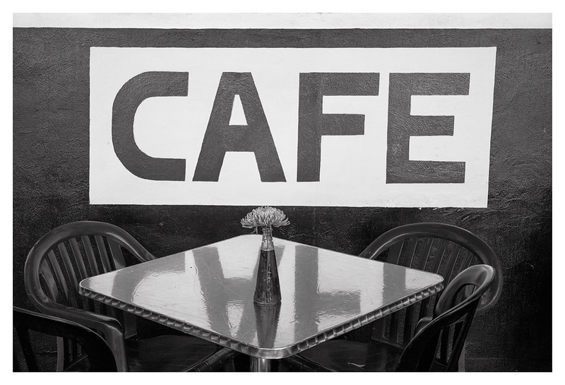
I was scrolling the page and saw this photo and immediately liked it. Didn't realize it was Eggleston till I read the paragraph above.
Totally disagree that it's only noteworthy only because it's an Eggleston. It has a very quiet but definite power conveying a particular kind of emptyness.
I can't articulate why this works so well, but I also can't escape the fact that it does.
Exactly - someone else who gets Eggleston! This kind of eye is innate and can't be taught. You're born able to see and capture scenes like this. Or you're not.
Photographs have been likened to footprints - "imprinted by Nature's hand" to quote Fox-Talbot - and this quality, this sense of connectedness with something real beyond the picture frame, that what we are looking is deeply significant to us, is what Eggleston does but many lesser photographers can't. This ability transcends technical skill and compositional skill.
Someone with this skill whom more RFF members might find to their taste is
Francesca Woodman.
Returning to this thread, one thing that annoys me
intensely about critiques is that the great majority ignore meaning, narrative, cultural significance and other similar qualities and instead drone on and on about composition and technical flaws. Some of this droning even suggests changes (e.g. crops) that make a photograph worse by turning it into an exercise in graphic design that destroys any vestige of narrative or other intangible quality.
When critiquing a photograph, we first need to consider what it's for, why it's been taken, what we read into it, how it affects our understanding of what's depicted, whether it impacts the subject, and the like, and how it does all these things - ignoring pictorial qualities such as composition and technique. Only when we've considered why the photograph exists and what effect this existence has on us and others should we start to look at its visual qualities - and then only in light of whether they support its message or not.
Going back to that Eggleston photograph, there are some technical "flaws" but they add to the impact of the photograph. Straightening the horizon, for example, would take away the spontaneity of this image, the feeling that we - like the photographer - have just encountered this scene.