
Sparrow
Veteran
... and what about the symbolic reincarnation of those trees as a shed?
.......... 😉
.......... 😉
... and what about the symbolic reincarnation of those trees as a shed?
.......... 😉
... OK then but that makes it documentation not art
A lifetime as a designer does not equip me well for this, making beautiful things for so long most have a lot to do with my inability to understand some things like this I expect
... for example the photo Ned put up earlier had me thinking about the typeface he'd used in the watermark almost as much as the photo itself
That's why I like making photographs: creating art that marries aesthetics with documentation. Of all the mediums, photography (still and moving) does this the best.... OK then but that makes it documentation not art
A lifetime as a designer does not equip me well for this, making beautiful things for so long most have a lot to do with my inability to understand some things like this I expect
... for example the photo Ned put up earlier had me thinking about the typeface he'd used in the watermark almost as much as the photo itself

That depends, something very aesthetically mediocre but rich in content can be poetic. Even something as bland as an ad in the second hand classifieds can be evocative; "For sale: baby shoes, never worn." Aesthetic beauty has a lot to do with craft but is can often be incidental in art.
BTW, I'm more or less with you on the bottles, but I'm glad members of the forum have such vivid imaginations.
That's why I like making photographs: creating art that marries aesthetics with documentation. Of all the mediums, photography (still and moving) does this the best.
Some of my artist friends are more interested in concepts and ideas than objects, and look at me uncomprehendingly when I say something like "it's not very attractive is it?" Some artworks need to be unaesthetic - for example, if you did a project on family snapshots it wouldn't be right if the "snaps" were beautifully composed - but often there is no good reason for an artwork not to be visually appealling. In fact, there are good reasons why it should be aesthetic: take paintings - as you know, we understood them by applying centuries of visual conventions and learnt ways of looking at pictures. If you ignore all that in your photograph, there's a good chance the viewer will walk right past it, either not noticing it or even being repelled!
Concept is central to my photographs. But I would like my photographs to be enjoyed by everyone - not just folk into Sontag or Baudrillard! This is a photo from my current project on the lost River Fleet in London that references ideas related to the French Situationists - but I hope it can be enjoyed simply as a picture.
.... Some artworks need to be unaesthetic - for example, if you did a project on family snapshots it wouldn't be right if the "snaps" were beautifully composed

I'd appreciate a critique of this photo I took a couple of years ago.
I'd appreciate a critique of this photo I took a couple of years ago.
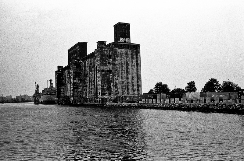
I'd appreciate a critique of this photo I took a couple of years ago.
... it's a cathedral to commerce, the central division of the horizon and the hopper on the left give it a lofty triangular composition in the top bit ... like ely cathedral soaring out of the fens, I can't get past the conflation of that really

If I don't value the aesthetic and graphic superiority of a particular image what have I left to judge it by?