ColSebastianMoran
( IRL Richard Karash )
[EDIT] New readers can skip to a Feb. 2019 summary of conclusions at reply #155 with this link.
We've had several threads about "scanning" with a camera, processing in post. Here's the challenge:
As automatic as possible camera-scanning approach for color-negative. I want to camera-scan my near infinite inventory of color negatives shot over the years, so it has to be as simple, fast, and automatic as possible.
Good color, achieved largely with auto settings, not with lots of manual work.
Not about resolution. I'm convinced camera-scans can produce plenty of resolution. 24MPx is plenty for my uses. And, you can always stitch for more pixels, so this is about color, not resolution.
Not Camera-scan vs. Real Scanners -- Please don't comment here about how one should use a real scanner. I know, they do great, this is about how to do camera-scan with good results most efficiently.
A Challenge, and a Prize -- To make this interesting, I'll give-away a good SLR film camera, ready to use, to the contributor who helps me the most. Minolta or Olympus, your choice. Maybe other possibilies TBD.
Game plan -- Here's what I want to do:
- I'll post a test shot, a test box of known colors, shot on color-neg film, then a RAW capture from the negative. We'll start with Fuji 200. I have a lot of negatives on this film stock.
- You process the camera-scan file, describe your nearly-automatic steps, and show the result.
- I'll post what I already know.
- We'll discuss the best approach for this application: nearly-automatic processing of camera-scans to get pretty good color images.
- Then I'll apply the best technique on a real image, maybe a tougher conversion, to see how we have done. You're invited to do the same on one of your images.
Here we go.
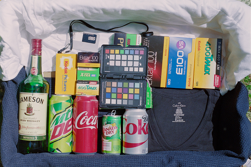
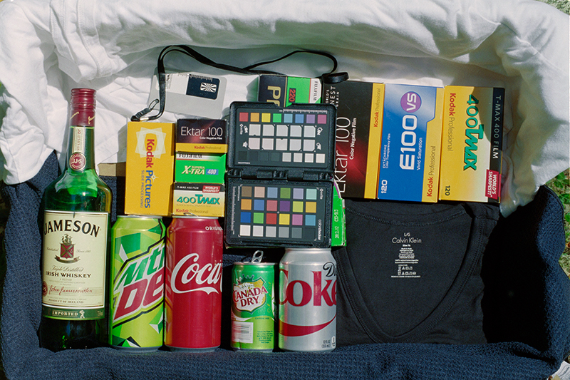
This is my test-box, shot with a good digital camera in direct sunlight (October in NH). A color checker, some known saturated colors, very bright white, very dark black (espec. in the shadow). A good gray reference.
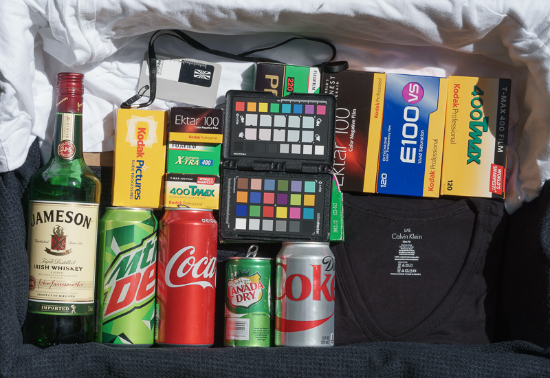
That's a Sony A6000 shot, processed in Lightroom, preset = Camera Neutral. To me, this is a bit over-saturated, extra punchy, vs. the original box. That's the way vendors think we like our photos.
We've had several threads about "scanning" with a camera, processing in post. Here's the challenge:
As automatic as possible camera-scanning approach for color-negative. I want to camera-scan my near infinite inventory of color negatives shot over the years, so it has to be as simple, fast, and automatic as possible.
Good color, achieved largely with auto settings, not with lots of manual work.
Not about resolution. I'm convinced camera-scans can produce plenty of resolution. 24MPx is plenty for my uses. And, you can always stitch for more pixels, so this is about color, not resolution.
Not Camera-scan vs. Real Scanners -- Please don't comment here about how one should use a real scanner. I know, they do great, this is about how to do camera-scan with good results most efficiently.
A Challenge, and a Prize -- To make this interesting, I'll give-away a good SLR film camera, ready to use, to the contributor who helps me the most. Minolta or Olympus, your choice. Maybe other possibilies TBD.
Game plan -- Here's what I want to do:
- I'll post a test shot, a test box of known colors, shot on color-neg film, then a RAW capture from the negative. We'll start with Fuji 200. I have a lot of negatives on this film stock.
- You process the camera-scan file, describe your nearly-automatic steps, and show the result.
- I'll post what I already know.
- We'll discuss the best approach for this application: nearly-automatic processing of camera-scans to get pretty good color images.
- Then I'll apply the best technique on a real image, maybe a tougher conversion, to see how we have done. You're invited to do the same on one of your images.
Here we go.
This is my test-box, shot with a good digital camera in direct sunlight (October in NH). A color checker, some known saturated colors, very bright white, very dark black (espec. in the shadow). A good gray reference.
That's a Sony A6000 shot, processed in Lightroom, preset = Camera Neutral. To me, this is a bit over-saturated, extra punchy, vs. the original box. That's the way vendors think we like our photos.
ColSebastianMoran
( IRL Richard Karash )
I shot this scene at a good exposure on Fuji 200 film. Here's what the negative looks like. There's a link below to the raw file for processing.
Camera-Scan of negative: Shot with Sony A7 with a good macro lens, on a Beseler Dual-Mode Duplicator, electronic flash illumination (i.e. the illumination was roughly daylight). No filtration.
LINK TO RAW FILE: http://2under.net/images/171004-TestBox-Fuji200-SonyNoFilter-DSC9558.ARW
OK, go ahead, download the RAW file, process it. Post your result 800 pixels wide with a description of your nearly-automatic method. I'll post a couple of basics and let's see where we go. I'm interested in good color and good tonality; I'm not worried about resolution.
ColSebastianMoran
( IRL Richard Karash )
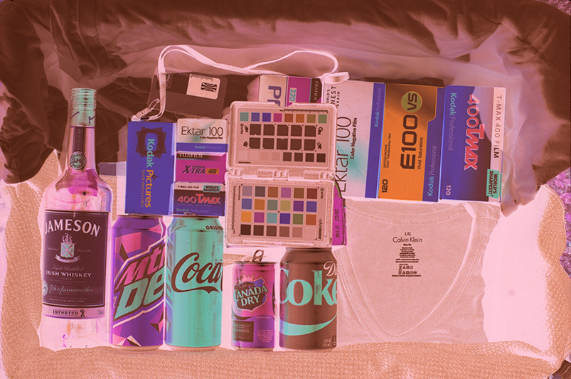
First, we obviously have to invert the images. There's an "Invert" adjustment in Photoshop. This is the result. Not too pleasing, we'll have to do more.
ColSebastianMoran
( IRL Richard Karash )
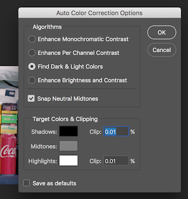
One of the most helpful nearly-auto things I've learned right here is an option in Photoshop:
Curves... Option-Auto... then these choices:
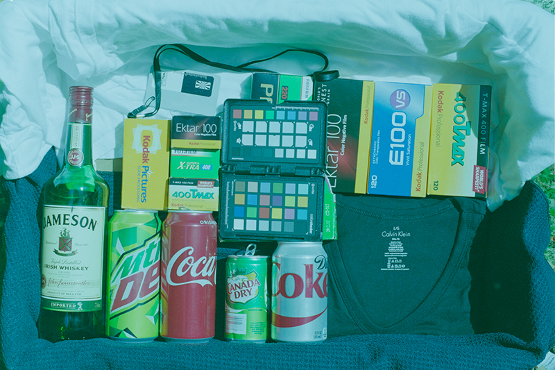
That, plus the gray eyedropper, produces this better result. It's better, but in my opinion not really up to par. The color and tonality are a little off.
My thanks to @Huss for pointing this out and to Michael Fraser for a Photoshop action with this option.
Curves... Option-Auto... then these choices:
That, plus the gray eyedropper, produces this better result. It's better, but in my opinion not really up to par. The color and tonality are a little off.
My thanks to @Huss for pointing this out and to Michael Fraser for a Photoshop action with this option.
Corran
Well-known
Doing Auto Contrast, Tone, and Color in PS gives you pretty much good color/tonality.
I think people really sleep on PS's Auto commands for color neg material, especially well-processed, in-date film. Critical corrections can be made from there.
As long as you don't clip anything in the raw camera "scan" it should be fine.
The only thing I notice is a slight difference in the material on the bottom of the frame. The film looks navy blue, the digital looks dark gray/black. What is it really?
Attachments
ColSebastianMoran
( IRL Richard Karash )
What's wrong? Here's what I think: The film is non-linear, the RAW capture of the negative is very linear, counting photons. Simple inversion doesn't do the job, it whacks the tonality. How to do better with something that's nearly automatic?
Here are some things I worried about that I don't think are significant problems:
- Our final digital images are gamma encoded. Not a problem; we work from the raw file.
- The orange mask means red clips first, then green, and blue is another stop down. I experimented with a cyan-magenta filter to offset the mask. I think it's not a problem; today's digital cameras have plenty of dynamic range. I got worse conversions with the filters; not sure exactly why.
- The orange mask is complicated, not just an orange filter, the mask varies for technical reasons. But, I can't see a problem in this regard.
ColSebastianMoran
( IRL Richard Karash )
The only thing I notice is a slight difference in the material on the bottom of the frame. The film looks navy blue, the digital looks dark gray/black. What is it really?
Thanks, Corran, for the first reply! Yes, that's pretty good.
You are absolutely right about clipping; that would mess things up.
The textured dark towel at the bottom is bluish. The T-shirt is very neutral black.
ColSebastianMoran
( IRL Richard Karash )
A member here, @Jzagaja, a Polish mathematician with interest in color science and sound, provided this non-linear inversion curve.
Here's the result from:
- RAW file as above
- Jack's inversion curve
- Curves... Option-Auto as above
- One adjustment to brightness/contrast in the above Curves adj layer
You can get Jack's curve from this link.
I think this is closer, maybe close enough, with better tonality.
Here's the result from:
- RAW file as above
- Jack's inversion curve
- Curves... Option-Auto as above
- One adjustment to brightness/contrast in the above Curves adj layer
You can get Jack's curve from this link.
I think this is closer, maybe close enough, with better tonality.
ColSebastianMoran
( IRL Richard Karash )
Doing Auto Contrast, Tone, and Color in PS gives you pretty much good color/tonality.
I think people really sleep on PS's Auto commands for color neg material, especially well-processed, in-date film. Critical corrections can be made from there.
Corran, thanks for your suggestion of Auto Contrast, Tone, and Color. Done in that order, I assume. This gives a pretty good result, not that different from the Curves... Option-Auto previously suggested to me. I'll keep that in mind.
Comparing, I do like this a little better than Curves... Option-Auto.
Corran
Well-known
Yes I normally do it in that order. Seems to work the best. Occasionally doing an extra Auto Tone changes the color slightly to something I prefer.
ColSebastianMoran
( IRL Richard Karash )
Check your film boxes, your soft-drink cans, and maybe your Irish whiskey bottle. What will give good color/tonality in an efficient process? G'night for now.
ColSebastianMoran
( IRL Richard Karash )
Yes I normally do it in that order. Seems to work the best. Occasionally doing an extra Auto Tone changes the color slightly to something I prefer.
Yes, I like this a little better than Curves... Option-Auto.
When I do an extra Auto Tone at the end, I didn't like the results.
ReeRay
Well-known
Invert>auto tone>auto color>Levels to fine tune. Finish.
 171004-TestBox-Fuji200-SonyNoFilter-DSC9558 by Ray Evans, on Flickr
171004-TestBox-Fuji200-SonyNoFilter-DSC9558 by Ray Evans, on FlickrColSebastianMoran
( IRL Richard Karash )
Invert>auto tone>auto color>Levels to fine tune. Finish.
Ray, that's very good. I like the Kodak gold and the Coke reds.
Please say more about "Levels to fine tune." You adjusted the three color channels, right?
ReeRay
Well-known
levels. Used three pionts for colour, black and white, tuned with sliders.
Corran
Well-known
It's important to remember that colors are subjective when it comes to CN film. Different films have different inherent "looks" (higher saturation on Ektar, better skintones on Portra, etc.), but you can wrench things around a lot otherwise. You can mess with levels, individual color channels, even hue/saturation to get to your desired color balance and hues.
However, the way I'm reading the original post, the question is "what is the quickest way to get to reasonably accurate color" - especially an automatic or mostly so process. Is this correct?
However, the way I'm reading the original post, the question is "what is the quickest way to get to reasonably accurate color" - especially an automatic or mostly so process. Is this correct?
meloV8
Established
jkjod
Well-known

Huss
Veteran
I clicked on one of my presets in LR, then exported to NikFX Color Pro and clicked on another preset with ProContrast, then reimported to LR and adjusted 'Blacks' under Tone.
 ColTest-1 by desmolicious, on Flickr
ColTest-1 by desmolicious, on FlickrPRJ
Another Day in Paradise
Your best bet would be to profile the film at the time you shot it, but that is out the window. Your next best bet would be to do a correction on one frame of the film in Photoshop then automate the correction to the rest of the roll. That of course will get you close, but it won't be perfect. Might just be good enough though, and if you shoot alot of the same film, could get you what you want. Even though this is not the fastest way at the beginning, it is going to be the best you will be able to achieve given the desire to automate as much as you can and still come up with a decent result.
This was put into Lightroom to invert it and get the colors close without clipping. You can easily apply the steps to the whole roll. Then it was output to Photoshop, converted to LAB and split in two, highlights and shadows. They were each worked on individually with levels layers with eyedropper points on the target you included. This is as good as you will get as far as color accuracy is concerned. You can save the adjustment layers with this method and apply them to other frames with an action if you wanted. You could do the whole enchilada in Photoshop if you have the latest version. Take a sample of the mask and invert the color, then apply it as a layer over the image. Edit from there with layers. Automate the whole thing. I couldn't do that straight with your image since my older version of Photoshop doesn't recognize the file.
If you need the color numbers for your target let me know. Your AdobeRGB file is one set and they change with different color spaces.
It took me less time to work on your image than it took to write this post.
Anyway, here is the Lightroom/Photoshop version of your image which if your monitor is properly calibrated, you will find to be accurate to what was really there based on the target you have in the image.
Share:
-
This site uses cookies to help personalise content, tailor your experience and to keep you logged in if you register.
By continuing to use this site, you are consenting to our use of cookies.