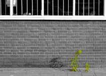
Can't see in color

I find it interesting that so many people associate color mostly with Spring and Summer, or in nature. There's tons of man made color. Garrish and luxuriant.

Winter can be a fantastic time to gather color images. Something I missed here in SoCal was the stark light I associate with winter. Sometimes back east I found that colors really popped in January. Probably due to the low angle of the sun and fewer particulates in the air to diffuse light.
 
Per the other posts, I think your "problem" has more to do w/personal vision than w/equipment. If equipment were the issue you could easily do little experiments to mix things up, e.g., have a friend load the M3 w/film & not tell you whether it's color or B&W, shooting the digicam in B&W mode, etc., & see if the results are any different.

Following remf's & shutterflower's posts, I tend to agree that there are some photos that work best in color & some that work best in B&W, but I also believe there are many that can work either way. Just 1 more reason why you should always carry @ least 2 cameras when shooting film. 😛
 
Both forms start with light. If you see b&w first, that's awesome. From there, think of color as adding a context that can either add or detract certain emotions from your subject matter. A portrait shot with blue surroundings and light may come off as stoic and emotionally charged; whereas if the surroundings and light are warm yellow/reddish tones that same portrait may produce the exact opposite effect of warmth and comfort. A good way to start is by photographing in areas with a limited color palet.
 
I admit that it can be sometimes be hard to see in colour, especially if you spend most of your time taking b&w photographs, but shooting colour film isn't always just about the colour. You're still making photographs, right? You still have a personal style, right? At the risk of sounding obtuse: It seems that you're getting much too caught up with what's in the camera, rather than what's in front of the camera.

May I suggest an experiment? Put some Provia/Reala/whatever in your "b&w camera", and some Tri-X/HP5/whatever in your "colour camera", and then go about business as usual. You might be surprised. Good luck, and good light.
 
Hi Melanie.... this thread made me think of two things. How enjoyable it is to look at the photographs of William Eggleston. And, "the man in the red shirt." A friend of mine told me he collected photos of the "man in the red shirt." It turned out that these photos were really just tourist postcards from famous spots. My friend explained that the man in the red shirt was in every one of them.

Have you looked at Eggleston pix?

Ed
 
Color is just another element that can add to or subtract from your photos. I once heard pulitzer prize winning photojournalist David Leeson say that those who say they don't like color just don't know how to use it well. While I mostly agree with him, I think of it like I would when picking out a camera and lens(es) for a days outing. What will I be shooting and how do I want the end product to look? If you see better in black and white then just stick with the 'tool' you are most comfortable with. I like black and white for much of my work, but shoot mostly color (digital) because that is what my employers want. I learned that others don't always appreciate black and white when I shot some T-max on the beach during my honeymoon in the Caribbean. My wife saw the photos when we got home and was upset because she couldn't see the aqua blue water. Black and white may have showed the wonderful tonality of the waves and sand, but couldn't (and didn't) capture the beautful color which is so integral to that scene. Color is a wonderful tool in the right hands.
 
I find it is also harder to photograph with color film, but when I have the choice either one or the other during trips, I often take color. Sometimes there are scenes or things that just must be in color.

might not be the best example, but I like this in color
 

Attachments

  • Bessa 06 USA_086small.jpg
    Bessa 06 USA_086small.jpg
    179.7 KB · Views: 0
We see in colour: that is why we can tell between green and red traffic lights, between shades of blue, and so on. Colour in vision is natural to our species and to most others. Photography began, and for a long while remained, exclusively a black and white affair. The history of photography until well beyond the middle of the 20th century, when working in colour was by no means new or even so difficult, is pretty much dominated by black and white. Weston, O'Keeffe, Capa, Cartier-Bresson -- these and all those others whom we look up to -- worked in black and white.

Inevitably, those of us who have seen such work think in black, white and shades of grey. All the "rules" of composition which have established themselves are expressed in tones, textures, volumes -- not in colours. Photographers need to understand and use these tools if we are to reduce three dimensions to two. Therefore we see and think in black and white.

It was hardly a coincidence that in the early days of colour photography, people sought to make the most of the technical resources which had become available. The result was photographs crammed full of several different colours, each competing to be more garish than the others. That tendency, alas, is still with us. Colours must on no account be "dull": they must be "vibrant" or what have you. They must sock you in the eye and induce nausea, even when they are not of small children playing with brightly coloured toys and balls and balloons.

Possibly the best colour photographs are those which are close to monochromatic. There is also a special visual charm to subdued colours. Some of the principles of black and white photography can be carried over to colour work. For example, as someone said earlier in this thread, a red tractor in a green meadow is essentially similar to a highlight in a black and white picture. Large shapes of different colours can be used in the same way as large, contrasting areas of white, grey and black. And so it goes.

There are of course those who swear by black and white for no reason other than that it is in some way "romantic": at any rate, the reasons they offer are so muddled as to be incomprehensible.
 
lubitel said:
I find it is also harder to photograph with color film, but when I have the choice either one or the other during trips, I often take color. Sometimes there are scenes or things that just must be in color.

might not be the best example, but I like this in color

I agree, it would be a rather nothing-photo in black and white, now the polarized (?) sky conveys the sense of midday heat.
 
Melanie: If you see first in black and white, that's a gift. Don't knock it.

I tend to see people and street scenes in B&W, and nature in color. One thing that helped me deal with color better, oddly enough, was getting a DSLR. I found that because DSLRs lack the detail and dynamic range of film, I had to concentrate on what they *are* good at, and one of those things is color. So when I go out with my DSLR, I look more consciously for color now.

I suggest that you deliberately go out looking for pictures that contain color as the principal element. For example, simple stuff with geometry brought out by color. Or, look for pictures where the subject's color makes the picture, usually because it's so different from its surroundings.

--Peter
 
Interesting thread. I don't do it so much any more, as I don't take as many photos as I used to. However, I used to try to carry both b/w as well as color film. Some things "spoke" to me as color, some as b/w. I remember in Korea, some of the temple shots were without question color. The temples there were usually very colorful and demanded color film. At least color negative film, but actually, usually Kodachrome. Even so, some of the scenic shots cried out for b/w. I often loaded my MF cameras with b/w with the idea of the large negatives I would have for enlargements of those shots. My 35mm cameras would then have the 'chromes.

Good color needs more than just color of course. But color needs to be a strong part of the photograph. Good b/w doesn't have the color to carry it, so it needs more. If you can see in b/w, I would say that is a good thing. Not everyone can. Frankly, I don't do it as well as I used to. My loss.

If I were you, I wouldn't worry about not "seeing" in color. Enjoy doing what you obviously enjoy doing. If your tastes change later, you will have a strong background on which to build.
 
A great way to start seeing or thinking in color may be to read up on some color theory. Josef Albers spent years teaching honing his student exercises at the Bauhaus, Yale School of Art, and Black Mountain College. His book, Interaction of Color, was recently re-released and includes many more color studies than the previous edition. Its a gem - I reference it all the time 🙂
 
grantray said:
Both forms start with light. If you see b&w first, that's awesome. From there, think of color as adding a context that can either add or detract certain emotions from your subject matter. A portrait shot with blue surroundings and light may come off as stoic and emotionally charged; whereas if the surroundings and light are warm yellow/reddish tones that same portrait may produce the exact opposite effect of warmth and comfort. A good way to start is by photographing in areas with a limited color palet.

Thanks for the comments, guys.

There are two suggestions I can think to act on right away, and many many more that I will hope to act on as I have time. The first two are to (a) play with color using my DSLR (hey, I should use it for something right?) and (b) to look for images with a limited color palette.

I've been thinking about this some. My training is in paleoanthropology and evolutionary biology (never mind that I'm currently doing dog genetics -- talk about jacks, or jills, of all trades) and as much as I hate evolutionary "just so" stories (paleoanthropologists are usually all too ready to throw them around) I'll admit I've been thinking along those lines.

One of the hallmarks of primates is that we are higly visual animals (most other mammals rely primarily on touch, scent, and sound) and have excellent color vision. Color is more important to us than it is for most animals, and we see a wider range of colors than most animals. Colors are useful to arboreal fruit and leaf eaters (which most primates are) for a number of reasons. Presumably if you have excellent color vision you can do things like identify ripe fruits or new leaves easily at a distance. I'm not sure what humans use color for primarily, or why, but color may be more likely to orient a person toward a specific object rather than a scene or a pattern. Not very scientific, but I'm just thinking aloud here.

Another hallmark of primates is that we have excellent three-dimensional vision. If you live in the trees, as our ancestors did, you need depth perception, which we have since our eyes both face forward rather than to the side (never mind that animals like squirrels have eyes on the sides of their heads -- these kinds of explanations are never all that neat). This may have something to do with the appeal of photographs with interesting depth of field effects. I don't know. I do know that these kinds of effects are more striking to me in black and white images -- or at least, more obvious. That could have more to do with my untutored eyes than fact.

When I think of being attuned to shapes, contours, textures, and outlines, that seems like a more predatory characteristic to me. Many mammalian predators have poor color vision, and rely more on contrast (and of course movement) to identify prey. They tend to be adapted to hunting in low light, when everything is grey anyway. Most primates are not particularly predatory, and we don't really know exactly how predatory our ancestors were. Anyway, being into shapes, contours, textures, outlines, and contrast seems to be something I'd expect more from a cat, or a wolf.

None of this explains why my color photos stink, but it's interesting to chew on.

I am going to carry either my D70s or one of my rangefinders around loaded with color film, and look for scenes with at most three colors in them to start with.

Thanks again, all.
 
i think colour photography is about photographing colour, something i'm not particularly interested in.

and black & white photography is about photographing content, something i like doing.

just my simple take on it.
 
payasam said:
There are of course those who swear by black and white for no reason other than that it is in some way "romantic": at any rate, the reasons they offer are so muddled as to be incomprehensible.
I don't know about "romantic", but I like to think of black-and-white as photography stripped down to the fundamentals, as opposed to merely "the absence of color". Color can be a distraction if dealt with indifferently (which is way too often the case). This doesn't mean I hate shooting color: quite the opposite, I love it when the situation truly warrants it. One of the reasons I bought a Ricoh GR1 was so I could load it up with Kodak Portra or the like when I have the Hexars loaded with some or other b/w emulsion I now also have a Konica Lexio 70 for the same thing, with the extra luxury of a not-too-shabby zoom). Some would, and do- shoot color and just convert to b/w in PS, but since one of my reasons for still shooting film almost excusively is to reserve the possibility of creating wet prints from my negs, I'll insist on shooting b/w negative, either conventional or chromogenic.

But color, approached consciously, can be the most moving thing.


- Barrett
 

Attachments

  • Broadwaymural.jpg
    Broadwaymural.jpg
    113.1 KB · Views: 0
back alley said:
i think colour photography is about photographing colour...

Quite the contrary, Joe. Color is merely a device that embues a specified emotional context within a controlled parameter.

back alley said:
and black & white photography is about photographing content...

Black & white, as a device, is also a unique tool to display, yet again, a specified and contolled emotional context.

There is no such thing as form without content, or vice versa.

P.S. Albers is still the king. (Try Goethe's theories as well for a more mystic approach.)

-grant
 
for me, shooting in color makes sense when the colors draw me in. When I am driving through the countryside and I see a spot where the colors in the fields and the sky and the clouds are all strong . . .or gentle . . . when the colors are beautiful and interesting, I shoot the picture with color as the primary emphasis, forming the composition around the presentation of the colors.

The colors are the primary affecting agent in composition. They define the geometry and where the eye goes.

When all I have it B&W, it is about how texture and tone define those aspects of the image, and I have to look through the VF with a colorblind eye, or else my natural human attention to color will betray the final product.
 
Back
Top Bottom