Creamy tones: what's your strategy?

regularchickens

Well-known
Local time
4:03 PM
Joined
Dec 27, 2007
Messages
221
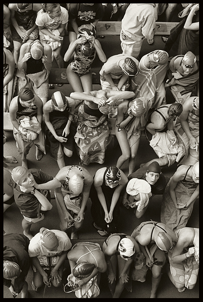
I'm looking for creamy-smooth midtones in my B&W, as I feel like that's something I've been missing. It's relatively easy for me in 120 (Neopan 400 and F76+ via a Tessar in open shade form my favorite combination for that), but trickier for me in 35mm, especially with 400-speed B&W.

So, what do you do and/or use (lenses, films, developers, printing, Photoshop) to get those gorgeous, creamy midtones?
 
Pan-F in 120.

attachment.php
 

Attachments

  • MFBW54_002.jpg
    MFBW54_002.jpg
    112.1 KB · Views: 0
Last edited:
I think midtones depend on light, exposition & development, and printing, but not on the film or lens... You as the photographer can use a material to have different looks... Not all shots with a film or lens will have similar midtones, and similar midtones can be achieved with different films or lenses...

Cheers,

Juan
 
It seems easier in 120 then 35mm, this one is with a Rolleiflex 3.5F with Tri-X at 200 souped in Xtol 1:1, a bit of toning in PS. Not sure if it's what your looking for but it looks 'creamy' to me.

247447691_c8018f0310_o.jpg
 
Light may play into this but I think the contrast of the lens does as well, here is one taken with a 50/2 collapsible summicron on Tri-X rated at 200 same developer as above...

362777470_f7f0e91ad7_o.jpg


next same film and developer but with a pre-asph 50/1.4 summilux
716568482_0ac950089b_o.jpg


Todd
 
1 Larger formats

2 Overexposure

3 Not being too worried about grain and sharpness (which don't matter as much with bigger formats...)

Cheers,

R.
 
My v2 Summilux 50/1.4 Juan.

Thanks for the feedback - I'm still pretty new to self development. Completely focused on Rodinal so far.

Roland.
 
I think the secret is in subtle gradations of tone. I have seen it most often in film based images, but I find this to be a particularly vexing issue with digital as opposed to film as digital tends not to be able to produce quite the same subtle gradations of tones quite so well or quite so reliably. Digitals notriously poor dynamic rnage is a limit here as its too easy to lose shadow and highlight detail - whereas what you need is the image tones gradually fading into these, not the blocky sudden transition that can occur.

But a few techniques may help in the digital domain......... Slightly lower mid range contrast assists. Also slight overdoing the noise reduction can smooth the image somewhat although this is problematic with photos containing much detail of course. However this affects detail more than tone but it still can help. In addition, I sometimes find it useful to add a slight amount of "glow" (some plugins facilitate this) which softens mid range tonal detail without obliterating it and can provide nice highlight tones. Incidentally one further thing I find helps is to add a tiny amount of silver toning (a very very soft sepia / warming tone.) Often my digital BW images are a little too cold in tone. The almost subliminal warming effect of the above does in my view help apparent smoothness and creaminess.

Adverting to my film experiences, I found that its affected by film type (perhaps obviously) and one of the best films for producing this effect in my opinion was the old Ilford XP2 chromogenic film which had lovely tonal range when shot at 100/200 ISO instead of its native 400 ISO.

I may also be affected by lens used and f stop. In the first image below (digital) I relied on post processing "fiddling" using the above techniques to get a pretty smooth tonal range that has some creaminess about it.

In the second image (digital - color) its pretty well down to the fact that I used a DSLR with Nikon's justly famous 180mm f2.8 lens which produces wonderfully "smooth" images. I am pretty sure if I converted this to black and white it would have the creaminess you are looking for.

4463285106_9dbf326af6_o.jpg


3821379581_6cf1600d52_b.jpg
 
Last edited:
Wow Roland! What a lens! What a shot! What a great expo&dev! Great point of view, composition and camera leveling! Wow!

Thanks for sharing!

Cheers,

Juan
 
well as usual
Todd & Roland 's pre asph lux shots won me over.....
Lovely gradation of Tones, beautifully Crisp with a Soft Glow...:cool:

peterm1 / Fab digi nikon pix...soooo Creamy dof
 
Todd, that shot of the swimmers is amazing. And Roland your shot through the window has so many clearly articulated tones it almost doesn't look like a photograph.

I've been pretty happy with a b&w workflow that goes like this: tri-x, d76 1+1, moderate to low agitation, all aiming for medium to low contrast negatives so that I have lots of flexibility after scanning.

3966707362_21f3992b56.jpg


(cron 40)
 
thanks to those that commented.

Snausages, the swimmers shot may be amazing but hardly compares to your girlfriend, truly amazing ;)

Todd
 
http://www.rogerandfrances.com/images/portraits/julie & holly 450h.jpg

Pentax SV, Acupan 200 (Foma 200), EI 80 in Paterson FX-39, Paterson Warmtone paper

http://www.rogerandfrances.com/images/malta/m m g xaghra mill spiral stairs 1b.jpg

Voigtlander Bessa-12, 12/5.6 Voigtländer, Acros 100 @ EI 64, Ilford MG WT

http://www.rogerandfrances.com/images/uk/two chairs.jpg

KowaSIX, 85/2,8, Maco Cube 400 @ 400 spot metered, Ilford MG WT

Three films, three systems, two formats. But the easiest way is XP2 Super:

http://www.rogerandfrances.com/images/portraits/neil & leslie.jpg

where Frances used a 75/2.5 Voigtländer on a Nikkormat and printed on MG WT.

Cheers,

R.
 
Back
Top Bottom