OK, here's are my thoughts in the order the photos were posted...
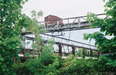
wlewisiii - I do like industrial subjects (and for some reason I especially like decaying industrial architecture). What I especially like about this one is the juxtaposition with the trees - it's as if nature is encroaching on what man has left behind and is reclaiming it, and so it adds a dynamism to what can easily be a very static subject. My only suggestion for change is that I wonder if it would be improved by cropping more tightly. I'd try a fairly heavy crop at the left - perhaps almost as far as the visible vertical trunk of the tree, and then a crop along the bottom to rebalance the proportions (It would lose the thirds proportions that you have achieved, though, so it might not work, but it might be worth a go).
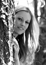
shutterflower - I love the mood, the thin colours, the model's expression, and the lighting. And I like the vignetting in the top corners - it gives a "naughty Victorian" feel to the picture. But what really makes it for me is the exposure. You've got it spot on in what looks like difficult lighting conditions - her face is exposed just right, and the white clothing is held back from being overblown. I also really like the driftwood - the contrast with the soft texture of the model's skin works well. My constructive criticism has to be the sloping horizon - it may be deliberate, and it may actually work for some people, but for me it distracts my eye a little from the actual subject.
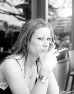
remf - What a great facial expression! And the direction the model is looking and focussing her attention disguises the fact that it is a posed shot and makes it look natural. Lovely mid tones, and very nicely exposed. And the background is excellent too - degree of out-of-focus is just about right, and the dark area behind the model's head helps to draw your eyes to hers. The reflection on her brow just above her left eye, and the contrast between the shadow under her left arm and the bright bit of background are perhaps a bit distracting, but only a little.
RdEoSg - High-key scenes like that are so hard to get right, but I think you've done a splendid job of it - I like it a lot. Exposure looks just about perfect, and I like the way you have two lines (the line of the top of the trees, and the line of the fence posts) converging and drawing the eye into the shot. I'm at a bit of a loss to suggest any improvement in this, but if I had to try something I might try a tighter crop (I can get a bit obsessive about cropping sometimes). Perhaps cropped to just past the leftmost fencepost, and just eliminating that distant post on the right (with top and bottom crops to retain the proportions)? But then again, that might destroy the splendid isolation of the trees, and maybe it's best left well alone. I'd love to see a bigger "print" of this one.
Thanks all, I've enjoyed doing this, and it's gracious of you all to give me the chance to comment in this way.
Best regards,