formal
***
raid amin
-------------
I like the abstract nature of the patterns in the bottom half of the image. I feel that the top half has too much concrete detail which distracts from the abstract nature of the rest of the image.
AusDLK
----------
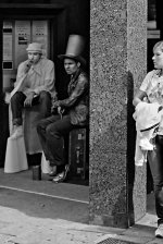
A good composition and I like the way all the people seem to be daydreaming. The "GE" on the left keeps drawing my eye out of the image and I find it a bit over sharpened.
ampguy
----------
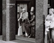
I like the way the child is looking over the magazine. However, the rest of the image is very "mundane" and it has the impression of a family snapshot, but perhaps that's what you want. I don't like the date.
Dracotype
-------------
I like the way the line of the building cuts the image into two parts and it has a pleasing range of tones. However, I don't like the way the window on the right and the doors at the bottom a cut off.
-------------
I like the abstract nature of the patterns in the bottom half of the image. I feel that the top half has too much concrete detail which distracts from the abstract nature of the rest of the image.
AusDLK
----------
A good composition and I like the way all the people seem to be daydreaming. The "GE" on the left keeps drawing my eye out of the image and I find it a bit over sharpened.
ampguy
----------
I like the way the child is looking over the magazine. However, the rest of the image is very "mundane" and it has the impression of a family snapshot, but perhaps that's what you want. I don't like the date.
Dracotype
-------------
I like the way the line of the building cuts the image into two parts and it has a pleasing range of tones. However, I don't like the way the window on the right and the doors at the bottom a cut off.