Critique #66 *Open Theme* 5 Participants + 1 Guest

I guess, we have broken all kind of rules then. I am not supposed to have commented on the comments unless everybody has posted their comments first. I forgot about Dave.

Raid
 
sirius -- Whoa nelly! I am listening to XM right now... Sorry brain fart. (Think about it.) Your image could be categorized in the "right up my alley" file. I want to like it and at first glance it was rather striking. But as the image was resized on my screen where I would see it in its entirety I was ultimately disappointed. The sun burst affect is quite nice (I'd like to know how to do this consistently) but as a whole the image is less than compelling. I think mainly I find the composition unsettling. The shadows of the pedestrians cry to be complete -- but both are chopped off with the man's more disconcertingly so. Overall the image seems crooked to me -- that is to say that the horizon line seems to be cocked clockwise too far. The person on the far left is distracting and does not add anything to image overall. And the people in the image are neither exactly centered nor qualify for the ubiquitous rule of thirds. In general the composition as presented does not serve the sun burst in the top third of the image that is quite nice. The exposure, contrast, and density as I see it on my screen are excellent. A much tighter crop that cuts most of the shadows, the person on the left, straightens the horizon, and that creates more of a "rule of thirds" composition might save the image. Try it.

davidbivins -- Stunning. Who cares who the man might be? I liked at first glance and as it sits on my screen I see no reason to change my mind. On my screen the there isn't much detail in the shadows of the man's shoulder but I'm sure in a real print or a higher-rez image this isn't an issue. There is a hotspot on the man's forehead that could be softened a tad. This jpg is a little more dense then I would have presented it but that's just a nit-pick. The lightening in the backdrop toward the upper right is a perfect touch. As a portrait for a wall frame this might be just a notch or two beneath a masterpiece.

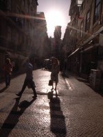
raid -- This is an engrossing image; technically very nice (with one exception noted below). The image invites a long, deep look. My gut reaction is that as it is presented that overall the image is rather flat -- that is to say I'd be happier with more contrast. The grain works nicely. The composition works but the overhanging awning kind of throws it off. I actually think it would have be a better image without the awning -- but, yes, I also acknowledge that it is the awning that makes the image different. So, clearly I have mixed feelings about your contribution. Other than my suggestion for more contrast, I don't have any other constructive criticism. (For example, I often think that cropping helps an image but not in this case.) This image falls in the category of either you like it or not (obviously you can't do anything about the awning). While I think my calling it engrossing applies in any case, it ultimately leaves me feeling that something just isn't right.

mrtoml -- Needs to gets me a Holga... Except for one (correctable) flaw, I think that your image is wonderful. The sense that we're seeing some stick figure climbing those steps is wonderfully suggested. The upper hoe is a little bit hot in my opinion and could stand some burning. My problem is the chain link background. I find this very distracting. It is not out of focus enough to keep from grabbing my eye and taking me out of the moment. I suggest blurring it and/or burning it almost to black. I suspect the Holga esthetic is to print everything full frame but if you're open to it, I think a slight crop to remove some of the less interesting portion of the steps in the lower right would serve the image significantly. (Is that a dust spot in the center of the hose curl? If so, shame, shame...) All told, I think that you have a winner here and it can only get better with a little bit on work here and there.
 
Last edited:
>The caption interests me because it suggests that this boy has been caught
>in some sort of act, probably harmless. But what is it?

Perhaps it would have been better to omit the "Busted" text from the image.

What I meant to imply was not that the boy was busted -- but rather I, the photographer, was busted because after several photographs the boy noticed me.
 
I've read the comments now and have the following to add...

Raid -- I actually like your image better in color.

My series was taken on an Amtrak train but I don't really think it matters whether it was a plane, train, or automobile.

I think that this is the most intelligent, thoughtful, and knowledgeable critique that I have participated in to date. Kudos and thanks to y'all.
 
I share Dave in his assessment of this thread.
Dave, I also like the color version more.

Raid
 
Sounds like this was a good critique. Maybe we'll try a couple more Guest threads. Thanks everyone, and thanks Ted!


:)
 
AusDLK, I like your sense of humor! Thanks for your comments everyone. I found them useful.

Raid, I like the colour one much more too. It seems to be a photo all about the colour: those contrasts between blue and orange, those touches of cream-coloured sand and red beer sign.

A number of people have mentioned straightening my photo. I can't really see that it would improve the photo. Perhaps someone would like to try so that I can see what was on your mind?

I am attaching my photo in colour so you can see how it originally looked. The colour really seems to do nothing for the photo so I played around with it in black and white. You can probably guess by the format that this was a digital photo. I took it with a Ricoh GRD camera, which has a 28mm equivalent lens.

I really liked the drawing of shapes on that street with the harsh light. I under exposed it about two stops and took a number of shots. This was the only one that really connected with a human element.

Lisbon has truly beautiful light. While walking around there I saw three photographers shooting models in the street. I think it may be from the cream coloured stone that they put on the streets. It reflects a lot of light. The sea air maybe has an effect too. Cartier Bresson made many lovely photos in Lisbon.
 

Attachments

  • RIMG0064.jpg
    RIMG0064.jpg
    497.2 KB · Views: 0
Last edited:
Thanks to all for the useful comments.

Just to note that originally I didn't actually think about the image as a man walking up the steps. I was surrounded by road workers and just noticed an interesting composition which I had to snap very quickly before the workers grabbed the tools and the moment passed. It was when I developed the roll that I noticed the potential.

I agree with AusDLK about the chain being distracting. I will have a go at blurring it.

Raid: I also preferred your colour image.

Cheers.
 
Thanks, everyone. I agree that this is a useful discussion and much better than I had hoped for. I learned a lot while composing my responses.
For what it's worth, I took my photo at a party. I had taken a lot of 35mm and SX70 already, so I was pretty transparent to the other people and this shot was not at all posed. I guess the subject (a very, very funny man and artist) was telling a story. The wall behind him was blood red I recall.
I'll have to go back to the negative and see if there was some more detail in the shoulder. I may have let it go to black for more dramatic contrast.
I do agree that it's a bit contextless. I like it and think it works on its own, but seen with a couple others from that evening it might make some more sense--for example, a reaction shot of other people there.
Thank you all for being honest and critical. Compliments are nice, but I can't learn from others without some down-and-dirty critique now and then.
 
sirius - I don't agree with the others about rotating your image to straighten the horizon. I think that part of the shot works well. Anyway, that's what you meant to do, right? The shot might also work well straight, and had you taken it that way you'd probably want to present it that way.
 
I also sometimes shoot slightly crooked horizons when I take photos of the ocean, and most times it was my intention to capture just what I saw in the viewfinder. Sometimes the horizon looks crooked but other things are just right, and this can be most important to the photographer. There is no need to make this issue a "must" just as the rule of thirds may be broken or that not all excellent images are tack sharp.

Raid
 
Back
Top Bottom